IDEA 2007 Brief Report

Themes from IDEA2007
Click for larger image

This past Thursday and Friday I hosted IDEA 2007, a conference on the design of information spaces of all kinds. This photo captures the themes we identified in a conference-wide discussion at the very end of the event.

It was an awesome event. Thanks to the efforts of the IA Institute‘s many volunteers, I could focus on paying attention to the speakers, and they were, across the board, great.

My biggest revelation was our first speaker, Michael Wesch, professor of anthropology at Kansas State University. Michael is most famous for his The Machine is Us/ing Us video. I didn’t know what to expect from him — I invited him because of the video and his background in anthropology. I admit, I was concerned he’d bring The Discourse and get all academic on us. Instead, he was an excellent speaker, clear, bright, passionate, and clever. He’d be ideal for any event having to do with technology, education, or information, and I’m proud to have introduced him, personally, to a new audience. He showed off two new videos that he hasn’t yet released, both of which will make huge splashes.

There was so much other great stuff, too — Sylvia Harris sharing her case study of redesigning (or rather, simply *designing*) the wayfinding system of Presbyterian Hospital in Manhattan; The Brad Paley Experience; Hasan Elahi’s on overwhelming the watchers; Chenda giving us a glimpse behind the scene of New York City’s 311… and I could go on.

In a second, and longer post, I will go into detail on the themes we captured, because they truly get at important characteristics of what it means to design in an information-drenched and uncertain world.

QUACK! On DUX07

The program for DUX07 (the “designing for user experience” conference) is nearly complete, and looks pretty good, and I don’t say that just because I’m the very first person on the main conference program.

And they’ve extended the early registration, so sign up soon to take advantage of the cheaper rate.

See you there!

Adaptive Path’s is coming to Vancouver; Register Now!

Coming in November is the third installment of our successful and well-loved UX Intensive event, taking place in Vancouver, British Columbia, Canada, November 12-15. In this workshop, you are taught by leaders in their fields:

  • Brandon Schauer — Design Strategy
  • Todd Wilkens — Design Research
  • Dan Saffer — Interaction Design
  • Chiara Fox — Information Architecture

Register by Friday, September 21 for deeply discounted prices. Use promotional code FOPM to get an additional 15% off the registration price.

I’ve been making a list of Canadian things Adaptive Path loves (which are mostly things *I* love about Canada):

  • maple syrup
  • Mounties
  • Terry Fox
  • Nanaimo bars
  • butter tarts (without raisins)
  • poutine from Le Banquise in Montreal
  • Bob and Doug McKenzie
  • gay marriage
  • single-payer health care
  • Broken Social Scene, The New Pornographers
  • animated shorts (particularly “The Big Snit” and “The Sweater”)
  • dressing as if you could go hiking or canoeing at any moment
  • Marshall McLuhan
  • politeness
  • Steve Nash
  • the theme song to “The Littlest Hobo”
  • early David Cronenberg films
  • “The Sweet Hereafter”
  • saying “process” and “project” with long “o”s, but “produce” with a short “o”
  • Banff

Rachel Hinman Demystifies Data Analysis

My Adaptive Path colleague Rachel Hinman just published an essay on our site titled Demystifying Data Analysis. She’s addressing what it takes to make sense of the data you’ve gathered after conducting user research — you’ve got transcripts, interviews, photographs, diaries, notes, and the like… now what?

She clearly articulates how to see your way through this part of the design process, coming out on the other end with a set of directives for your design work. Good stuff!

Get Satisfaction/Give Satisfaction

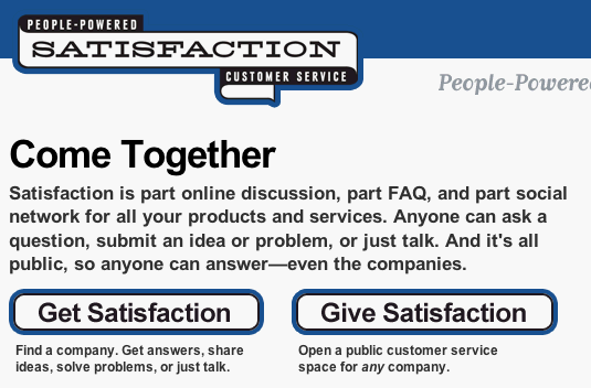
Congrats to the Satisfaction team for the launch of their new service. (Lane Becker, whom I used to work with, toils there now.)

The home page for Satisfaction (which in part looks like this:)

Getsatisfaction

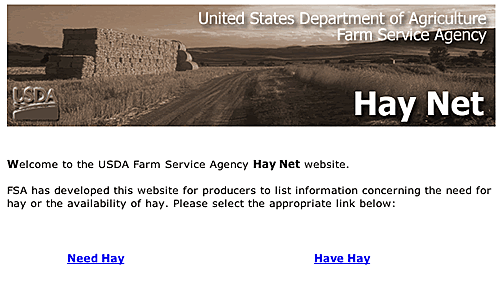
I suspect might have been inspired by an old Adaptive Path favorite, the (since redesigned) home page for Hay Net, a service of the Farm Service Agency that connects farmers who have hay with farmers who need it.<

What’s the Big IDEA?

I’ve been remiss in pimping IDEA 2007, the conference I’ve programmed, taking place 4-5 October in New York City.

Last year’s IDEA was a remarkable experience for me, establishing a new event and catalyzing, I hope, a new community. This year continues that with a selection of speakers addressing a wide range of approaches within the subject of designing complex information spaces.

Due to our setting, there’s definitely a strong New York City theme: Rachel Abrams talking about the Taxi Project; Jake Barton talking about a New York City-based project; Chenda Fruchter showing us behind the scenes at 311 (the remarkable New York City information service); Sylvia Harris, who’s worked in information design in New York City for 25 years; and Kevin Slavin, renowned for such Big Urban Games as Pac-Manhattan.

But wait, there’s more! For a slightly more theoretical and academic bent, I’m thrilled that we have Michael Wesch, professor from Kansas State University, who took the web by storm with his The Machine is Us/ing Us video. And Alex Wright, author of the recently published GLUT, sharing historical case studies on remarkable information systems. And finishing off with David Weinberger, author of Everything is Miscellaneous, and general all-around smart man.

But wait, there’s more! David Rose from Ambient Devices and Mike Kuniavsky from ThingM (formerly of Adaptive Path) will be sharing their experiences bridging complex information and physical devices. Mike will be sharing his experiences designing WineM, the intelligent wine rack, which you can see here.

And we’re bringing back Fernanda Viegas, who will be joined by her inestimable colleague Martin Wattenberg, to talk about Many Eyes, their social information visualization tool.

This conference is going to totally unscrew your skull and scramble your brain. In a good way.

Come to MX East and I will buy you dinner…or something else

Scott Berkun is, among other things, very clever. He’s offering a free dinner to anyone who attends MX East using his promotional code. So, not only do you get 15% off the registration, you get a personal gift — either dinner, a signed copy of his book, or he’ll write a blog post on a topic of your choice.

Well, that’s definitely raised the ante, and I feel obliged to at least meet it, and maybe raise it a little more. If you come to MX East, and use my promotional code FOPM, not only will you receive the 15% off the registration price, but I will also offer you a personal gift.

As dinner is already provided at MX East, I will buy you dinner either in your home city, or when you visit the San Francisco Bay Area. If connecting for dinner is too challenging, I’ll happily ship you your choice of some of the best that the Bay Area has to offer:

  • chocolates from Rechiutti (San Francisco), Scharffenberger (Berkeley), or Joseph Schmidt’s (San Francisco).
  • Two pounds of Philz or Blue Bottle coffee (the latest coffee crazes in the Bay Area)
  • Junipero Gin (from San Francisco’s Anchor Brewing Company)MX East has come together real well. We’ve got an amazing lineup, including:
  • Joshua Wesson, CEO, innovative wine merchant Best Cellars
  • Mark Jones, Service Design Director, IDEO
  • Irene Au, Director of User Experience, Google
  • Khoi Vinh, Design Director, The New York Times
  • Ryan Armbruster, SPARC Innovation Program, Mayo Clinic
    and many many more!

Thoughts on (and pics of) the original Macintosh User Manual

I recently purchased an original Macintosh User Manual (thanks eBay!). I had seen one at a garage sale, and was struck by how it had to explain a total paradigm shift in interacting with computers. I figured I could learn something about helping make innovation happen.

It’s been an intriguing read. It’s a remarkably handsome manual, beautifully typeset, which, considering par for the course at the time was probably Courier with few illustrations, is saying something.

Also, even back in 1984, there was no definite article. You get phrases like “With Macintosh, you’re in charge.” No “the”s or “a”s.

One of the more striking things was how every
Chapter is introduced with a full-color photo of Macintosh being used. Here they are (click on them to see bigger sizes):

Macintosh User Manual - <br />Chapter 1″ /><br />Chapter 1</a></p>
<p><a href=Macintosh User Manual - <br />Chapter 2″ /><br />Chapter 2</a></p>
<p><a href=Macintosh User Manual - <br />Chapter 3″ /><br />Chapter 3</a></p>
<p><a href=Macintosh User Manual - <br />Chapter 4″ /><br />Chapter 4</a></p>
<p><a href=Macintosh User Manual - <br />Chapter 5″ /><br />Chapter 5</a></p>
<p><a href=Macintosh User Manual - <br />Chapter 6″ /><br />Chapter 6</a></p>
<p><a href=Macintosh User Manual - Appendices
Appendices

The first thing I appreciated was how Macintosh is set within somewhat normal (and quite varied) contexts of use.

Then I noticed that, with the exception of
Chapter 5, every photo shows a preppy white male using the computer. Women and people of color need not apply! (The dude in
Chapter 4 even has a *sweater* around his shoulders!!!)

And
Chapter 5 exudes preppiness with the glass brick backdrop.

Also, why is the keyboard in
Chapter 3 positioned like that? Why on earth was it posed that way?

Anyway.

The thing you’ll notice in
Chapter 6 (and maybe you saw it in the Appendix) was the infamous Mac carrying case. There’s a page about it, which I photographed:

Macintosh User Manual - Carrying Case
Carrying Case – On The Go!

The introduction of the manual greets you with this image:

Macintosh User Manual - Introduction
Introduction

Dig that reflection! Apple returned to the reflection as a visual element a few years ago…

Some of the best stuff, of course, is explaining how the thing works.

Macintosh User Manual - Clicking
Clicking and Dragging (pretty straightforward)

My favorite is scrolling. I can imagine the discussion: “Well, it’s called a scroll bar… I know, let’s use a drawing of a scroll!” Yes. Because people in the mid-80s were all about scrolls…
Macintosh User Manual - Scrolling

And, hey, Where Does Your Information Go?

Macintosh User Manual - Saving
You’ll probably want to click for details

Oh! That’s where that metaphor comes from…

Macintosh User Manual - Desktop

And perhaps the strangest sentence: “The Finder is like a central hallway in the Macintosh house.”

Macintosh User Manual - Finder Rooms

(And the disk is a… guest? Someone looking for the bathroom?

It’s been surprisingly delightful flipping through this little bit of computer history. The pace, and deliberateness, with which the system and its interface are explained are quite impressive.