iPad and the importance of price — I called it 10 years ago

After the announcement of iPad in 2010, I wrote on Adaptive Path’s blog about “Apple’s iPad and the importance of price.” I noted how the success of Palm Pilot was in part because it had a target price of less than $300, and that Steve Jobs undoubtedly had done the same with $500. It helped explain some curious decisions about the product, like how it didn’t have a camera, even though it had the a space for it in the design, and iPhone, which had been out for 3 years had a camera. (And a camera appeared in the next generation iPad.)

There was no official commentary about the $500 price point and what had to be sacrificed in order to get there. Apple never made mention of it as a target — just that that’s what it would cost.

Today we get an interview with Phil Schiller in The New York Times that affirms what I suspected:

The project started being about, “O.K., what is a future computer device that can be under $500, that is something we’d be proud of, that has Apple quality and an experience we’d love?” Very quickly, the team and Steve came to, “Well, if we’re going to get to a price point like that, we need to remove things aggressively.”

So, please excuse me while I pat myself on the back. It’s gratifying to have sussed out a key component of Apple’s product strategy, especially when no one else seemed to realize it.

THE best conference for UX/Design managers and leaders…

…is Adaptive Path’s MX Conference, taking place on March 29-30 2016 in San Francisco.

I’m biased. After a few years away, I’m back and helping program and host this year’s event. We have a stellar line-up, including Bob Baxley (formerly Apple and Pinterest), Hyo Yeon (leading the design charge at McKinsey), Janaki Kumar (VP Design at SAP), Kim Scott (spreading the gospel of Radical Candor, a philosophy I can totally get behind), and many others. Oh, and me (I’ll be co-teaching, with Kristin Skinner, a workshop on “Org Design for Design Orgs”, based on what we’ve been writing in our book).

No other conference packs so much value into two days for folks who are managing/directing/leading design teams.

AND: Use the promotional code FOPM to get 15% off the registration price!

Personal update: Self-employed, writing a book, and looking for lunch

Not long ago, I wrote about Design at Jawbone. How quickly things change. Due to organizational restructuring, which lead to the elimination of all executive design roles, Friday was my last day.

There’s a big silver lining, though, as I’m co-writing a book on building and operating design organizations, and now I can do that during the day, instead of stealing time on evenings and weekends.

I’m considering management consulting gigs around design and product management. If you’re building an in-house design team and need sage advice and an outside perspectives, don’t hesitate to reach out.

And, I’m passively looking for my next full-time gig. I want to focus my time on the book, but if there are interesting conversations to be had about new opportunities, I’m always willing to talk.

Finally, given my new status, I’m up for all manner of breakfasts, lunches, coffees, and early ‘after-work’ drinks. If you’re not in the SF Bay Area, happy to hop on Skype or Google Hangouts. Let’s catch up!

Lessons Learned from Adaptive Path: The Evolution of UX Consulting Practice

In 2011, I left Adaptive Path after being there for over ten years. Before leaving, I wrote a series of emails on things I’d learned. These recently came back to my attention, and I thought I’d share them here.

When Adaptive Path started, in 2001, most companies had no UX competency, some had 1 person doing UX, and a very small number actually had UX teams.

So, when we were brought in, it was to be the ones to deliver on user experience. Clients recognized that this emergent practice was important to their success, but didn’t have the people in house to do it.

In that period, our work tended to live in this squishy space between strategy/planning and detailed design and development. In pre-UX days, it was common for product development to go right from product definition into detailed design. One of the values of UX practice was to recognize you needed to bring more of a systems thinking approach to product development, to understand the structure of the product, how the piece-parts related to one another, and how someone would move through it.

Now, in 2011, most companies have a decent UX competency. They don’t need us to come in and do the architecture diagrams, workflows, wireframes, and the like, because they have staff members who do that.

Instead, UX consulting work seems to be bifurcating.

On one end, UX is being recognized as an approach that can inform, if not drive, strategy and planning. The work we’ve done for [various big multinational clients] is in this vein. Companies recognize it’s no longer sufficient to have spreadsheets and checklists driving their product strategy. They need to add research and experience strategy in the mix as well.

On the other end, there is an emerging requirement for new modes of UX execution and delivery. [Startup clients] are indicative of this — trying to figure out how UX can best be performed when the product is already defined, in a time-constrained environment, and collaborating with development.

The squishy middle, where Adaptive Path initially staked its claim, seems to not be a viable consulting service any more.

I’ve been talking with some people about this for the past couple of months, and so it was interesting to see the reframing of Adaptive Path service offerings presented at the company meeting last week:

        – Experience Strategy

        – Service Design

        – Detailed Product Design

The first and third map directly to the bifurcation that I am talking about.

And after the meeting, I realized that

        service design:2011::ux design:2001

Service design is now the squishy middle that companies are starting to realize they need, but don’t have the people in-house to deliver. And it is reliant on the kinds of deliverables (journey maps, service blueprints) that have fallen out of favor in the UX world. And seems to have finally achieved a maturity where clients, even if they don’t know to ask for “service design,” are coming to us for service design challenges.

[end of email]

Looking back over the past four years, I feel pretty good about what I foresaw. We’re seeing companies acquire design/UX firms to do that squishy middle stuff that wasn’t as viable to do as a consultant. We’re seeing management consultants actively moving into the experience strategy space. We’re seeing small agile design firms successfully delivering product, augmenting in-house teams. The one thing we haven’t really seen is the Rise of Service Design like we saw the Rise of UX. By 2005, UX was pretty firmly established as a thing companies were investing in (and it was around that time that Adaptive Path grew in earnest). Here in 2015, Service Design still feels niche. I’m thinking that’s because companies still don’t know how to buy service design, because it requires drawing from multiple departmental budgets, whereas UX usually drew from a single group.

There is no such thing as UX Design

Provocative statement: The entire “field” of user experience emerged for one reason — to accommodate, and overcome, poor (or non-existent) product management practices.

Product management’s responsibility is to identify opportunities in the market, specify new offerings, and see these through development and distribution. Originally, product management was seen as a business function, and MBA’s were placed in that role. As such, it was about sweating the market, assessing opportunities, crafting business plans, establishing requirements, and the like.

In Silicon Valley, most notably at Google (where Larry felt it inappropriate for non-engineers to tell engineers what to do), a more technically oriented product manager emerged, essentially a flavor of engineering management but with some business savvy.

The rise of software, and particularly networked software, lead to products of immense complexity. It was in these environments that some designers realized that a significant perspective was being neglected–drawing from customer empathy. Designers, who are typically the most empathetic folks in a product organization, knew that many of the requirements they’d been given were foolhardy–that no one would use the thing. So, they pushed back, incorporating first usability and then up-front user research methods, and developing systems-level design practices around architecture diagrams, interaction flows, wireframes, and the like.

This work was called “user experience,” a term originally coined by Donald Norman to acknowledge that the totality of a user’s experience should be intentionally addressed.

The problem is, Don should have never had to say something so obvious. It was due to the shortcomings of the MBA and computer science mindset that product management had not yet considered this.

So, the field of user experience emerges, typically within design teams, in order to fill this gap. It makes for an awkward organizational fit, because, really, product managers should be the ones driving these efforts, as they are best suited to weigh these inputs alongside the business and technical concerns.

The dissolution of “UX Design”

User experience is an emergent property of an entire organization, not just one group. When user experience is so closely associated with design, it allows non-designers to feel like user experience isn’t their responsibility. This association also sets up designers to fail, because they are given a charter they cannot deliver on.

There is another issue around the job title, and career path, of “UX Design.” The use of the term is so broad as to be meaningless. Instead, let’s unbundle the components of what people think of as UX Design and place them where they make more sense.

Much (most?) of what people mean when they say UX Design is around the structural and interface designs of complex, software-enabled systems. And we already have a name for that: interaction design.

There are strategic aspects of UX Design — user research-informed product strategy, using design and storytelling to help figure out what we should do. We also have a name for this: product management. As in, product managers need to consider this empathy-driven understanding with equal weight to the business and technical concerns.

Do not interpret this as me suggesting designers should not be included in product management — far from it. Design is a key input, and oftentimes, driver of product management. In fact, I am seeing more and more senior “UX Designers” reframing themselves as product managers, because it better explains what they’re actually doing. This is progress.

“User experience design” served a purpose when it was necessary to shine a light on a glaring gap in the ways we were working. That gap has largely been addressed, and I see no reason not to retire that term.

Why I Don’t Like the iPhone 6

iPhone 4

When I got the iPhone 4, I would turn it over in my hand, studying it. It was a remarkable work of design and engineering, an ecstatic product unlike anything out there, and one of the most beautiful things in my possession.

I was wary of the iPhone 5, as I believed the hype about limitations of hand size guiding phone size, but found the 5 to be an improvement — in this case, more pixels were better.

However, I find the iPhone 6 to be a serious step in the wrong direction. Whereas the craft, precision, and boldness of the prior models could have only come from Apple, this is first iPhone that feels like it could have been made by anyone. (Khoi digs into this very thoughtfully.)

Having used an iPhone 6 since a week after it came out, I feel like I have a firm grasp on just what this phone is. And I don’t really like it.

It’s too big. It’s awkward in the hand. My thumb can’t quite reach the upper-left-hand corner, and I’m constantly mis-tapping items up there. That Apple had to give us a hack to make it more usable should have been a sign to someone (Jony?) that however fashionable this size is, it’s still not a good idea.

I’m constantly having to shift it from pocket to pocket because it doesn’t sit well in any of them. It peeks out over shirt pockets. And yes, you’re constantly afraid of bending it.

And I haven’t realized any benefits from the greater screen size. Apps are in no way improved.

It’s too slippery. The curved edges and aluminum back make it quite slippery. I’ve dropped it a number of times. The 4/5 had those hard edges that gave you something to grip. The 6 is just an eel.

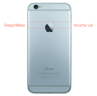
iPhone 6 buttonsThe Sleep/Wake button is in the wrong place. Recognizing that size was a problem, Apple shifted the Sleep/Wake button from the top to the side — so you could reach it with your thumb. However, given that this phone is too big/awkward already, it doesn’t matter where they put the Sleep/Wake button, because you’re already compensating for it’s size.

By putting it on the side, they introduced a whole new problem. The Sleep/Wake button is now symmetrical to the Volume Up button. I typically leave my phone in my pocket while listening to podcasts. Due to the vagaries of different recording levels and ambient noise, I fiddle with volume quite a bit. (Do you see where this is going?) Now, because of symmetricality, half the time when I intend to press the volume button, I instead hit Sleep/Wake. A key principle for successful industrial design is that I don’t need to see the product to use it right — physical affordances should allow me to operate by feel.

Also, if you transition between iPhone 6 and an iPad (as I do), you now find yourself feeling for the Wake/Sleep button on the side of the iPad.

I guess what I don’t like is that the seemingly elegant (because of symmetry) and smart (because of hand size) move of the Sleep/Wake button makes me feel stupid because I’m often pressing the wrong button. This is a classic kind of design error that expresses itself as user error, the impetus for Don Norman to write The Design of Everyday Things.

So, ultimately it’s disappointing. The iPhone 6 is the first generation that lacks perspective, personality, and the obsessive care we’ve come to associate with the product. It’s a me-too phone. It definitely has benefits over the 5s (mostly notably processor speed and camera), so, it’s not like I’m going to downgrade. But had they simply placed the iPhone 6’s guts into an iPhone 5 shell, I would have been much happier.

The fear, of course, is that this is the first step in a post-Jobs design direction, and without his tyrannically high standards, Apple once again loses its way. We’ll see. One hopes it’s simply a fashion-chasing misstep that is corrected over time (though, the market response suggests otherwise). We’ll see.

[It turns out, unsurprisingly, Mark Hurst has some very similar sentiments to mine.]

The Why and The How of Organizations that Deliver Great Experiences

As companies embrace the need to take user experience seriously, often their first step is to build out a “UX department.” However, the reality is that user experience is a phenomenon that emerges from an entire organization’s activities, not just the efforts of one team. There are (at least) six components that need to be aligned throughout the organization, which I’ve grouped into “The Why” and “The How”.

The Why

Values

What do you stand for?

An organization must have a clearly articulated set of values, and if you want to deliver great experiences, those values most include humanistic qualities of customer-centeredness and empathy.

Values statements from Apple, Southwest Airlines, Target.

Vision

Where are you headed? 

Everyone must have a shared sense of where the organization is going. This vision must be concrete and inspiring. Bulleted lists do not comprise a vision, because it allows team members to have very different interpretations, which will undermine their efforts to deliver a great experience. At Groupon, before we launched our redesigned website, we created an internal-only “north star” that illustrated what our experience could be in 2 years time. It helped orient everyone in the same direction. Deborah Adler’s “SafeRX” prototype embodied a vision for a new pill delivery system better than any list of requirements could.

Jared Spool has written good stuff about vision: The 3 Qs for Great Experience Design, The 3 Steps For Creating An Experience Vision.

Goals

How do we know when we’re successful?

At Adaptive Path, my favorite question to ask client stakeholders during the initial discovery phase was, “How do we know when we’re successful?” It seems so obvious and innocent, but as I worked with more companies, I grew to realize just how few organizations had a clear sense of what success meant to them. However, if you’re not clear about goals and success metrics, it’s much harder to make decisions throughout your process, and your efforts lose focus.

Christina Wodtke’s discussion of OKRs is a good place to go deeper.

How

Incentives

How do we encourage desired behavior within the team?

Incentives might seem a highly specific tactical matter compared to the others. Thing is, it warrants being called out as it’s where the best laid plans of delivering great experience get bound up in the legacy behaviors of an organization.

How is performance assessed? What criteria drive rewards (raises, bonuses, promotions)? What behaviors get lauded and evangelized? 

I’ve worked with numerous financial services organizations, where people were rewarded based on the performance within their business unit (banking, brokerage, insurance, loans) or their channel (in store, by phone, online). Such incentives are anathema to great experiences, as it discourages internal cooperation, even though customers are engaging across businesses and channels. 

I recently spoke with Irene Au about her career leading UX teams, and a challenge she had at Google is that individuals were promoted based on how much stuff they shipped, and not about the quality of what was shipped. Optimization and refinement was thus discouraged, even though such iteration is necessary for great experiences.

Processes

How do we operate?

The first thing to understand — there is no One True Way. No grand process to rule them all. Delivering great experiences requires discarding rigidly defined processes, instead embracing a toolkit, a set of techniques that can be used as needed to solve specific problems. 

However, there are characteristics of organizational operation that typically lead to the delivery of better experiences.

Work as a cross-functional team as early as possible. Waterfall approaches, where one functional group hands off to the next functional group, deliver poorer experiences. The complexity of the problems you’re trying to solve, the components that need to be marshaled and coordinated in order to succeed, requires input from the entire team from the outset. And not just at a kickoff meeting, but throughout throughout definition, design, and development.

Upfront, qualitative field research reveals opportunities, leads to insights, and sparks creativity. Engaging prospective and active users at the start of a project, understanding their current behaviors, and revealing the motivations and emotions that drive their actions, will lead to insights that in turn identify new opportunities for delivering customer value. 

Design and prototyping are activities that support the entire process, not discrete steps in the process. You can use design and prototyping techniques from the beginning of the process. (For more on this, read about The Double Diamond Model)

Bias towards building and making, not thinking and documenting (though some thinking and documentation can be quite helpful). Companies that deliver great experiences are constantly crafting those experiences, refining and refining them.

Capabilities

What skills are necessary?

This question is the hardest to answer generically, because it’s so dependent on the specifics of experience delivery. That said, there are a couple of newish roles that organizations serious about great user experiences must consider.

Strategic designer. As design gets brought into earlier parts of the process, it’s important that designers are comfortable with strategy and planning. Not all designers excel at these discussions, so it is important to have designers who can engage with and are excited by strategic concerns, and who can hold their own with business analysts,  product managers, and engineers.

Prototype engineering. Engineering is typically seen as a production exercise — creating code that is ready to be deployed. In this new era of iterative design and prototyping, a role has emerged for those who can quickly cobble together interactive prototypes with no concern as to whether the code created is reusable. 

This capability comes from one of two places — technologists who are comfortable being nimble, or designers who are comfortable prototyping their designs. Either way, it’s important that your team can quickly prototype new solutions in such a way that users can experience them and provide meaningful feedback, which will then inform subsequent iterations of the solution. 

I’m Sure There’s More

While I think this is pretty complete, it’s doubtless not exhaustive. I’d love feedback on improvements, be they amendments, refinements, or removals.


Design should drive product and engineering, not vice versa

[Note: I’m actually wary of “should”s, and what follows is more of a provocation than a call to arms. But I think it needs to be seriously considered.]

In 2007, Jared Spool wrote about the market maturity framework, and how technical product categories evolve from “technology” (where it’s compelling that a product simply does a thing at all) to “features” (where there’s competition that stakes claims based on the number of capabilities) to “experience” (which delivers a gestalt greater than the sum of the parts, and often involves removing features).

Most technical product organizations are still driven by engineering (“technology”) or product management (“features”). “Experience” is where design comes to the fore, but because of its nascency, design is typically subsumed into an existing engineering- or PM-driven org.

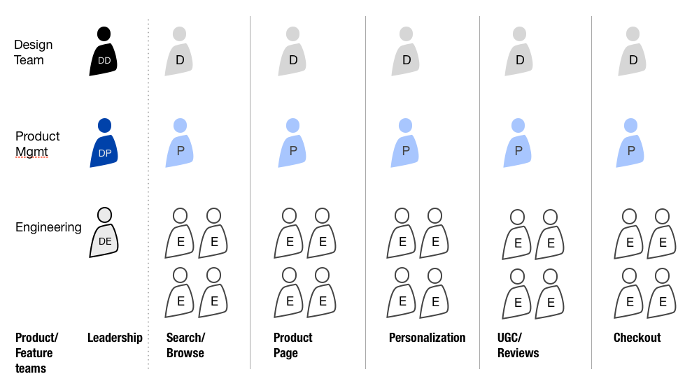
This means that many organizations place design within existing product/feature teams, looking something like this (for an imagined e-commerce service):

typicalprod

The vertical orientation is primary. On the left, there’s a leadership team with a Director of Design, Director of Product, and Director of Engineering who coordinate and plan across the teams. Then you have distinct “feature” teams that own different parts of the product, comprised of a product manager, a designer, and 4 (or so) engineers.

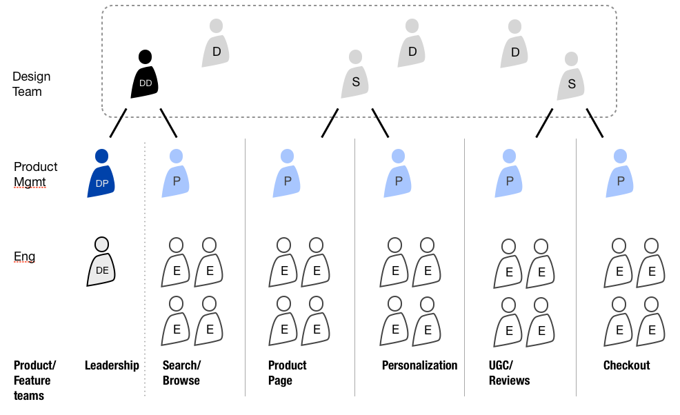
At Groupon, and in some other orgs I know, you see an organization more like this:
centralizedpartnership

The design team is distinct and works together. The Director of Design still coordinates with Director of Product and Director of Engineering, and now also with a Product Manager on a key feature team. We’ve introduced Senior Designers who own relationships with two Product Managers each. When a PM needs to know what’s going on with design, the PM talks to that senior designer. And then we have 2-3 additional designers who collaborate with the Senior Designers or Director of Design as needed.

I call this a “Centralized Partnership” model, where design is centralized, but, through the senior designers, there is a real commitment and partnership with product areas. The benefit of this model is that designers can work across multiple features, ensuring coherence of the experience.

However, this is still ruled by “features”. So, maybe we need to fundamentally rethink it?

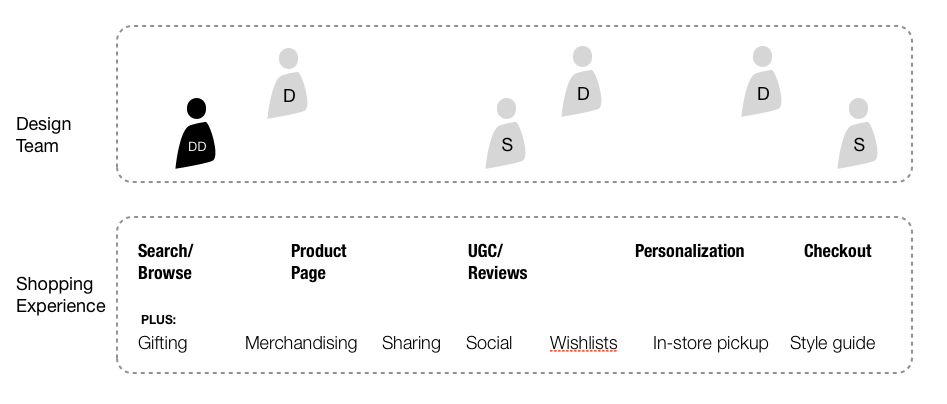
If companies are serious about focusing on experience, than design teams should be free to work on that holistic experience, which means that they can actually address a whole lot more. At Adaptive Path, I lead a project team on an e-commerce site. We were able to deliver across many more features, because we weren’t constrained by product teams.

designteam_experience

The open question is to figure out how product management and engineering should be structured to support this crafting of experience. But it doesn’t make sense to let legacy organization structures constrict our ability to deliver the greatest possible experience for our users.

The Seduction of the Superficial in Digital Product Design

Digital product design discourse over the last few years has become literally superficial. Much (most?) of the attention has been on issues like ‘flat’ vs ‘skeuomorphic,’ the color scheme of iOS7, parallax scrolling, or underlining links. And not that these things aren’t important or worth discussing, but as someone who came up in design by way of usability and information architecture, I’ve been disappointed how the community has willfully neglected the deeper concerns of systems and structure in favor of the surface. I mean, how many pixels need to be spilled on iOS 7.1’s redesigned shift key?

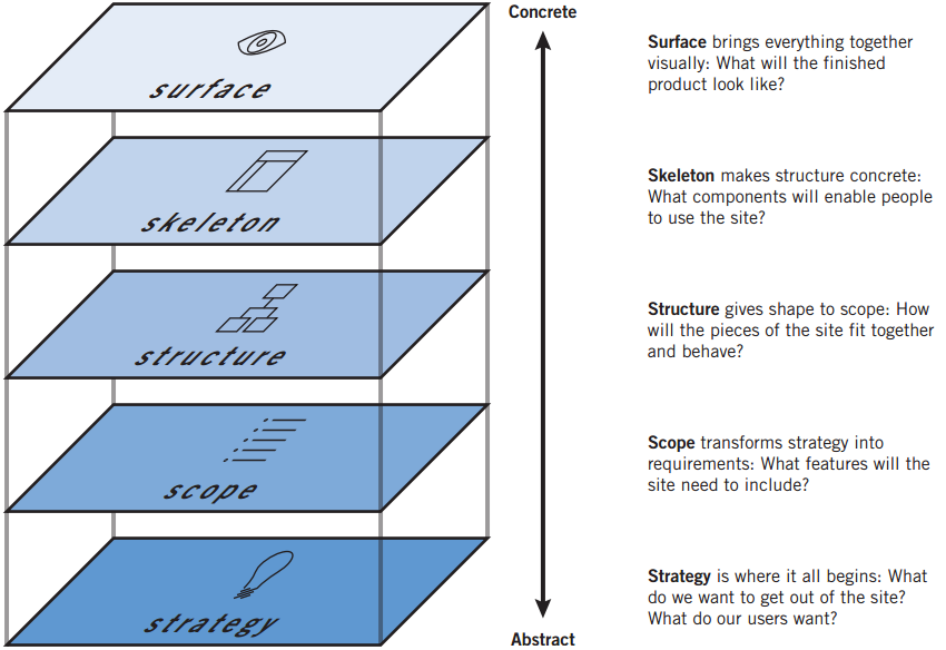
I was talking with Jesse about this over lunch a bit back, specifically how his 5 planes are more important now than ever.

simpleplanes


There was a golden moment, in late 90s and early 2000s, where the deeper matters of strategy, scope, and structure seemed to get more play, with multiple books on information architecture, and online journals like Boxes and Arrows leading the design discussion.

Jesse, ever the wiser one, coached me to watch for my “Get off my lawn!” mindset, and through our discussion I realized something.

When digital design discourse emerged in the late 90s, our ability to interestingly design for “surface” was heavily compromised. We designed for 640 x 480 displays. Maybe 800 x 600. We worried about the Netscape Color Cube. We had laughable control over typography and layout.

Graphic designers often got frustrated with the Web, and did what they could to control the presentation, overly relying on images, and exploiting hacks with tables and invisible .GIFs. And schmucks like me, who had no real graphic design skill, would smugly tell them to “embrace the medium” and focus on the interesting hard problems of information architecture and interaction design.

We now live in a world where I have an 1136×640 display with 16 million colors in my pocket. And processor speeds that allow for startlingly smooth animations. The Surface now warrants critical examination and exploration. But the Surface isn’t merely superficial. The decades of insightful dialogue on matters of graphic and motion design can now be applied to digital products. The increased sophistication of the digital canvas has lead to limitless possibilities on the Surface, and a capable digital interface designer must understand not only color, composition, typography, and layout, but now must also be facile with motion and animation. That’s enough to keep anyone busy for their career.

It’s understandable that non-designers talking about design (as increasingly happens) focus on the superficial–it’s the easiest to discuss. However, we in the digital design community must not get so caught up in the seductive Surface that we neglect those lower layers. There are a number of reasons:

  • It is a disservice to younger designers, particularly the self-taught, as it encourages emphasis on style over substance
  • It plays into the still-prevailing attitude among business and technical types that designers don’t grok the deeper concerns in these complicated systems, and are best to bring in when it’s time to make something look good
  • As the services we design cross more devices and have more online and offline touch points, managing those deeper layers is increasingly important for success

I’ve realized I’m grateful for the passionate conversation around Surface–it means that people care and are engaged. Still, we must be vigilant in maintaining similar attention to those deeper layers, precisely because their abstraction makes them more challenging to discuss.

User experience has stunted information architecture

I came up through UX practice as an information architect and interaction designer. I was an avid reader of Peter and Lou’s “Web Architect” column, spoke at the first IA Summit, and was an early proponent of facets and tags in the broader UX community.

The UX community was essential for casting light on the importance of information architecture. It made clear how the organization, structure, relationships, and semantics around and in our information are key to delivering a successful user experience. There was a period, around 1999-2005 or so, where information architecture was a vibrant, dynamic, evolving field.

But there are only so many talks to give on facets, tags, and the like. And, over time, it feels like IA has been swallowed by UX (and seen in strange competition with interaction design).

IA had become less and less of my practice as Adaptive Path shifted towards strategic design consulting. And so I didn’t think about it too much.

Then I went in house. In particular, I joined Groupon. A month or so into the job, I became part of discussions to change evolve our site navigation. This excited me — I would get to flex some of those old analytical muscles that had atrophied over time.

As I dug into it, though, I felt a little like I was peeling an onion. Every layer presented new layers beneath. And I quickly left the realm of site navigation, and found myself engaging in conversations that went deep to the core of Groupon’s operations. Because, it turned out, our taxonomy influences everything we do — the deals we strive to get, the operations of our sales force, the presentation of our offers across devices and channels, heck, it even determines where some people sit.

And I realized this was bigger than I could tackle at the time, because I had (and still have) a design department to run.

And it also made me realize that IA had been stunted by its relationship with user experience. Because information architecture, when approached with the depth and rigor that is warranted, is a deeply seated operational and organizational function. The UX component of information architecture, how information is represented to end users, is important, but truly a tip of the iceberg. (And not just Peter Morville’s iceberg.) But in order to IA to have the impact it could (and should), IA needs to free itself from being seen under the umbrella of UX, and instead pursued as a distinct, and difficult, practice that’s not just about taxonomies and semantics, but the organizational, operational, and technological change to realize that.