Digital product design discourse over the last few years has become literally superficial. Much (most?) of the attention has been on issues like ‘flat’ vs ‘skeuomorphic,’ the color scheme of iOS7, parallax scrolling, or underlining links. And not that these things aren’t important or worth discussing, but as someone who came up in design by way of usability and information architecture, I’ve been disappointed how the community has willfully neglected the deeper concerns of systems and structure in favor of the surface. I mean, how many pixels need to be spilled on iOS 7.1’s redesigned shift key?
I was talking with Jesse about this over lunch a bit back, specifically how his 5 planes are more important now than ever.
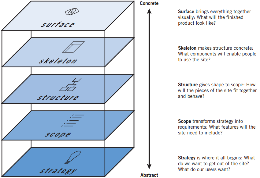
There was a golden moment, in late 90s and early 2000s, where the deeper matters of strategy, scope, and structure seemed to get more play, with multiple books on information architecture, and online journals like Boxes and Arrows leading the design discussion.
Jesse, ever the wiser one, coached me to watch for my “Get off my lawn!” mindset, and through our discussion I realized something.
When digital design discourse emerged in the late 90s, our ability to interestingly design for “surface” was heavily compromised. We designed for 640 x 480 displays. Maybe 800 x 600. We worried about the Netscape Color Cube. We had laughable control over typography and layout.
Graphic designers often got frustrated with the Web, and did what they could to control the presentation, overly relying on images, and exploiting hacks with tables and invisible .GIFs. And schmucks like me, who had no real graphic design skill, would smugly tell them to “embrace the medium” and focus on the interesting hard problems of information architecture and interaction design.
We now live in a world where I have an 1136×640 display with 16 million colors in my pocket. And processor speeds that allow for startlingly smooth animations. The Surface now warrants critical examination and exploration. But the Surface isn’t merely superficial. The decades of insightful dialogue on matters of graphic and motion design can now be applied to digital products. The increased sophistication of the digital canvas has lead to limitless possibilities on the Surface, and a capable digital interface designer must understand not only color, composition, typography, and layout, but now must also be facile with motion and animation. That’s enough to keep anyone busy for their career.
It’s understandable that non-designers talking about design (as increasingly happens) focus on the superficial–it’s the easiest to discuss. However, we in the digital design community must not get so caught up in the seductive Surface that we neglect those lower layers. There are a number of reasons:
- It is a disservice to younger designers, particularly the self-taught, as it encourages emphasis on style over substance
- It plays into the still-prevailing attitude among business and technical types that designers don’t grok the deeper concerns in these complicated systems, and are best to bring in when it’s time to make something look good
- As the services we design cross more devices and have more online and offline touch points, managing those deeper layers is increasingly important for success
I’ve realized I’m grateful for the passionate conversation around Surface–it means that people care and are engaged. Still, we must be vigilant in maintaining similar attention to those deeper layers, precisely because their abstraction makes them more challenging to discuss.