When I got the iPhone 4, I would turn it over in my hand, studying it. It was a remarkable work of design and engineering, an ecstatic product unlike anything out there, and one of the most beautiful things in my possession.
I was wary of the iPhone 5, as I believed the hype about limitations of hand size guiding phone size, but found the 5 to be an improvement — in this case, more pixels were better.
However, I find the iPhone 6 to be a serious step in the wrong direction. Whereas the craft, precision, and boldness of the prior models could have only come from Apple, this is first iPhone that feels like it could have been made by anyone. (Khoi digs into this very thoughtfully.)
Having used an iPhone 6 since a week after it came out, I feel like I have a firm grasp on just what this phone is. And I don’t really like it.
It’s too big. It’s awkward in the hand. My thumb can’t quite reach the upper-left-hand corner, and I’m constantly mis-tapping items up there. That Apple had to give us a hack to make it more usable should have been a sign to someone (Jony?) that however fashionable this size is, it’s still not a good idea.
I’m constantly having to shift it from pocket to pocket because it doesn’t sit well in any of them. It peeks out over shirt pockets. And yes, you’re constantly afraid of bending it.
And I haven’t realized any benefits from the greater screen size. Apps are in no way improved.
It’s too slippery. The curved edges and aluminum back make it quite slippery. I’ve dropped it a number of times. The 4/5 had those hard edges that gave you something to grip. The 6 is just an eel.
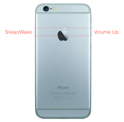 The Sleep/Wake button is in the wrong place. Recognizing that size was a problem, Apple shifted the Sleep/Wake button from the top to the side — so you could reach it with your thumb. However, given that this phone is too big/awkward already, it doesn’t matter where they put the Sleep/Wake button, because you’re already compensating for it’s size.
By putting it on the side, they introduced a whole new problem. The Sleep/Wake button is now symmetrical to the Volume Up button. I typically leave my phone in my pocket while listening to podcasts. Due to the vagaries of different recording levels and ambient noise, I fiddle with volume quite a bit. (Do you see where this is going?) Now, because of symmetricality, half the time when I intend to press the volume button, I instead hit Sleep/Wake. A key principle for successful industrial design is that I don’t need to see the product to use it right — physical affordances should allow me to operate by feel.
Also, if you transition between iPhone 6 and an iPad (as I do), you now find yourself feeling for the Wake/Sleep button on the side of the iPad.
I guess what I don’t like is that the seemingly elegant (because of symmetry) and smart (because of hand size) move of the Sleep/Wake button makes me feel stupid because I’m often pressing the wrong button. This is a classic kind of design error that expresses itself as user error, the impetus for Don Norman to write The Design of Everyday Things.
So, ultimately it’s disappointing. The iPhone 6 is the first generation that lacks perspective, personality, and the obsessive care we’ve come to associate with the product. It’s a me-too phone. It definitely has benefits over the 5s (mostly notably processor speed and camera), so, it’s not like I’m going to downgrade. But had they simply placed the iPhone 6’s guts into an iPhone 5 shell, I would have been much happier.
The fear, of course, is that this is the first step in a post-Jobs design direction, and without his tyrannically high standards, Apple once again loses its way. We’ll see. One hopes it’s simply a fashion-chasing misstep that is corrected over time (though, the market response suggests otherwise). We’ll see.
[It turns out, unsurprisingly, Mark Hurst has some very similar sentiments to mine.]
I agree on almost every count, all but screen size. After more than a month with the 6, I picked up my wife’s iPhone 5s, and I was glad I wasn’t working on that smaller screen. That’s when I realized that I appreciated the slightly larger size of the screen on the 6. It makes a difference, at least to my eyes.
Other than that, I too am annoyed by the placement of the buttons — I keep wanting to squeeze the 6 to press the Off button, but I inevitably press the volume buttons at the same time. And the new form factor reminds me way too much of one of those Galaxy Android phone I see people carrying.
Any feedback about battery? I was planning iPhone 6 Plus for its battery, but you say 6 is too big. Cannot decide.
For all the reasons mentioned about why the 5/5S was an improvement, along with some personal appreciation for a certain tactility and aesthetic, my ideal phone right now would be the guts of the 6 in a white 5C body (but with a black screen frame).
After playing around with the 6 I was immediately reassured that my 5S was still preferred, although I did really like gentle curve of the glass. But no worries there, I’ll be able to appreciate that soon enough. I plan on camping out for the Watch.