Rebranding Snag, Part 4: Reflections and Lessons Learned

The last three posts (Part 1: Brand Strategy; Part 2: Brand Identity; Part 3: The Logo) detailed the steps it took to launch our new brand (and though I wrote much, I probably covered a third of all that it took). Here are a few reflections on the whole experience.

It takes time

The brand work began in earnest the day I joined Snagajob, January 2, 2017, and launched to the public April 4, 2018. Throughout the entire process, we felt pressure to move quicker–we’re a startup, we shouldn’t overthink things, we need to be scrappy, we don’t have the resources for a big engagement, we’ve been living under brand confusion too long already.

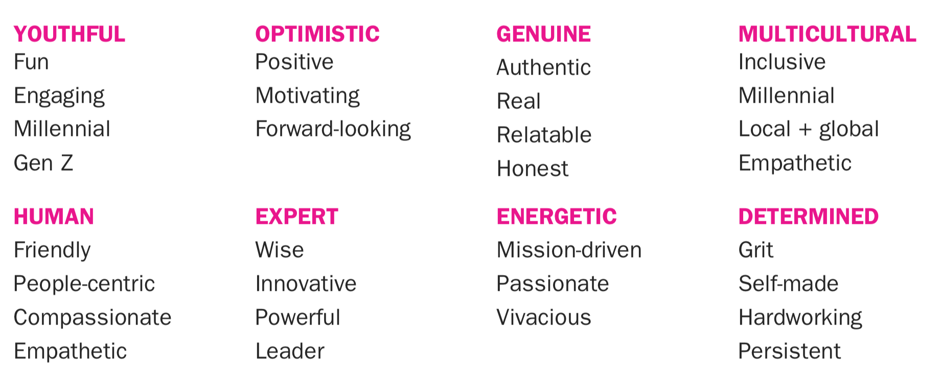
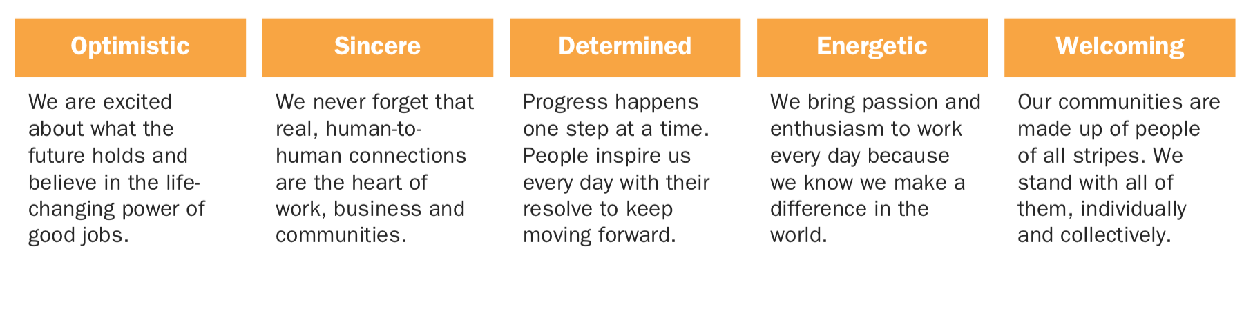
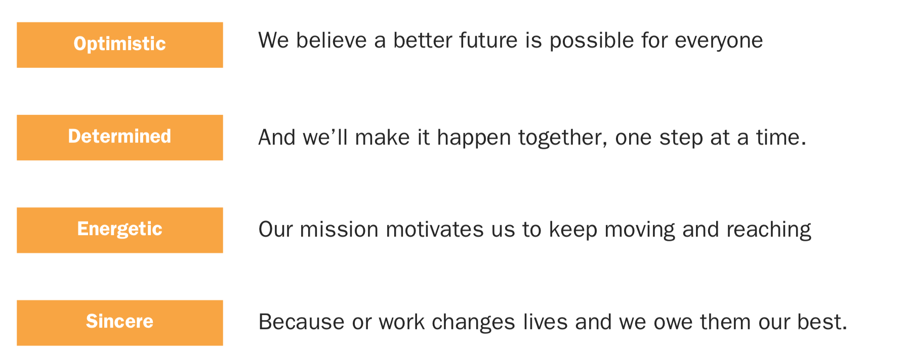
Looking back, with all the knowledge I have of our process, I cannot find a single point where I think we should have moved faster. The brand strategy work took 5 months, and every day of that was necessary – bringing people along on something as sensitive and fraught as brand cannot be treated lightly, and needs rigor and rationale to address any concerns. Brand strategy is the part of the iceberg underneath the water – unseen, underappreciated, but a massive effort necessary to ensure that which is seen is as strong as it can be. The work took 5 months because it needed sufficient discovery (interviews with customers, employers, and Snaggers); workshop planning, execution, and analysis; development and refinement of brand positioning for all of our audiences; analysis and refinement of our brand architecture; naming exploration and choosing; brand story and brand personality development; and probably things I’m forgetting.

Heck, if anything, I think we could have taken some more time, particularly around naming.

As the prior 2 posts explained, developing a world-class visual identity doesn’t happen quickly either. We got a lot out of our 3 months with Fuzzco, and even then, we spent another 3 months (engaging roughly a dozen designers) to evolve and refine the brand identity work they delivered. And every week we spent made it stronger, and better.

To be candid, even when we publicly launched the new brand, we weren’t done. In order to meet our launch date, we took an expedient path with imagery, settling on a photographic style that sufficed. I expected we wouldn’t actually feel like our brand identity was truly complete for another 3-6 months after launch.

Don’t settle for least resistance; do the challenging thing that excites you

The biggest reason I left design consulting to move in-house was that instead of handing off a design and hoping for the best, I wanted to be “in the room” where the umpteen big and little decisions happen that ultimately affect the quality of the final product.

On a hairy project like this, it’s tempting to opt for the easy decision that keep things moving. And people will laud you for the speed of your progress. But that is a trap that leads to crappier outcomes, and the people who lauded your expediting will then express dissatisfaction at what is produced.

There were three key points where sticking to our guns served us well. The first was with the original brand strategy project plan – no executive wants to hear about a 4-5 month project. But cutting any corners would have limited the ultimate impact of the work. Sticking to the plan proved the right idea – not only did we have immense buy-in from across the Snag for our brand strategy, we then worked with Great Monday again on re-developing our corporate values.

The second was with the name. The easiest choice would have been to call everything “Snagajob.” And even though the name had generally positive associations, we knew it wasn’t right. So we added 4 weeks (which could have easily been 6 or even 8) to get us to our best name. And while “Snag” may seem like an obvious step in retrospect, in our process we weren’t sure, and we needed the time to explore all options and develop confidence with that choice.

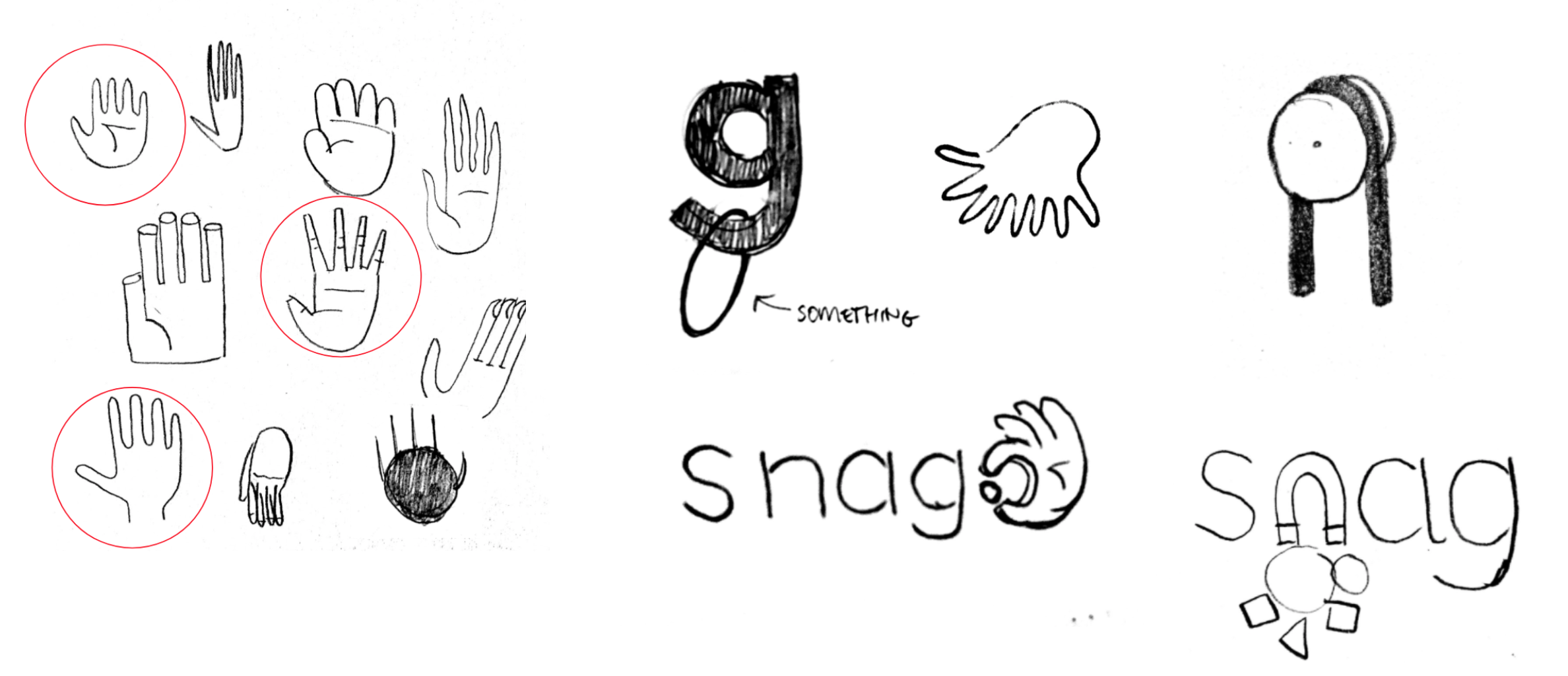
The third was the hand in the logo. (Which I often found myself calling “that fucking hand.”) The hand was a high-risk/high-reward proposition. As I wrote in the prior post, we nearly gave up on it a number of times – the wordmark was strong and could have stood on its own. But, because of its potential, I became stubborn, and insisted we get it right, and threw myself into a design process in a way I hadn’t in a very long time. And it ultimately paid off with an identity that resonates, speaks to the company’s ideals, and sets itself apart from the competition (I mean, come on).

The Design team can lead it

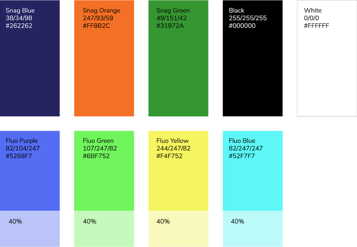
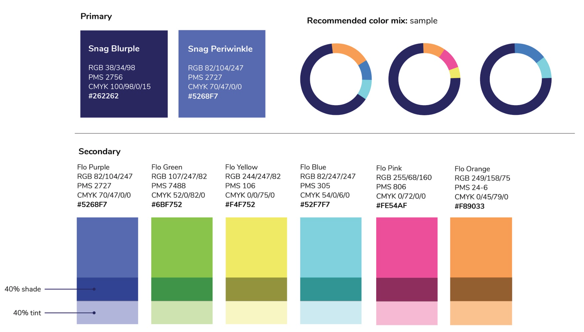
This initiative was atypical in that it was lead by design, not marketing. Marketing was involved in the core team throughout, but I, the VP of Design, was the ranking executive. And my experience suggests it makes more sense for the Design org to be the leaders of a rebrand. Key to making it work is that all design functions are represented in this one organization – this would not have worked nearly as well if there was a marketing design team in marketing, and a product design team in product. This makes design organizationally agnostic, which I think leads to a better outcome. If marketing leads brand, it will adopt a solution that inclines towards the needs of marketing, which may be quite different than the needs of product. Design doesn’t have an agenda the way that marketing, product, or sales does, and that allows design to be even-handed in making decisions that affect the entire organization. Also, naturally, the design team will be responsible for the expression of the brand identity (visual and verbal).

Rebranding Snag, Part 2: Brand Identity

In Part 1, I explained key aspects of developing Snag’s new brand strategy. Elements like our brand personality characteristics (Optimistic, Energetic, Determined, Sincere) and brand positioning (that we lean towards human, not technology, or towards the worker, not the employer), proved foundational for creating a new brand identity.

Choosing a partner

As we did with Great Monday for our brand strategy, I knew we would want an external partner to develop our visual brand identity. Early in my career, I worked at Studio Archetype, and realized that designing brand identities isn’t just a subset of communication or graphic design, but a black art whose top practitioners seem to be wired differently, and so great identity design is much more reliant on talent than it is on process.

To narrow our field of consideration to a manageable set, we focused on boutique firms located in the same cities as our offices (Richmond, VA, Washington, DC, Charleston, SC, and Oakland, CA.) And with this filter, we met with a few firms, including Fuzzco, based in Charleston, lead by the delightful partnership of Josh Nissenboim and Helen Rice.

joshandhelend

Looking over their site, you’ll see a range of beautiful work, from graphic design for Charleston restaurants to identities for tech firm Puppet Labs, and a remarkable collection of all kinds of stuff for Mailchimp.

We used our brand personality to help us make a decision, and chose Fuzzco because we felt they embodied the energy, optimism, and sincerity that we were striving for.

We worked with Fuzzco for about 8 weeks. I won’t rehash the entire process–in the big picture, it was a typical approach of starting very broad, and then week-by-week getting more specific and more polished until we were done. I will highlight key decision points along the way that drove us to the final result.

We Fall in Love with A Concept

One thing Fuzzco does a little differently than many firms is that instead of having an initial round of 3 or 4 moderately polished concepts to choose from, they bring the client into the pencil-sketching part of the process, presenting literally dozens of concepts, and from there, a single concept is chosen to develop.

Here is a selection of 5-10% of the concepts they shared:

concepts

While we were intrigued by using the “g” to snag something, we found ourselves captivated by the hand grabbing the period. It wasn’t because of the obviousness of the hand ‘snagging.’ As my boss, Jocelyn, stated, the hand connected us to our workers, their work, and our company’s humanism.

So, we knew we wanted the hand. But we also know getting it right was going to be a lot of work. There’s a reason there aren’t many logos with hands in them (Allstate is the only one that usually comes to people’s minds). Hands are tricky. They’re complex and busy. They “say” a lot depending on their orientation, placement of fingers, implied movement. They risk being in the “uncanny valley”–if they’re not rendered exactly right, they can feel distressingly unnatural and weird.

I have much more to say about the hand, so much in fact, that it warrants it’s own post. (So stay tuned for part 3!)

Meanwhile, we considered logo typography

Early in our work with them, Fuzzco showed the following screen, and it became the jumping off point for our typography exploration.

fonts
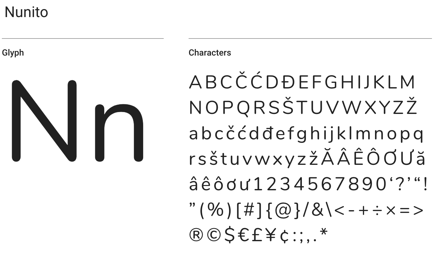
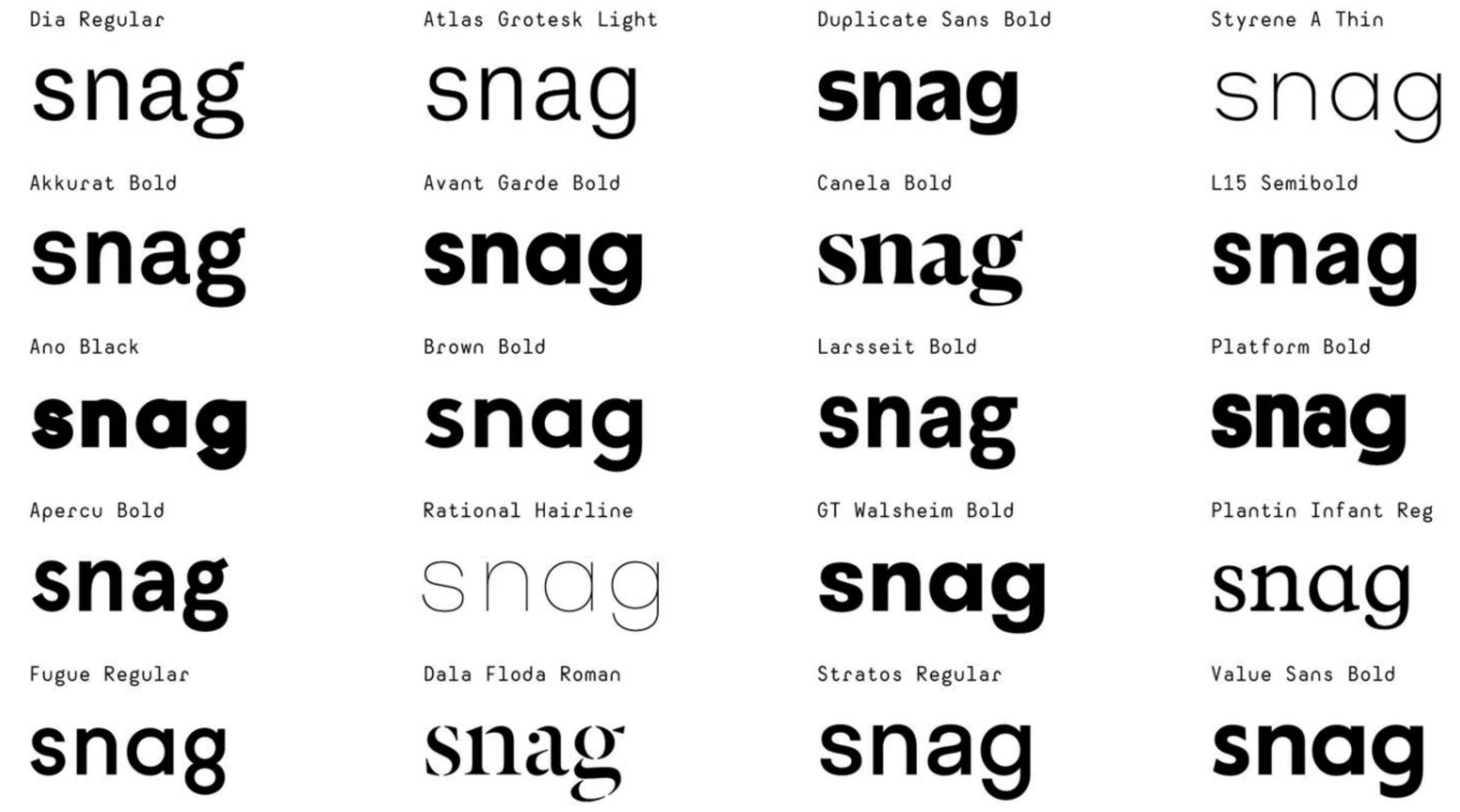
Designers can obsess about type all day long. And we did. With only four letters in the name, each letter takes on remarkable importance. Much of the team leaned towards Avant Garde and its cousins – Brown, Walsheim, Value Sans. The reason was obvious — they were most similar to the existing Snagajob logo.

I got very worked up about the letter g. As the last letter, and one with a descender, I knew it was going to do a lot of work for us. And I found myself leaning towards the “double-story” or “looptail” g, particularly in Dala Floda. It’s just so expressive, and with such great energy and flow.

I wasn’t as excited about the Avant Garde crew – their geometric precision felt contrary to the humanism we were striving for. Perusing the other choices, apart from Dala Floda, I was drawn to Duplicate Sans – it had a funky squashed aspect reminiscent of Cooper Black, but didn’t feel nostalgic or outdated. We showed these typefaces to our CEO, and, to my happy surprise, he also gravitated toward Duplicate. And, as it turned out, Fuzzco were big on Duplicate for us, and that pretty much settled it. In the next round, they shared a bunch of variants, oh, and made official a particular element.

duplicates
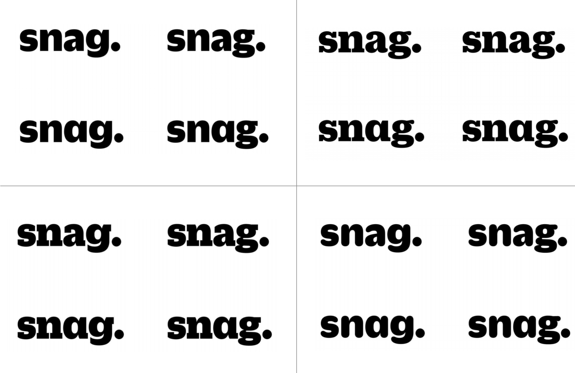
They explored not only type variants, but double-story “a” and “g” versus single. We all stared long and hard at this, and though we dug the slab serifs, the Duplicate Soft Black (lower right hand corner) felt more approachable and on-brand, and within there, we appreciated the tension of the double-story “a” and the single story “g.”
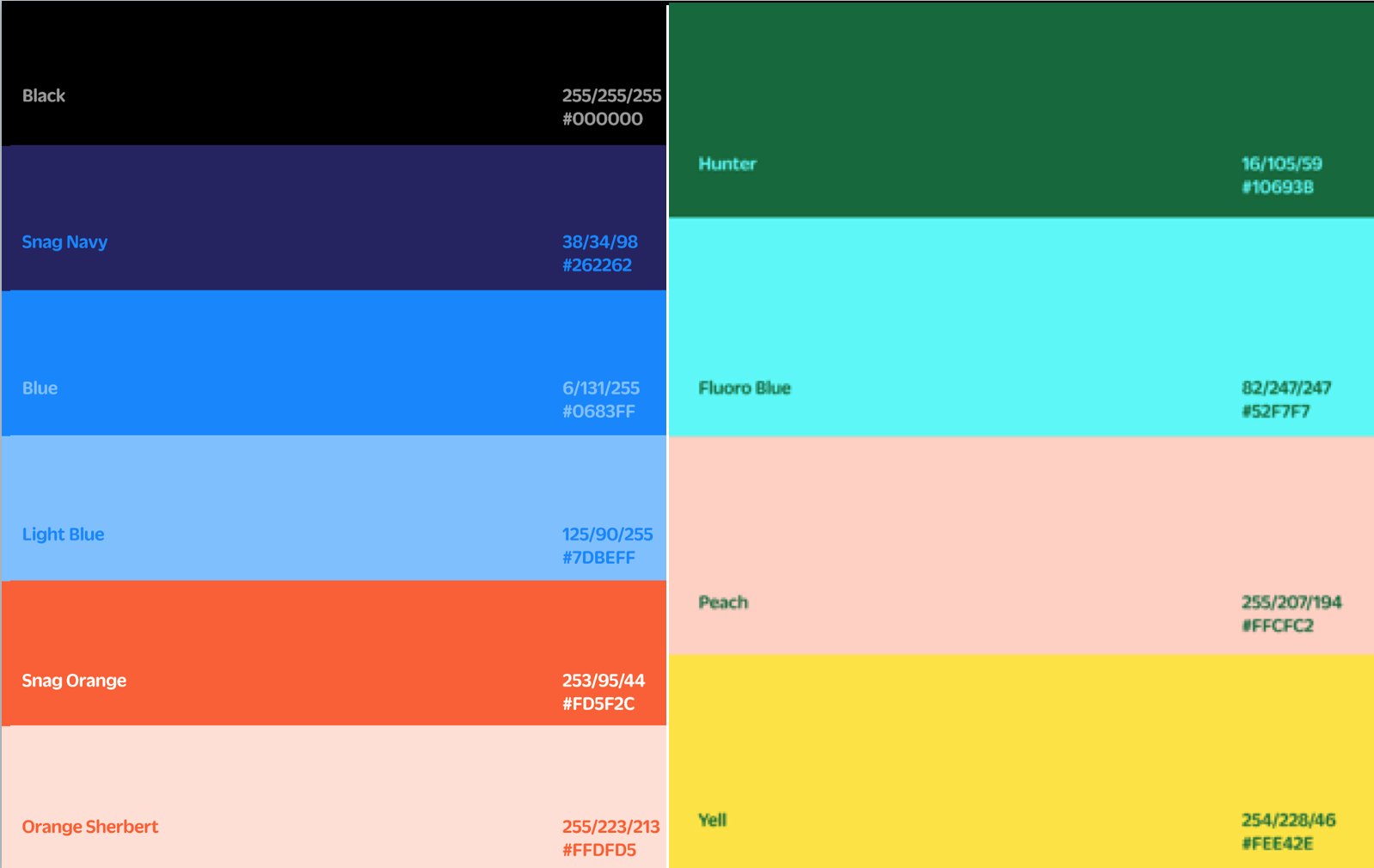
The period looked so natural, that it was never up for debate. It also helped reinforce snag-as-a-verb.

The emotions around color

Early in our brand strategy process, we polled employees about our brand’s characteristics, and along with the expected responses around “passionate,” “friendly,” “fun,” a top response was “orange.”

Orange had been the key brand color from the beginning. And even though the current logo’s orange was only in the ball above the “j”, people held it dear.

As part of any visual identity project, a color palette is developed. Very quickly, Fuzzco settled on a deep navy blue for our base color (it just felt right, and we agreed), and paired it with orange as our primary palette, and then provided a host of bright fluorescent colors as an energetic secondary palette.

earlycolorpalette

The core team found we were gravitating more towards the secondary palette than the primary one. We just liked its energy.

Also, members of my product design team raised accessibility concerns about the colors chosen. This is where I’m grateful for the brilliant people I worked with, because it would have never occurred to me to raise such issues. Contrast is a significant factor in readability for the sight-impaired, and the colors we had didn’t have high enough contrast (Learn more about such matters here.). Our feedback to Fuzzco was to heighten the contrast, lose all those blue variants, and not to worry about “primary” and “secondary”–just give us a palette that worked. After some tinkering, they delivered:

refinedpallete

Orange still has a prominent place, and you’ll see an iteration of the energetic colors, the “Fluo”s.

Fuzzco’s work was done at the end of 2017, and starting at the beginning of this year, we took on an internal program of applying this color palette to all of our interfaces, and some marketing material, to see how it worked. I can’t show those explorations (as I don’t have access to that any more), but what quickly became clear is: orange is a bitch to work with. It simply didn’t play nice with our other colors, except occasionally when there was a single call-to-action, or a subtle highlight. So, even though it had been so core to our visual identity for so long, orange was demoted to the most secondary of colors in the final palette we arrived at, replaced by what became our favorite new color:

final peltte

Our designers absolutely fell for periwinkle. It had just the right context for our deep navy (now renamed Blurple), and became the workhorse color for buttons, links, and other common actions.

Quick thoughts on typography

Along with the typography in the logo, Fuzzco gave us styles for type throughout our marketing and product experience. There’s not much to say, except that though we really liked the initial typography they suggested for us (Duplicate Slab as a display face, Graphik Regular for body), we quickly realized that the web licensing fees for these fonts were prohibitively expensive (an issue I’ve had at every company I’ve worked). We asked them to explore Google fonts as an alternate, and they hit upon Nunito, which isn’t all that common (unlike Open Sans), has a remarkable variety of weights, and echoes the friendly roundness of Duplicate Soft in our logo.

nunito

Hey, what about the logo? And imagery, photography, illustrations, etc.

Getting the logo right is an epic in and of itself, and I realize it warrants its own post, as this one has already gotten too long. So, stay tuned for Part 3!

And there’s more to a visual brand identity than just a logo, type, and colors. We also worked with Fuzzco on developing illustration and photography styles. What I learned in this process is that we needed waaaaay more time and budget than we could afford in our relationship with Fuzzco to get imagery right. In fact, while you’ll see a distinct photo style on Snag’s homepage and Employer Landing Page (we quickly grew to love that pink-to-purple gradient overlay), at the time of our public brand launch on April 4th, we still had a lot of work to do to define our imagery style. I look forward to seeing what the team creates in the coming months!

Rebranding Snag – Part 1, Brand Strategy

The Backstory

Among the strangest aspects of my sudden departure from Snag is that, just a week before, we launched one of the greatest endeavors of my professional life–a top-to-bottom rebrand of the company.

Even before joining Snagajob in January 2017, the possibility of a rebrand was discussed with me. The company had acquired PeopleMatter, an enterprise software company, and had launched a pilot on-demand service, HUSL, and all these brands lead to confusion both in the market and internally. The name “Snagajob” was much too specific to the company’s job board past, had no relevance to employers, and, frankly, was a bit sophomoric and could be hard to take seriously.

So, from the day I started, January 2, 2017, I was the lead executive on rectifying this brand challenge, partnered with Bridget Walsh, our director of communication design. There is some irony to me leading brand, as I’m not really a brand guy. I’m a research-strategy-information architecture-interaction design guy. I am skeptical, even dismissive, of much of the discussion around brand1Never forget, branding is the application of a red hot iron to the hide of livestock..

That said, my first design industry job (1996-1998) was at Studio Archetype, a design firm that grew out of a specialization in identity and communication design to become a pioneer in CD-ROM and web design. And so while skeptical, I appreciate the wizardry of truly gifted brand professionals.

Thankfully, I inherited a big-enough budget to bring on external help to guide us through this. An early realization was that there were two projects here–clarify our brand strategy, and then, based on that, develop a new visual identity.

Choosing a strategy partner

We interviewed a few potential partners for the strategy work, and quickly settled on Great Monday, whose principle, Josh Levine, is an old friend of mine. We chose them because they were clearly smart and capable, pleasingly small (I think there’s only 3 full time staff), located in Oakland (as am I), and, importantly, Josh understood what we needed from him – not just a clever brand strategist, but a charismatic presence who could rally a room of people from across the company, who could speak with authority to our CEO and other executive team members, and who would do all the little things that it takes to see something through that is as fraught and anxiety-inducing as a total reconsideration of company’s brand.

Given that potential for anxiety, and given Snagajob’s size (mid-400s), age (17 years at this point), geographies (4 cities), and company philosophy (heavily mission-driven), Great Monday proposed a measured, thoughtful approach, designed to hand-hold us through every stage and maintain our confidence that we were on the right path. It also meant that it would take 4-5 months. Our executives wanted it sooner and pleaded with me to move faster, but I felt that in order for this to succeed, we needed to do it right – a rebrand isn’t something you get to iterate on in the market.

I won’t delve into every project detail. Suffice to say it included discovery, stakeholder and customer interviews, internal questionnaires, workshops, positioning and story development, brand architecture, and brand personality.

Oh and naming. That I do want to talk about. Before I do, it helps to set up a couple of things.

Brand Workshop Reveals Key Strategic Foundations

About a month and a half into the work, Great Monday hosted a workshop with 20 people pulled from all departments, and from all levels of seniority (though it was admittedly top-heavy).

They lead us through a series of activities, two of which proved crucial in defining our brand. In their discussions with internal stakeholders, the identified a few areas of tension. They placed opposing concepts on a simple single-line spectrum, and had us dot-vote where we thought we currently were, and where we should be. Two of these dominated our discussion:

  1. Were we a ‘tech’ company or a ‘people’ company?
  2. Do we lean more towards the worker or the employer?

The placement of the dots wasn’t nearly as important as the discussion it catalyzed. For the first, the passionate discussion made it clear that we were, and wanted to be perceived as, a ‘people’ company. In fact, we considered it ironic that in a jobs/work space that is so much about people, pretty much no competitor authentically embraced their humanism. The discussion around the second grew quite heated, as employers pay our bills, and many were adamant our brand should preference them. However, Great Monday had spoken to many employers, who expressed general apathy about our brand, saying that our value to them was our ability to appeal to workers. So we decided our brand would be ‘worker first.’

Brand Architecture Forces Focus

After the workshop, the next key decision we made was to settle on a brand architecture. At the time, Snagajob was a somewhat clumsy “house of brands.” The company was named Snagajob, and that name was used in our services that faced our jobseekers and workers. They had acquired PeopleMatter, an applicant-tracking SaaS offering, and kept that name as the brand facing employers. And then there was an innovation team that was developing an on-demand offering, which they branded as HUSL.

We had an opportunity to approach this thoughtfully. Should we keep this individual architecture where you have different brands under a corporate brand (think GM and Buick, Chevrolet, Cadillac); a monolithic architecture where there’s one brand to rule them all, with sub brands underneath (FedEx, and FedEx Ground, FedEx Express, FedEx Office), or a hybrid architecture that features a strong corporate brand, but gives room for subbrands that stand on their own (Marriott with Courtyard by Marriott, Residence Inn, J.W. Marriott, etc.). At our size (450 employees), and in our market (job marketplace, similar to Indeed and LinkedIn), it became quickly clear that monolithic was the way to go. No one else in our space had different names for the worker and employer facing services, and pretty much no marketplace business does. The strength of a marketplace is signaled by having one brand that hosts everybody.

If we’re going to have one name…

With the decision to be a monolithic brand, we then had to come to terms with the matter of the name. The easiest solution would be to call everything Snagajob. It’s how we’d been known for 17 years. The problem was that the name is distinctly worker-facing. Employers might not care, but it felt inappropriate to actively exclude them. But also, the company had evolved beyond jobs, with the most exciting opportunity being in on-demand, helping employers and workers make it easier to offer and pickup shifts. And while “Snagajob” may have felt dot-com appropriate when coined in 2000, by 2017 it came across as clunky and unprofessional.

I found out that, even before I joined the company, the idea of renaming it “Snag” had been floated. It mimicked Snapchat renaming themselves “Snap,” was brief and catchy, and maintained some brand equity while allowing for offerings beyond jobs. However, the word “snag” has primarily negative connotations (hitting a snag, a snag in sweater). Unsure quite how to proceed, we engaged in a naming exercise with Great Monday.

Naming is a bit of a black art. We fed them a bunch of brand names we liked and didn’t like, and the reasons why. We also had our brand positioning and personality characteristics (more on those later). After many days of what I assume was playing with morphemes, paging through dictionaries and thesauruses, and long soaks in the bathtub, they presented us about 20 names to consider, and another 100-plus that had also come up. We went through a few rounds of throwing things away, coming up with new stuff, and eventually had a selection of 3 names that we liked.

(No, I’m not going to share them with you. Maybe over beers.)

The problem is, we couldn’t agree on them. Of the 5 or 6 people on the ‘core team’ for the brand, there was no consensus. And our executive sponsors also didn’t align.  Our CEO pointed out that what we think doesn’t matter nearly as much as what our jobseekers and workers thought, so why don’t we ask them? So we set up one of the quickest bits of research I’ve overseen in my career, talking individually to 12 jobseekers (NO FOCUS GROUPS. EVER.) across the United States about the three names we were considering. Oh, and we threw “Snag” in there as well to see how it compared. We asked them their impressions of the different names, and then we had them rate the names against each of our brand personality traits, as we wanted to make sure that the name spoke to how we wanted to be perceived.

Coming out of the research, jobseekers exhibited a variety of preferences, with no one clear “winner.” But, to our surprise, the name that scored strongest was…Snag. After all that work, it turned out the right name was there the whole time. There were no regrets about the process – we needed to go through that rigamarole to have confidence that Snag could, in fact, work for us.

If you were a tree, what kind of tree would you be?

Going all the way back to the brand workshop, there was another activity that proved key to our brand strategy. And that was having each of us propose a spokesperson for the brand, someone, out in the world, who represents what we felt our brand stood for. People came up with all kinds of answers. I don’t remember them all, but some were America Ferrara, Zendaya, Barack Obama.

For each spokesperson we listed 3 to 4 personality traits that explained why they were a good representative. Across the 20 or so spokespeople, we had 70-some adjectives emerge. After some sorting and categorizing, we arrived at the following groups:

We knew this was too many. And some, like “Human” and “Genuine” have become cliches; even if they are true for you, they’re no longer interesting as brand characteristics, as too many companies claim them. Key to successful brand traits is that they’re a) authentic and b) ownable. To be ownable, it means that no other competitor could claim them. (You also want to avoid traits that are really just table stakes for being in business, like “trustworthy.”) With that mindset, we got it down to:
However, we felt 5 was more than could be readily remembered, so we got out our scalpel, and trimmed it to:

I love these traits. They strongly resonate with Snag’s internal culture. They’re humanistic. They’re candid — “determined” recognizes the toil it takes to succeed. They’re unexpected – “sincere” is surprisingly sentimental for a company (we almost went with “heartfelt” but thought that was a bit too much.)

With the brand strategy, architecture, new name, and new characteristics, we had a strong definition of our new brand. The next step was to figure out how to express that personality, which I will describe when I get around to writing part 2.

(For the sake of verbal expedience, I’m probably not spending enough time highlighting the individuals at Snag who made this all go. Along with Bridget, our core team featured Dane Schwartz, and then in the next concentric circle out was Jason Conrad and Megan Overton. None of this would have happened without the support of my boss, Jocelyn Mangan, or the encouragement of our CEO, Peter Harrison.)