In Part 1, I explained key aspects of developing Snag’s new brand strategy. Elements like our brand personality characteristics (Optimistic, Energetic, Determined, Sincere) and brand positioning (that we lean towards human, not technology, or towards the worker, not the employer), proved foundational for creating a new brand identity.
Choosing a partner
As we did with Great Monday for our brand strategy, I knew we would want an external partner to develop our visual brand identity. Early in my career, I worked at Studio Archetype, and realized that designing brand identities isn’t just a subset of communication or graphic design, but a black art whose top practitioners seem to be wired differently, and so great identity design is much more reliant on talent than it is on process.
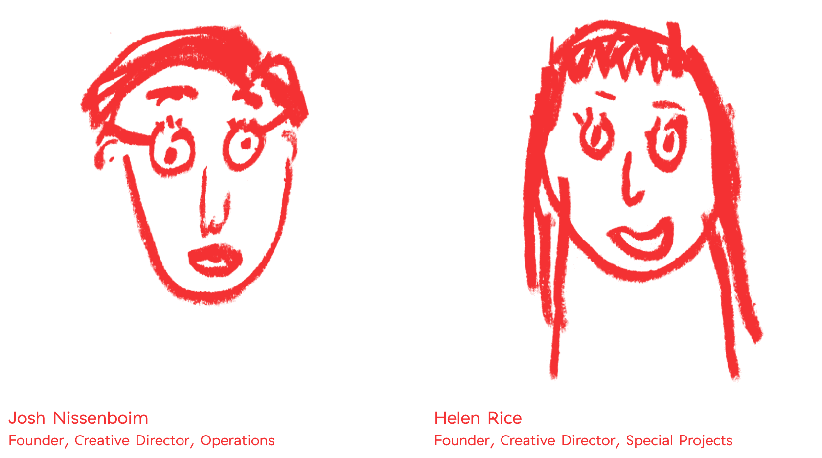
To narrow our field of consideration to a manageable set, we focused on boutique firms located in the same cities as our offices (Richmond, VA, Washington, DC, Charleston, SC, and Oakland, CA.) And with this filter, we met with a few firms, including Fuzzco, based in Charleston, lead by the delightful partnership of Josh Nissenboim and Helen Rice.
Looking over their site, you’ll see a range of beautiful work, from graphic design for Charleston restaurants to identities for tech firm Puppet Labs, and a remarkable collection of all kinds of stuff for Mailchimp.
We used our brand personality to help us make a decision, and chose Fuzzco because we felt they embodied the energy, optimism, and sincerity that we were striving for.
We worked with Fuzzco for about 8 weeks. I won’t rehash the entire process–in the big picture, it was a typical approach of starting very broad, and then week-by-week getting more specific and more polished until we were done. I will highlight key decision points along the way that drove us to the final result.
We Fall in Love with A Concept
One thing Fuzzco does a little differently than many firms is that instead of having an initial round of 3 or 4 moderately polished concepts to choose from, they bring the client into the pencil-sketching part of the process, presenting literally dozens of concepts, and from there, a single concept is chosen to develop.
Here is a selection of 5-10% of the concepts they shared:
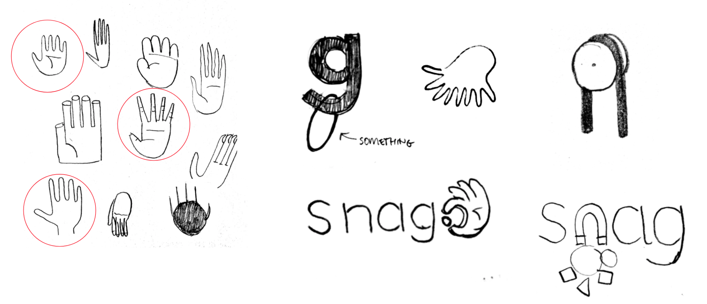
While we were intrigued by using the “g” to snag something, we found ourselves captivated by the hand grabbing the period. It wasn’t because of the obviousness of the hand ‘snagging.’ As my boss, Jocelyn, stated, the hand connected us to our workers, their work, and our company’s humanism.
So, we knew we wanted the hand. But we also know getting it right was going to be a lot of work. There’s a reason there aren’t many logos with hands in them (Allstate is the only one that usually comes to people’s minds). Hands are tricky. They’re complex and busy. They “say” a lot depending on their orientation, placement of fingers, implied movement. They risk being in the “uncanny valley”–if they’re not rendered exactly right, they can feel distressingly unnatural and weird.
I have much more to say about the hand, so much in fact, that it warrants it’s own post. (So stay tuned for part 3!)
Meanwhile, we considered logo typography
Early in our work with them, Fuzzco showed the following screen, and it became the jumping off point for our typography exploration.
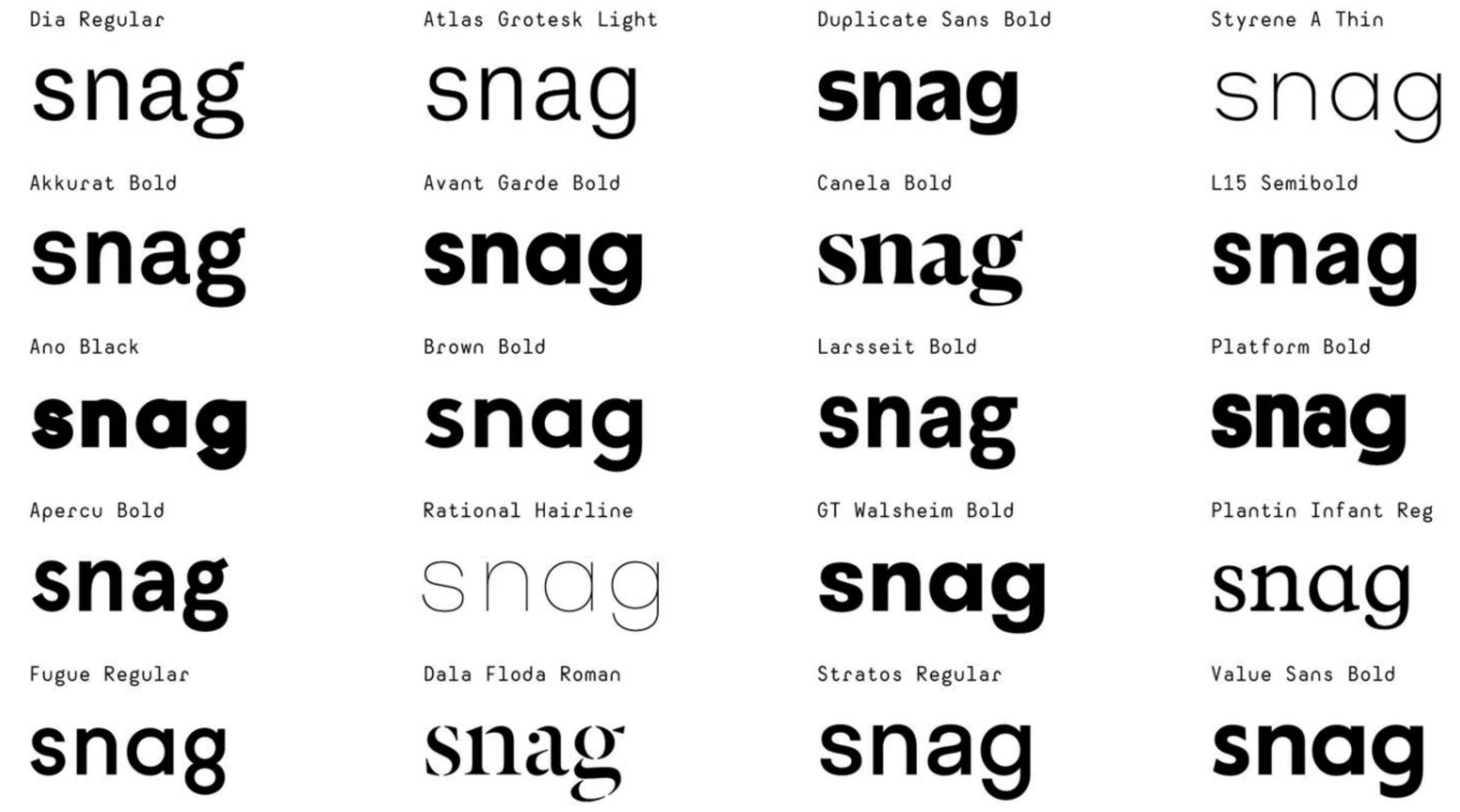 Designers can obsess about type all day long. And we did. With only four letters in the name, each letter takes on remarkable importance. Much of the team leaned towards Avant Garde and its cousins – Brown, Walsheim, Value Sans. The reason was obvious — they were most similar to the existing Snagajob logo.
I got very worked up about the letter g. As the last letter, and one with a descender, I knew it was going to do a lot of work for us. And I found myself leaning towards the “double-story” or “looptail” g, particularly in Dala Floda. It’s just so expressive, and with such great energy and flow.
I wasn’t as excited about the Avant Garde crew – their geometric precision felt contrary to the humanism we were striving for. Perusing the other choices, apart from Dala Floda, I was drawn to Duplicate Sans – it had a funky squashed aspect reminiscent of Cooper Black, but didn’t feel nostalgic or outdated. We showed these typefaces to our CEO, and, to my happy surprise, he also gravitated toward Duplicate. And, as it turned out, Fuzzco were big on Duplicate for us, and that pretty much settled it. In the next round, they shared a bunch of variants, oh, and made official a particular element.
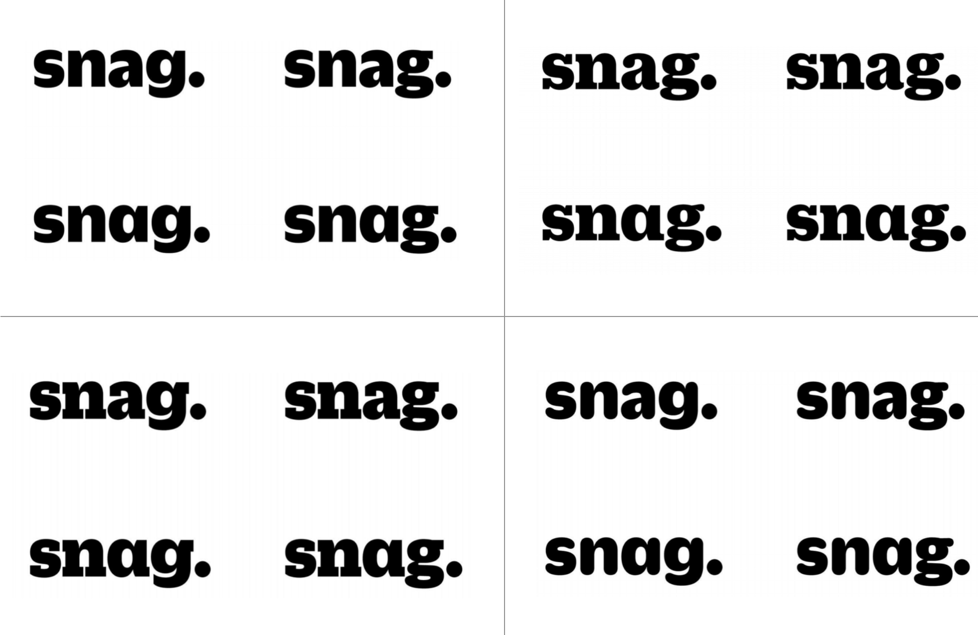 They explored not only type variants, but double-story “a” and “g” versus single. We all stared long and hard at this, and though we dug the slab serifs, the Duplicate Soft Black (lower right hand corner) felt more approachable and on-brand, and within there, we appreciated the tension of the double-story “a” and the single story “g.”
The period looked so natural, that it was never up for debate. It also helped reinforce snag-as-a-verb.
The emotions around color
Early in our brand strategy process, we polled employees about our brand’s characteristics, and along with the expected responses around “passionate,” “friendly,” “fun,” a top response was “orange.”
Orange had been the key brand color from the beginning. And even though the current logo’s orange was only in the ball above the “j”, people held it dear.
As part of any visual identity project, a color palette is developed. Very quickly, Fuzzco settled on a deep navy blue for our base color (it just felt right, and we agreed), and paired it with orange as our primary palette, and then provided a host of bright fluorescent colors as an energetic secondary palette.
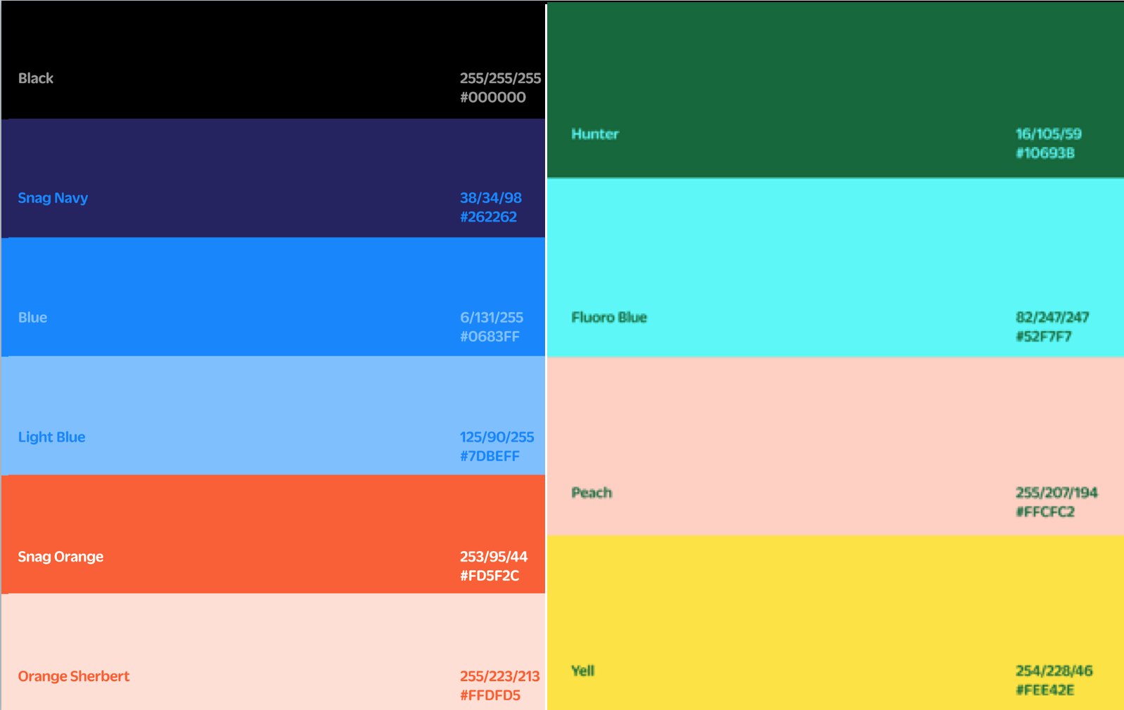
The core team found we were gravitating more towards the secondary palette than the primary one. We just liked its energy.
Also, members of my product design team raised accessibility concerns about the colors chosen. This is where I’m grateful for the brilliant people I worked with, because it would have never occurred to me to raise such issues. Contrast is a significant factor in readability for the sight-impaired, and the colors we had didn’t have high enough contrast (Learn more about such matters here.). Our feedback to Fuzzco was to heighten the contrast, lose all those blue variants, and not to worry about “primary” and “secondary”–just give us a palette that worked. After some tinkering, they delivered:
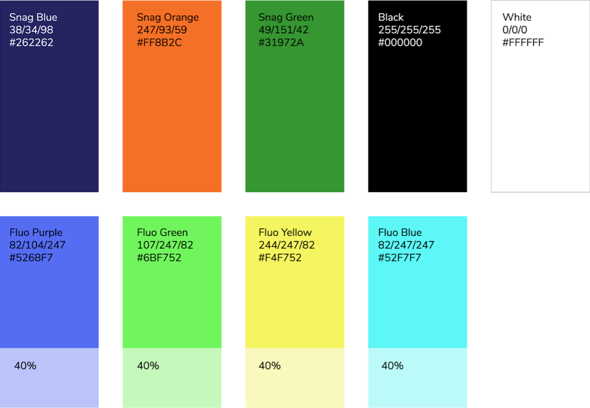
Orange still has a prominent place, and you’ll see an iteration of the energetic colors, the “Fluo”s.
Fuzzco’s work was done at the end of 2017, and starting at the beginning of this year, we took on an internal program of applying this color palette to all of our interfaces, and some marketing material, to see how it worked. I can’t show those explorations (as I don’t have access to that any more), but what quickly became clear is: orange is a bitch to work with. It simply didn’t play nice with our other colors, except occasionally when there was a single call-to-action, or a subtle highlight. So, even though it had been so core to our visual identity for so long, orange was demoted to the most secondary of colors in the final palette we arrived at, replaced by what became our favorite new color:
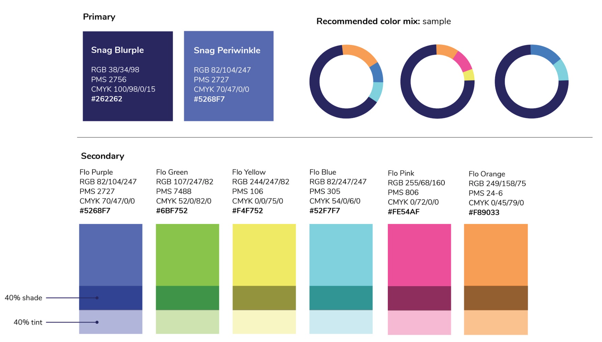
Our designers absolutely fell for periwinkle. It had just the right context for our deep navy (now renamed Blurple), and became the workhorse color for buttons, links, and other common actions.
Quick thoughts on typography
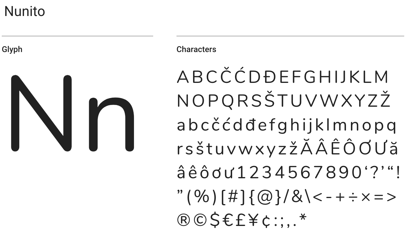
Along with the typography in the logo, Fuzzco gave us styles for type throughout our marketing and product experience. There’s not much to say, except that though we really liked the initial typography they suggested for us (Duplicate Slab as a display face, Graphik Regular for body), we quickly realized that the web licensing fees for these fonts were prohibitively expensive (an issue I’ve had at every company I’ve worked). We asked them to explore Google fonts as an alternate, and they hit upon Nunito, which isn’t all that common (unlike Open Sans), has a remarkable variety of weights, and echoes the friendly roundness of Duplicate Soft in our logo.
Hey, what about the logo? And imagery, photography, illustrations, etc.
Getting the logo right is an epic in and of itself, and I realize it warrants its own post, as this one has already gotten too long. So, stay tuned for Part 3!
And there’s more to a visual brand identity than just a logo, type, and colors. We also worked with Fuzzco on developing illustration and photography styles. What I learned in this process is that we needed waaaaay more time and budget than we could afford in our relationship with Fuzzco to get imagery right. In fact, while you’ll see a distinct photo style on Snag’s homepage and Employer Landing Page (we quickly grew to love that pink-to-purple gradient overlay), at the time of our public brand launch on April 4th, we still had a lot of work to do to define our imagery style. I look forward to seeing what the team creates in the coming months!
One thought on “Rebranding Snag, Part 2: Brand Identity”
Comments are closed.