IDEA Conference Blog


The IDEA conference continues to take shape.

We’ve got a remarkable set of presenters (with a few more slots open).

We’re closing in on the next registration deadline (August 27th).

And we’ve just launched the IDEA Conference blog, where we’ll be posting about the design of complex information spaces, as well as conference news and information. The latest post focuses on the venue, the Central Library of the Seattle Public Library, and how information went into its design.

“The Descent” of film critics’ taste

I love a good horror movie. But I haven’t seen one recently, because the parallel trends of sadism (Saw, Hostel) or Japanese surrealism (The Ring, The Grudge) don’t interest me. I like my horror to have a story, some cleverness, and good thrills.

Last night, a bunch of guys went to see The Descent. It’s a horror film about 6 woman cave-diving. I was encouraged to see it in part by the mostly favorable reviews collected at Metacritic. I’ve learned not to put much stock in film critics’ opinions, but my triangulation of their thoughts lead me to believe that there was hope.

That hope was misplaced.

The Descent isn’t a bad movie, but, it’s a surprisingly boring one. There is no plot, so there’s nothing to really get you involved in what’s happening on screen. The bulk of the thrills are shocks and startles, which also doesn’t really get you involved. The film is little more than a ride, and, like rides at theme parks, doesn’t really go anywhere.

What I realized is that, in these bleak cinematic times, critics are so desperate for anything that doesn’t outright suck that they will laud the mediocre, because it shines by comparison. Which is sad.

No wonder box office take is down. Particularly when we have DVD access to truly great horror such as Alien, Nightmare on Elm Street, The Exorcist, Halloween, An American Werewolf in London, The Changeling, and more.

You know a horror film is pretty weak when you have no interest at all in the human characters, but find yourself curious about the society of the “Crawlers”, the subhuman cave-dwellers who serve as the enemy of the film. Are they hierarchical? What is the family dynamic? Courtship and mating rituals? How do they communicate? Anyway.

Microsoft R&D – So what?

I’m a little late to the party on this one, but last week, Paul Kedrosky pointed to this chart presented by Microsoft touting their R&D spend, seemingly as a way to say “we’re more serious about this stuff than Google.”

As Paul, and his commenters, point out, spending R&D money isn’t the same as producing results. I wrote about this in February 2004, where I called into question the value of R&D in interaction design. Over two years later, and it still stands — innovation is occurring in places with almost no official R&D spend (particularly in this Ajax epoch).

Remember this name: Aaron Koblin

This afternoon I attended the Yahoo Design Expo, a collection of projects from students engaged in new media/media arts/interaction design at various universities.

Most of the exhibits were interesting, but only one presenter really shone through as One to Watch: Aaron Koblin. A student at UCLA, he showed two works that demonstrated amazing promise:


The Sheep Market – exploiting Amazon’s Mechanical Turk, he collected 10,000 drawings of “sheep facing left.” It’s silly, weird, and brilliant.


Flight Patterns – using FAA data about a single day’s set of flights, Aaron generated a visualization of airplane movement that is reminiscent of Stamen’s Cabspotting — though on a much larger scale.

Make sure to download the large Quicktime movie, “Overview Documentation”. So good.

Completed my conversation with Michael Bierut

You can read the third (and final) part of my conversation with Michael Bierut on the Adaptive Path site. It’s a nice little capper of our discussion.

You’ll also see a teaser from Michael on what he plans on discussing at User Experience Week. And, if you didn’t know already, you can buy single-day passes to UX Week, so if you just want to see Michael (or you just want to see Steven Johnson, or Jeffrey Veen), you can do that. Just don’t forget to use promotional code FOPM to get 15% off.

Tufte’s Beautiful Evidence, Chapter 3: Links and Causal Arrows: Ambiguity in Action

Welcome to my thoughts on chapter 3 of Tufte’s Beautiful Evidence. If you haven’t yet, you can read what I thought of Chapters 1 and 2.

As an information architect and interaction designer, I’ve had my share of trafficking in boxes and arrows — diagrams of schemes, systems, processes, and flows, commonly depicted as elements connected through lines. So it was with great anticipation that I approached the third chapter, which begins with this diagram:

The chapter gets off to a good start, with this informative diagram, and Tufte serves the reader well in his assessment of its strengths and weaknesses. The primary thrust of this chapter is that linking elements in diagrams, typically represented as lines or arrows, are too often ambiguous in meaning; or, even worse, different links in a diagram, which might appear identical, might have different meaning (i.e., one line might mean “influenced by” as you see in the diagram above, while another line might mean simply “related to”, etc. etc.)

The chapter starts losing focus when showcasing Ad Reinhardt’s brilliant cartoon “How to Look at Modern Art in America.” In part because, though a fun illustration, the cartoon has very little to do with the thrust of Tufte’s thesis. Also, because I think Tufte takes the drawing too seriously, seeing it as a weighty condemnation of certain art practices. I find it hard to discern Reinhardt’s specific point of view, but in some ways that doesn’t matter. It’s a cartoon. Enjoy it as such.

The Mark Lombardi drawing brings Tufte back on focus, but sadly he spends only half a page on his work. Yet Lombardi, and the influence he draws from, the sociogram, showcase an essential expression of the link and causal arrow — how people are connected to one another through various relationships. (Also think: family trees, or, if you want to get more involved, anthropological kinship diagrams.)

Such diagrams are pretty easy for people to appreciate, yet Tufte doesn’t use these kinds of diagrams to dig into his analysis. Instead, he goes on about cladograms (which depict evolutionary development), Feynman diagrams, and Italian drawings from the 15th and 16th Century. It’s as if he’s purposefully obfuscatory — perhaps with some desire to deonstrate his breadth? I mean, the horsey made all up of annotated lines is, frankly, a useless illustration. And yet it gets two full pages devoted to it.

The one exception to this is the diagram depicting the spread of SARS, which Tufte rightly displays as an exemplar, even though it’s “design” is *extremely* basic.

I found this chapter to be perhaps the most disappointing so far, because it’s a subject so close to my interests. Whether website architecture diagrams, social network diagrams, or conceptual models like mind maps, boxes and circles connected by various lines is a fundamental tool in the strategic designer’s box.

Thinking of links and causal arrows brings me to a conceptual model Jesse and I developed for a client, a bank. Here is one small section of the model (which has links to other parts that you’ll just have to ignore).

Thematic Model

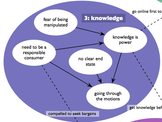
We called this the thematic model, because it addressed themes that emerged from our user research observations. What for me was interesting about this bubble was the story it told:

People, when acquiring financial products and services (like checking accounts, loans, etc.), have a fear of being manipulated. That leads them to seek knowledge, because knowledge is power. They also have a sense of what it means to be a responsible consumer, which means to compare options across providers. The thing is, these folks were unable to articulate an end state (the precise product and service, with its fees, percentages, etc.), and when you combined these three concepts, you ended up with someone who, when shopping for financial products, just goes through the motions.

Now, what Tufte would point out, and I think he’d be right, is that our arrows are woefully ambiguous. The drawing requires explanation — it is in no way self-evident, and a legend wouldn’t help, because all the lines look the same. BUT, and I think this is important, I can think of no more a compact way of presenting this finding of ours, and I think the visual does compel.

Anyway, Tufte really only scratches the surface of the discussion here, getting distracted by diagrams either too technical or too archaic to be of general use. Maybe Dan’s book can help those us needing more applicable examples?

Why Joel Kotkin is Full of It

Joel Kotkin is an urban theorist who loves to flout urban conventional wisdom by supporting suburbs and the rise of new cities like Phoenix.

His primary argument seems to be, “If people want to move there, Why not let them?”

And a good reason to at least call into question this flight of people to places like Phoenix is because the growth of cities in the middle of nowhere is that it can have a deleterious effect on the environment, as this Chronicle article illustrates.

The article discusses a housing boom in California’s Central Valley because land is cheap. However, developing in these hot inland regions means developing under the assumption that people will be living air-conditioned lives, which is an enormous contributor to energy consumption. And, thus, a contributor both or our rolling blackouts, and to the greenhouse gases that are causing global warming.

Joel doesn’t seem to care about these second and third order effects, which has always upset me. Residents of these towns should be taxed in ways that reflect the true cost of their living there… Then we’ll see just how quickly they flock there.

Those taxes wouldn’t just address issues like energy consumption, but health as well — residents of a hot inland city are bound to be more sedentary (who wants to go out in that heat?) and thus have all kinds of medical concerns.

It’s not just a matter of giving people what they want. It never is. People living in the Central Valley, or places like Phoenix, are an enormous drain, requiring more energy, greater fossil fuel consumption to supply them with resources, water needing to be brought in from ever-farther distances, etc. etc. And the problems that arise from this drain are not located only in those cities, but shared with everyone. Shouldn’t residents of those cities contribute more to offset the harm they’re causing?

Fujita-san

Stacy, because this is the kind of thing she does, has been digging into the history of the house in which we live. Among the things we’ve found out is that it was built in 1905, and has the identical floor plan, albeit in mirror image, to the house right next door.

A couple days ago she came to me with a print out of this database record. It turns out the subject of that record, Santaro Fujita, lived in our house in 1942 (though we don’t know if he rented or owned.)

What will sadly not surprise you, if you connect a Japanese name and the year 1942, is that the record is evidence of his relocation that year to the Central Utah Relocation Center, but not before being housed at the race track in Tanforan (San Bruno, California). As in, horse stalls converted to barracks. (You can download a Powerpoint presentation featuring photos of Tanforan.)

Look again at that record. That such a reductive, factual presentation of data can stir up such sadness is a bit shocking. Fujita-san was no recent emigre. At the time of his relocation, he was nearly 60 years old, having lived in the United States over 40 years. The idea that our government considered him in any way a threat is dismaying to a remarkable degree.

Fujita-san was married to Toyo. She was relocated along with him. She was ten years younger, and had been in America for under 30 years.

I’m having trouble uncovering much on the Japanese community in Berkeley before World War II, but there’s some mention of the relocation situation in Chapter 7 of Berkeley, A City in History.

Though deeply saddening, I must say I’m looking forward to what else Stacy uncovers that allows me to connect my current situation with that of the past.

[[I forgot in my original posting to add this. The Social Security Death Index shows that Santaro Fujita lived to be 90 years old, dying in Los Gatos, CA.]]