Way back in 1997 or so, web designers explored the possibilities that frames gave for cutting up portions of the screen. One of the unfortunate results of these explorations was the info-slit, a little window for scrolling text, usually four lines high. Info-slits are a pain in the ass to use, as they often deliver a full page of content four lines at a time.
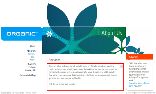
Well, it’s now 2008, and people who should know better continue to use the info-slit. The culprit this time is Flash, and designers who want everything to fit on a single screen. Perhaps the most shameful example I’ve seen of late comes from Organic, an interactive marketing agency that really really should know better (info-slit highlighted in red rectangle):
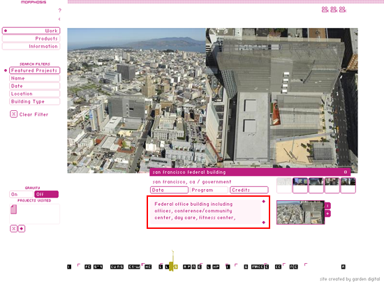
And architecture firms are notorious disasters when it comes to web presences, and Morphosis is no exception:
Dear designers: STOP TRYING TO CONTROL EVERY DAMN THING. It just don’t work on the Web.
I second that. I feel like I’m peeking through a keyhole trying to read their content. Plus, this egregious usability error is often combined with another egregious usability error: non-standard scroll bars that don’t look like scroll bars (as shown above). Or, even worse, no scroll bar and just little scroll buttons (also shown above).
From my view, simplicity is still the best. Squeezing everything into a 800×600 browser is as good as looking for a needle in the open sea.
As a matter of fact, designer should advise their client by providing appropriate and sleek design BUT it will never be them at fault if clients die die wants that type of funny design.
This can be also a classical consequence of Powerpoint Prototyping combined with Scroll Panic… which doesn’t come only from designers, but from business people. “Web design is Web Design”.
The Morphosis site rocks!
In a world (wide web) of increasingly bland web sites, with the pervading concept of the web as ‘page’, The Morphosis stands out as a rich, layered, ‘spatial’ experience, as close to an online manifestation of the architectural ideas of the practice as you’ll find.
Sure it could be easier to use, and read, but that’s not the point. That it requires some effort to understand and interact with it ultimately leads to a more engaging experience.
Ease of use and legibility may be overused concepts in web design. Did James Joyce write Ulysses to be easy to read? Did Malevich paint his Suprematist works so that everyone would instantly understand them? Does David Lynch make films with only one possible interpretation?
Why do we always expect such transparency in web design?