(In the prior blog post, I detailed key elements of Snag’s brand identity, including typography, the color palette, and the initial concepts for the logo. I realized the logo was a beast worthy of its own post.)
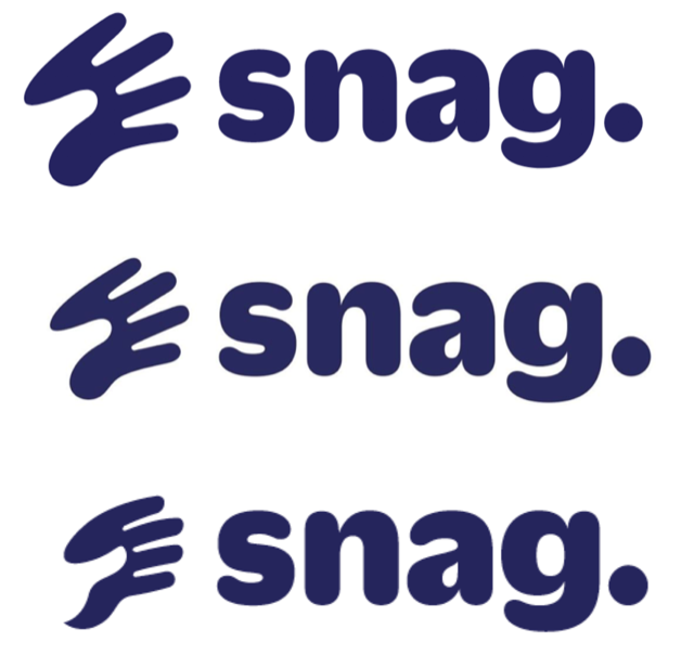
To refresh where we were with the logo, we had settled on a typeface for the wordmark, Duplicate Soft Black, that the wordmark would end with a period:
We also knew we wanted a snagging hand, in part to reinforce our specific meaning, and also to represent humanism and connect with the work our audience does.
Fuzzco shared with us initial ideas:
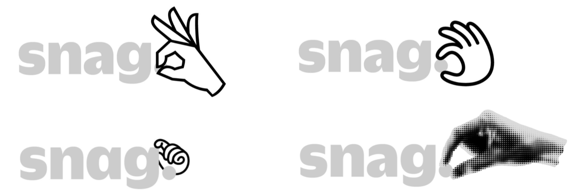
Along with a crapton of sketches from their own hand studies
And this lead to three directions:
The middle one we excluded immediately. We dug the squiggly playfulness of the first one, but felt that it wouldn’t scale to small sizes well. So we preferred the graphic clarity of the last one, and how it grabbed the “s” instead of the period. We felt the hand, grabbing the “s”, could work as an icon for applications such as apptiles.
Though, for all its simplicity, we felt it was still too busy — movement lines, fingernails, shading – and could get murky at small sizes. Fuzzco created a matrix of variants of details and shading:
Which lead us to this:
And, we thought we were done. A handsome mark, legible, playful, and iconic.
(Narrator: They weren’t done.)
Showing the logo around, we initially got good, though maybe slightly puzzled feedback. It is a strange logo, but we were fine with that. However, another concern emerged, one that we couldn’t ignore. While those of us who had been active throughout the process didn’t see this at first, when we showed the logo internally, a number of folks felt that the hand on the “s” made it harder to read the name. And that was a dealbreaker–as a bit of an upstart wanting to make our mark, clarity was paramount. So we (well Fuzzco) went back to the drawing board.
I provided them with a brief set of requirements for the hand:
- it had to be iconic
- it couldn’t obscure the name “snag” in any way
- it read at small sizes
- it reflected the energy and determination in our brand
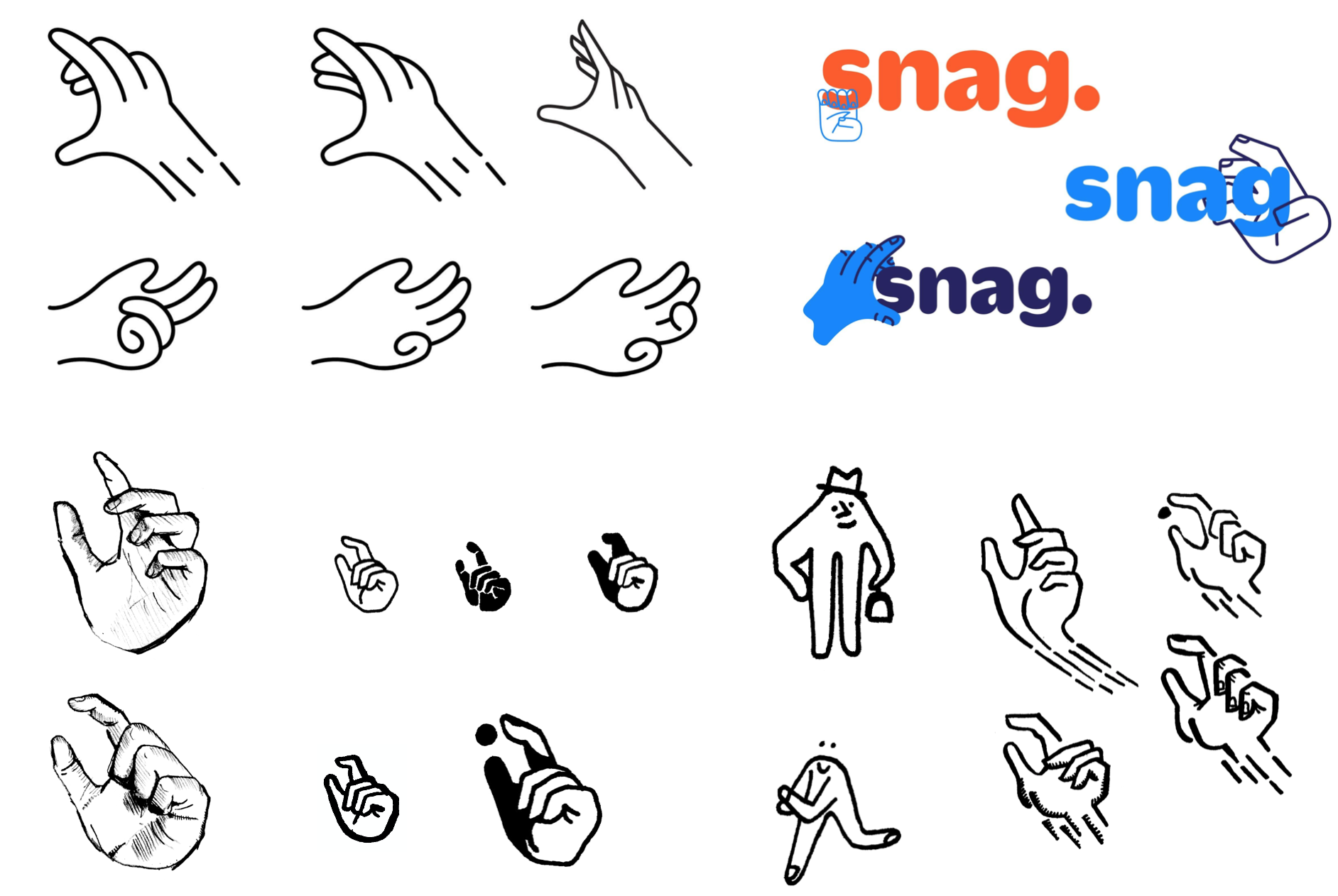
With that, they came back with a solution that checked all the boxes:
We knew it wasn’t quite right, but we dug the direction. The circle gave the hand a “thinginess” we liked, ideally suited for an apptile. We worked with Fuzzco on literally dozens of iterations, often working in realtime – they’d share a direction, we’d provide feedback, they’d adjust and turn it around immediately. Here’s some of that evolution:
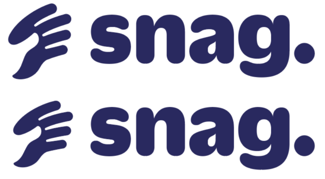
That lead to our final logo:

This mark was done just as we were wrapping up our time with Fuzzco, and we were thrilled to have something landed on something we loved. At a standing meeting of leaders from throughout the company, I shared the new identity.
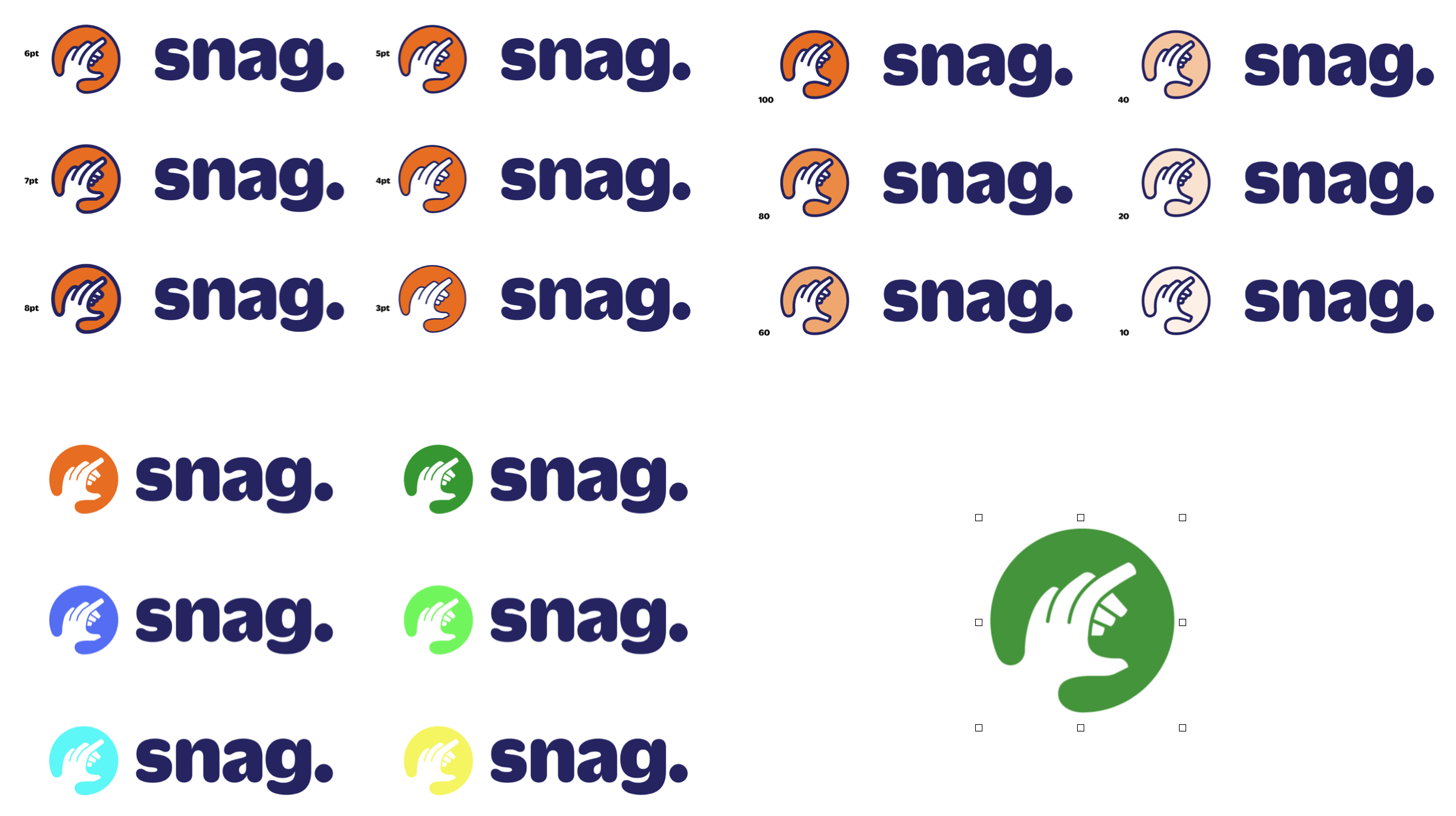
I explained how the orange in the circle connected us with our current logo. How the hand spoke to our humanity, and its action reinforced our name. That the uniqueness of the hand in our logo helped us stand out among our competitors, and that it would be a strong icon for an apptile or favicon.
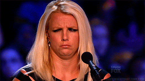
I believed in the logo, and did my best to sell it. But they weren’t buying. People clearly had a visceral reaction to it, and it wasn’t positive. It was bit more like:
All the rationalizing in the world wasn’t going to turn this around.
So, I had three options.
- Ignore the haters and push forward with the new logo, on the basis that as people became familiar with it, they’d come around, as we on the core team had.
- Drop the hand altogether. While folks didn’t like the hand, they did like the typeface, the color palette, and other elements of the identity.
- Go back to the drawing board (again).
We were coming up on the end of the year, right before winter holiday break. We were targeting a launch in three months. And we had a number of elements that definitely worked. I pulled up with Bridget Walsh, the head of communication design and my companion throughout this whole process, and said, “We can’t lose the hand. It means too much to us. But we can’t use this hand. Seeing the team’s reaction tells me it’s just not working. We have some time. When we get back from the holiday break, our focus has to be solving this hand.”
We bring on an illustrator
Even before this all went down, we had planned to work with an illustrator (Douglas Fuchs) to help us develop and build out our house illustration style. With this SNAFU, we shifted gears, and had our illustrator help us with the hand.
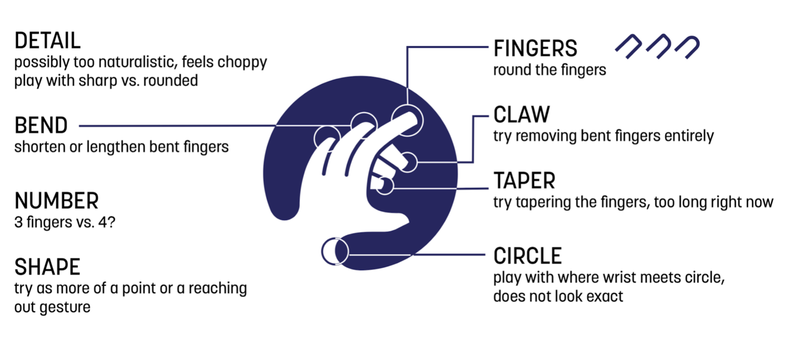
His first step was to map out all of our concerns with the hand.
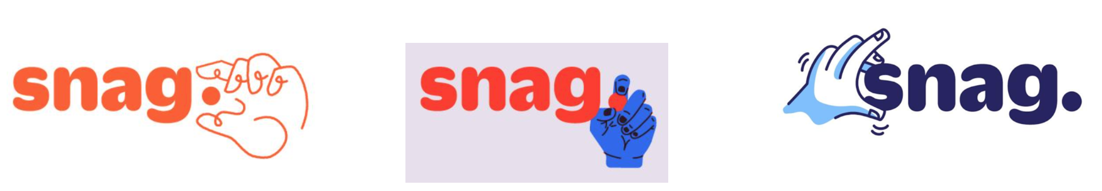
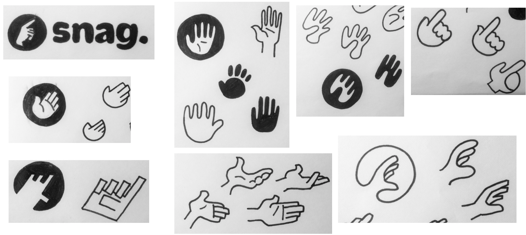
From there, he produced dozens of sketches, a small sample of which are:
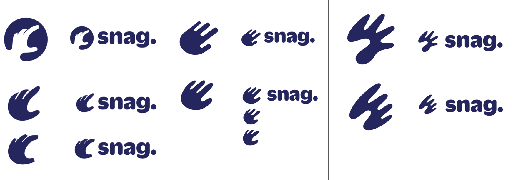
Three directions appealed to us, an evolution of our current hand, and two new ones:
We quickly oriented hard on the right-most one, the “negative space” hand (called that because the thumb is created with negative space). We like the visual play, the evocation of depth, the energy of the reach.
Negative space went through rapid rounds of iteration. The initial rendering had a strong graphic quality and good energy, but was too abstract (we labelled it “Calderesque”) to reliably read as a hand. So subsequent rounds moved towards something more natural:
While the last one was clearly a hand, the sheer aesthetics weren’t working for us. We had a crisis of direction, conducted a two-hour “handsploration” internally, and that new thinking lead to two new ideas for consideration:

The graphic qualities of the new directions intrigued, but we felt they were too abstract, too hard to read as a “hand.”
We got very close to giving up. By this time, we had been producing material (sales sheets, web site landing pages) with just the wordmark, and it worked well. We felt like we were banging our head against a wall.
We get out of our heads, and into our audience’s
At this point in the process, we realized we couldn’t really “see” the logo any more. We were too close to it. Borrowing a page from our naming exploration, we quickly found 10 or so workers and jobseekers to gauge their reaction: Do they recognize the image as a hand? What do they think the hand is doing? What sentiments do they associate with it? Do they like how it looks? How does it compare with a simple wordmark?
The first thing we did was show them the drawing for just a couple seconds, and we were gratified that they realized the negative space drawing as a hand, and some even saw that it was reaching. They associated it with helpfulness and care. And while they may not have loved the specific rendering of the hand, they uniformly preferred the logo having an image, especially for use as an apptile, than a simple wordmark.
These results encouraged us to soldier on. We still had some time before we needed to make our finalfinal decision. We sweated every last detail. I felt that if we just worked and worked and worked it, we could uncover a depiction that satisfied us.
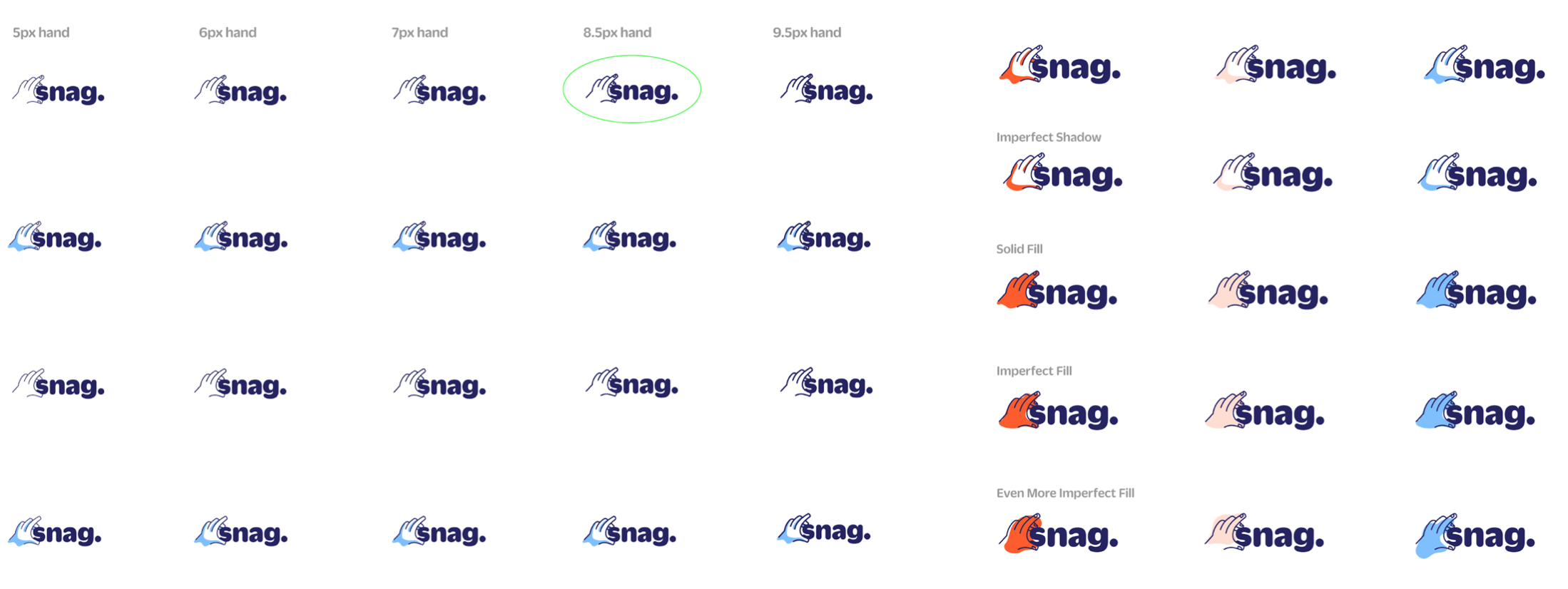
Bridget and I engaged in a highly detailed back and forth. She’d share a drawing, I’d plop it into Google docs, and call out minute details, focusing on stuff that was working great, or not at all. It took a number of iterations:
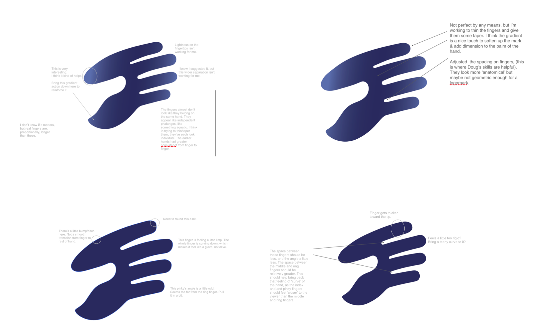
When we got it to a point that just felt right, we handed it back to the illustrator to provide polish:
And after the minutest of adjustments (shortening a finger, extending the palm, a subtle rotation) we arrived at our destination:

Whew. I was thrilled. Not just because we were done after months of trial, refinement, and doubt. But because we got to a mark that truly embodied our brand personality, connected with our humanism, warranted a double-take, reinforced our new name, could standalone as an icon, and ‘felt’ right from a purely aesthetic sense.
In Part 4, I’ll wrap this up with some overall reflections and lessons learned.