Ethnoclassification and vernacular vocabularies

The latest meme to catch fire in the IA community deals with the folk classification tools found on systems like del.icio.us and Flickr. Users are able to freely tag content with whatever metadata comes to mind.

Headshift provides a good overview of the issues at hand, and Alex does his thing when making sure we appreciate the good and the bad of such approaches.

I just IMed with Victor about this for a while, and thought I’d chime in with my perspective.

I touched on this topic almost three years ago in a post titled “Vernacular Thesauri,” based on a talk I saw at the 2001 ASIS Annual. Go read it. It’s about porn.

Okay, you back?

First off, I think we should drop the term “folksonomy.” No offense to Thomas — it’s a catchy term, which, I guess, is why it has caught on. It’s also inaccurate. What bugs me most is the use of the word “taxonomy.” Taxonomies tend toward hierarchy, and they tend to be imposed. Tagging does not a taxonomy make.

What we’re talking about here is “classification.” In rooting around, trying to find some prior research on this topic, I plugged “folk classification” into Google, it turns out that anthropologists have done some thinking around this, particularly with respect to ethnobiology, or how the folk approach biology, and ethnoscience.

This lead me to think that the appropriate term would be “ethnoclassification”, and when I plugged that into Google, I found “Slouching Toward Infrastructure”, a page for a 1996 Digital Libraries Workshop lead by Susan Leigh Star.

The practice of tagging on del.icio.us works because, at its heart, it’s meant for the use of the individual doing the tagging. The fact that it contributes to the group is a happy by-product… But as a tool for group tagging, it’s woefully insufficient. Del.icio.us has a very low findability quotient. It’s great for serendipity and browsing, and an utter disaster for anything targeted.

This is where Alex’s quest for a middle ground resonates with me. Being as wedded to the practical as I am, I wonder how we could put such ethnoclassifications to work in useful contexts. I’m thinking maybe an intranet, where people are free to tag documents as they see fit, but there is some librarian/IA role that attempts to provide some degree of robustness to such a scattered classification. If nothing else, this approach would be a boon to developing thesauri, particularly variant terms.
Organizational Lessons from Burning Man – Spreading Memes

Chatting with some friends who have been going to Burning Man for years, we marveled at how, even with it’s astonishing growth, the event has been able to retain it’s essence year after year. It’s remarkable that, while the experience necessarily changed (25,000 people is just too different from 250), the spirit, and what draws people to it, has stuck around. Yes a few jaded folks dismiss the more recent instantiations, but that’s little more than old-timers pining for long-lost glory days.

Anyway, in our discussions, it became clear that, among the things it has done very right, Burning Man has a small set of core principles that are easy to communicate:

– No spectators
– No commerce
– Leave no trace
(there are probably others, these are what sprung to mind).

Such simple and clear memes are easy to spread, and won’t mutate. Additionally, they’re pithy, unambiguous, and directive. They thus support dissemination to a wide audience, and can effectively prepare first-timers for what is expected of them. Any growing organization can learn from this example.

People Are The Same The World Over

I’ve just completed the first section of Lawrence Weschler’s delightful collection of essays, Vermeer in Bosnia. One essay, “Aristotle in Belgrade”, follows protests in the face of rigged elections. He describes the Serbian political mindset as being able to support seeming opposites — “they could simultaneously feel that their neighbors were affording them no threat and exult at a visiting demagogue’s promise that he wasn’t going to let those neighbors ‘beat you anymore,'”” — and of not being cognizant of consequences — “They saw no problem in roundly despising a leader and simultaneously planning to vote for him.”

Weschler explains the origin of such puzzling thought as “state propoganda, [which] had blithely spewed forth all manner of contradictory positions simultaneously.” His tone, however, is a bit condescending — as if it’s a Serbian problem that he just cannot understand.

I read that passage the day I read Louis Menand’s piece in the latest New Yorker, “The Unpolitical Animal.” It’s a roundly depressing piece, filled with evidence that people make political decisions without the slightest concern for ideology, issues, and consequence. I’ll quote the passage that connected me to Weschler’s work:

Repeal [of the estate tax, which effects the wealthiest two percent of the populations] is supported by sixty-six per cent of people who believe that the income gap between the richest and the poorest Americans has increased in recent decades, and that this is a bad thing. And it’s supported by sixty-eight per cent of people who say that the rich pay too little in taxes. Most Americans simply do not make a connection between tax policy and the over-all economic condition of the country.

Americans are, clearly, just as contradictory as Weschler’s Serbs. I suspect Weschler’s condescension toward the Serbian mindset has likely lifted, given an editorial he penned for the LA Times, “He’s The Picture of Racial Compassion,” about how President Bush employs photos of himself with black people in an attempt to demonstrate his “compassion” toward them, though his policies have only served to hurt them.

Weschler is the head of the New York Institute for the Humanities at NYU, though it’s not clear that the institute actually does anything.

He’s also trying to get a magazine titled Omnivore off the ground.

And the Globe and Mail has a decent interview with Weschler.

Jumping through hoops

A while back I posted about how product designs are getting too difficult, and how the greater the number of steps it takes for someone to set up a product, or to use a service, the less successful they will be. In it, I mentioned the Six Sigma concept of Rolled Throughput Yield: “the probability of being able to pass a unit of product or service through the entire process defect-free.”

Let’s say you have a website, and a registration process that takes four steps. Each step is pretty well-designed– 90% of users are able to complete each step. However, only 65% of people will actually make it through, because you’re losing people every step of the way (.9 x 4 = .65). The shows that often the best way to address the problem is not to improve the individual elements, but to remove elements altogether.

More recently, I wrote about how hard it is for organizations to produce well-designed products, because in order for a good design get out in the world, it has to run jump through a set of departmental hoops — be approved by the business owners, marketers, designers, engineers, manufacturers, etc. etc. At each step, the project can be stalled. Or so many people have to be pleased, products are “designed by committee” – not a recipe for innovation.

This struck me as a kind of organizational variant to Rolled Throughput Yield. Particularly because we’ve seen that the organizations that do support innovative design have smaller, multi-disciplinary teams, not departmental stovepipes. It also struck me that these are two sides of the same coin. The complexity of product from the first example is often a result of the complexity of organizations in the second — design by committee, or some form of serial design process, leads to products with too many discrete parts and interfaces, which are essentially invitations for something to go wrong.

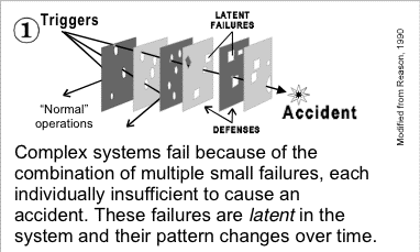
Separately, on a bit of a Googlewander, I came across David Woods, who, among other things, has written about “human error.”In reading some papers he wrote on the topic, I came across this diagram:
error
Taken from here (PDF), which is meant to be read in conjunction with this (PDF).

(I’ve been meaning to read more of David’s stuff for a while. I think the study of “human error” can be an insightful perspective for user-centered design.)

The challenge, of course, seems to be to manage complexity. Complexity seems to be a given. Is it? Is increasing complexity inevitable? Occasionally products emerge that massively reduce complexity (at least, complexity of use), and are popular — the original Palm (compared to earlier pen-based computing) and Google come to mind. Maybe the iPod (I don’t know how it stacks up to other music players from a complexity standpoint).

I’ve Got The United States Ranked 30th In Olympics Medal Count

Typically, we see medal counts ranking countries by raw medal numbers. Something like this, where the total score is derived by having the Gold worth 3, Silver worth 2, and Bronze worth 1. (This isn’t a complete count — I got sick of cleaning tabular data.)

Country Gold Silver Bronze "Total"
1 United States 20 17 12 106
2 China 20 13 10 96
3 Russia 7 13 14 61
4 Germany 10 9 11 59
5 Australia 11 7 11 58
6 Japan 12 5 5 51
7 France 6 8 7 41
8 Korea 5 10 5 40
9 Italy 6 6 6 36
9 Great Britain 5 7 7 36
11 Netherlands 3 6 7 28
12 Ukraine 6 2 5 27
13 Romania 5 0 2 17
13 Belarus 2 3 5 17
15 Greece 3 1 3 14
16 Hungary 2 3 1 13
16 Poland 2 2 3 13
18 Slovakia 2 2 1 11
18 Spain 0 5 1 11
20 Turkey 3 0 1 10
21 Cuba 0 2 5 9
22 Georgia 2 1 0 8
22 Thailand 2 0 2 8
24 Indonesia 1 1 2 7
24 South Africa 1 1 2 7
24 Bulgaria 1 0 4 7
24 Denmark 1 0 4 7
24 Austria 0 3 1 7
24 DPR Korea 0 3 1 7
30 Zimbabwe 1 1 1 6
30 Croatia 0 2 2 6
30 Czech Republic 0 2 2 6
33 Ethiopia 1 1 0 5
33 Belgium 1 0 2 5
33 Canada 0 2 1 5
36 Chile 1 0 1 4
36 Sweden 1 0 1 4
36 Switzerland 1 0 1 4
39 New Zealand 1 0 0 3
39 Norway 1 0 0 3
39 United Arab Emirates 1 0 0 3

But, this approach doesn’t take into account what I consider an obvious advantage of the leading countries — population size. Of course the United States has a lot of medals — it has a lot of people from which to draw a select group of athletes. If you factor a country’s population size into their total, you get a very different ranking. “Score” is the “Total” divided by the population, multiplied by 10,000,000 (to get a nice, readable number).

Country Gold Silver Bronze "Total" Population Score
1 Australia 11 7 11 58 19,731,984 29.39
2 Slovakia 2 2 1 11 5,430,033 20.26
3 Netherlands 3 6 7 28 16,150,511 17.34
4 Belarus 2 3 5 17 10,322,151 16.47
5 Georgia 2 1 0 8 4,934,413 16.21
6 Croatia 0 2 2 6 4,422,248 13.57
7 Greece 3 1 3 14 10,665,989 13.13
8 Denmark 1 0 4 7 5,384,384 13.00
9 Hungary 2 3 1 13 10,045,407 12.94
10 U Arab Emirates 1 0 0 3 2,484,818 12.07
11 Bulgaria 1 0 4 7 7,537,929 9.29
12 Austria 0 3 1 7 8,188,207 8.55
13 Korea 5 10 5 40 48,289,037 8.28
14 Cuba 0 2 5 9 11,263,429 7.99
15 Romania 5 0 2 17 22,271,839 7.63
16 New Zealand 1 0 0 3 3,951,307 7.59
17 Germany 10 9 11 59 82,398,326 7.16
18 France 6 8 7 41 60,180,529 6.81
19 Norway 1 0 0 3 4,546,123 6.60
20 Italy 6 6 6 36 57,998,353 6.21
21 Great Britain 5 7 7 36 60,094,648 5.99
22 Czech Republic 0 2 2 6 10,249,216 5.85
23 Ukraine 6 2 5 27 48,055,439 5.62
24 Switzerland 1 0 1 4 7,318,638 5.47
25 Belgium 1 0 2 5 10,289,088 4.86
26 Zimbabwe 1 1 1 6 12,576,742 4.77
27 Sweden 1 0 1 4 8,878,085 4.51
28 Russia 7 13 14 61 144,526,278 4.22
29 Japan 12 5 5 51 127,214,499 4.01
30 United States 20 17 12 106 290,342,554 3.65
31 Poland 2 2 3 13 38,622,660 3.37
32 DPR Korea 0 3 1 7 22,466,481 3.12
33 Spain 0 5 1 11 40,217,413 2.74
34 Chile 1 0 1 4 15,665,216 2.55
35 South Africa 1 1 2 7 42,768,678 1.64
36 Canada 0 2 1 5 32,207,113 1.55
37 Turkey 3 0 1 10 68,109,469 1.47
38 Thailand 2 0 2 8 64,265,276 1.24
39 Ethiopia 1 1 0 5 66,557,553 0.75
40 China 20 13 10 96 1,286,975,468 0.75
41 Indonesia 1 1 2 7 234,893,453 0.30

Congratulations, Australia, Slovakia, and the Netherlands, for being the leading countries (so far)!

Soccer doesn’t really explain much more than soccer

When I was in Europe, I found myself swept up in Euro 2004 fever. I found it odd that a sport I never before followed took so much of my attention. When I saw reviews of Franklin Foer’s How Soccer Explain the World, I got a copy of it from my local library.

I just finished it, and, well, If soccer does explain the world, Franklin doesn’t explain that to us. Really, it’s just an excuse for Mr. Foer to travel all over the world, and where he has brought back stories of soccer in various places. There’s actually a lot of good material in there — he finds some interesting stories, and tells them well. I particularly enjoyed the discussion of FC Barcelona (aka Barca) — the truly populist nature of the team reminded me of the Green Bay Packers. (I tend to think that only cities should own teams, not individuals.)

Anyway, a good book, but not really an exploration of “globalization.”

Search, And Ye Shall Maybe Find

A little bit o’ company promotion here.

Jeff and Darcy recently published “Site Content Search: A User Experience Analysis”, an in-depth review of search engine interfaces, what works, what doesn’t. Boatloads of examples, screenshots, etc.

Use the coupon code SEARCHDEAL to get 15% off your whole order, as long as the search report is in it.

To get a taste, read Jeff’s latest essay, 8 Quick Ways To Fix Your Search Engine.

Seeing Through the Mists of Marketing

In today’s Chronicle, an article on Humboldt Fog cheese begins with this passage:

Few American artisan cheeses created in recent years have penetrated the national market like Humboldt Fog. Whether because of its striking appearance or superior flavor, consumers have embraced this unusual goat cheese with ash in the middle.
In supermarkets that make no pretense of offering a quality cheese selection, there’s Humboldt Fog. On the menus of small-town restaurants aiming for a little sophistication, there’s Humboldt Fog. Cheesemaker Mary Keehn says she felt she had really arrived when an acquaintance told her about seeing the cheese in Europe.

The secret to Humboldt Fog’s above-average success is not that secret: it’s marketing, pure and simple. Doubtless, there are countless cheeses on the market that offer a similarly superior flavor, quite possibly for less money.

But Humboldt Fog has the gimmick: a layer of ash through the middle and ash in the rind. Now, ash isn’t enough — there are other ash cheeses. So thus, the name, “Humboldt Fog,” which evokes the mysterious romance of California’s northern coast. So the name provides the hook, the necessary fillip that takes this cheese from being one of many tasty artisan cheeses (that all tend to blur together to any but the most ardent connoisseur) to one that stands out.

It’s classic branding really.

I bring it up because I find, at least in the user experience community, an unfortunate baby-with-the-bathwater mentality when it comes to marketing… Because so much marketing *is* bad, and so many marketers *are* clueless, there’s a tendency to dismiss marketing altogether. But Humboldt Fog points out the brilliance of good marketing, the elevation of a truly quality product to a distinct, must-have item.

Design is Easy; Organizational Politics is Hard

[This is a draft (and an early one at that) of an essay I’m working on for the Adaptive Path site. Wanted to get some thoughts out there while still raw.]

At the DIS2004 Conference, I attended a panel on how innovation seems to be on the wane, with the potential culprit being user-centered design methods that stress safety over risk, surety over adventure, meeting existing customer expectations instead of exceeding them.

This argument struck me as a red herring. In my experience, the problem is not with design or design processes. In fact, design practitioners have figured out a lot about what works, and what doesn’t. For those in the design field, design is easy – developing solutions to problems is a pretty straightforward endeavor. The problem isn’t with design or designers – it’s with organizations whose fundamental structures prevent the good ideas from getting out.

A panelist harkened back to a more golden era of design, a mid-20th-century period where massive organizations took design risks, where GM would develop visions of a Futurama, where IBM worked with The Eames’ and Paul Rand. The thing is, these companies could do so because they were extremely centralized, and the wishes of those at the top became the marching orders of all beneath. Design-minded CEOs could make such innovation happen.

In the 70s, 80s, and 90s, corporations fundamentally changed. They became extremely siloed. Product teams were no longer collaborative individuals, but a stovepiped set of departments whose efforts were stitched together by a product manager. And each of those departments has their own metrics of success, their own P&L statements — in other words, their own asses to cover. product managers are rewarded for on-time and under-budget delivery; marketing with exceeding sales goals; engineering with minimizing defects and other marks of “quality”. Nowhere does design and innovation factor in.

As the products became more complex, the lack of cohesion became more apparent – it’s common for an electronic consumer product to have the hardware engineering performed by one group, the onboard software made by another group, the manufacturing somewhere else, the marketing yet elsewhere, all leading to incoherent messes that blink “12:00.”

This departmental mess has been witnessed in the field of web design, in research conducted by User Interface Engineering, where they found that the only correlation they could make between the size of an organization’s UCD/usability practice was mildly inverse to the usability of the site – companies that seemed to invest more in usability actually had marginally worse products.

A big reason for this oxymoron is that the more that’s invested in UCD, the more likely it is to become a separate group or department. With it’s own measure of success (minimize user interface defects) that are not aligned with those of the other departments. And this group tends to get relegated to the role of “interface cops,” folks who must review everything before it goes out, and thus serve as a bottleneck in development processes, a point of pain to route around.

The panel I attended was called “Beyond Human-Centered Design”, suggesting that maybe we need to explore other design approaches to achieve innovation. Currently innovation doesn’t happen because every department in product development has competing metrics for success, and any of them can veto a product decision if it doesn’t satisfy their limited world view. I would argue that the imperative is to move Toward Human-Centered Organizations, where companies are structured to support good, usable, innovative design, where metrics are aligned across organizations to achieve a common goal.

What we’ve seen is that the best work, the best products, are created by small, multidisciplinary teams. Where there is no such thing as departmental hand-offs and review. Instead, you’ve got marketers, designers, engineers, user advocates working closely together on a single project. Where success is measured for the group as a whole, so that everyone is striving for the same goal.