January 04, 2004
Your Tax Dollars Delivering Good Design
When one thinks of good graphic design, one pretty much never thinks about the work of the federal government. American graphic designers have long bemoaned the government's lack of interest in supporting good design (and always always always hold up the Netherlands as the ideal).
I spent 10 days over the holidays on a road trip throughout the American Southwest, with the chief destinations being national parks -- Death Valley, Grand Canyon, Mesa Verde, Canyon de Chelly, and Petrified Forest. Perhaps in another post, I'll discuss the travels. Here, I'm focusing on something else.
Upon entry of each park, you receive a park brochure. Overtime, you realize there's a pattern to the brochures -- black band across the top with white type, and lush imagery to draw your attention.
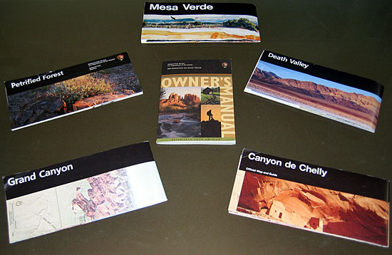
So, already, we're seeing the development of a smart graphic system -- bold, striking, clear, and engaging. There's not a visitor to a national park who doesn't want to immediately open the brochure to see what goodies await them, and the brochures rarely fail to deliver.
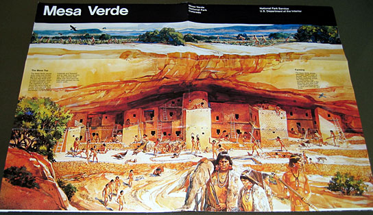
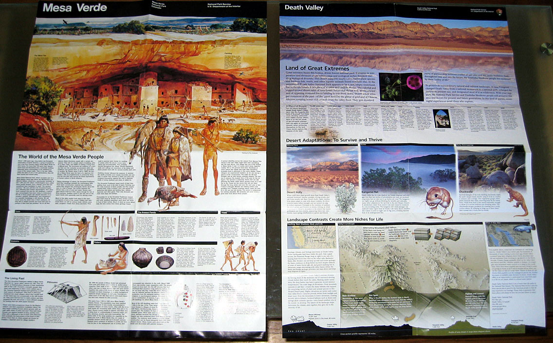
The Mesa Verde brochure serves as something of a standard bearer for publication design, so we'll focus on that. When you first open the brochure, the imagery continues, depicting life when Mesa Verde was inhabited (this is a departure from the other brochures, that utilize photographs):
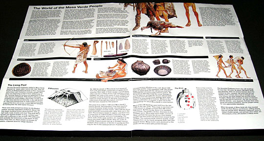
As you continue to open it fully you are given textual information explaining the park.

(Click the image for an enlarged view)
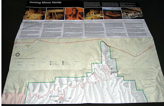
Stacy was the Keeper of the Brochures (I tended to be the driver), and what she noticed pretty soon is how the information on the brochure is aligned with the large page's folds. So, if you can't have the whole thing open in front of you, you could choose to expose the text:
And the same goes for the back side. You can see where the fold separates the text from the map:
Obviously, this isn't happenstance. It's a precise plan, and a remarkably aware one. While I was pleased to see a government agency capitalize on graphic identity standards such as the black bar and the imagery, I was surprised to realize that a government agency used a design system that afforded greater utility.
It turns out there's a very good reason for this, which a wee bit of web digging unearthed.
The National Park Service's Department of Publications has their shit together. As someone who labors to get clients to understand the value of smart, consistent design, I was delighted to click around the Publications mini-site, and see how they communicate their mission and operations.
If you click into the brochures section you see a link to "The Unigrid System", created by Massimo Vignelli back in 1979, and still used to support good design.
I also love the section on the process by which publications are developed.
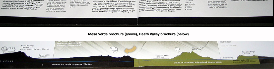
If you look at a variety of brochures, you realize that just because they're based on the same grid system (and have other requirements for color, typography, and imagery) that it doesn't mean a designer's creativity is impinged. Look at the Mesa Verde and Death Valley brochures side-by-side:
The Death Valley brochure is newer, utlizing color photographs as screened-out backgrounds, and playing with the grid a bit to provide a different experience. But it still basically works along the folds, and it's clear that it's a cousin to the Mesa Verde display.
The National Park Service faces a monumental task. How do they keep their hundreds of sites in line when it comes to a standard look and feel? Their website shows you how they attempt to manage it. The results are not perfect -- across brochures you'll see inconsistent typography, or just plain mediocre design (I'm looking at you, Grand Canyon) -- but considering the scope of the problem, they perform more than admirably.
And it's clear that they're willing to have some fun. Typically, at the bottom of a brochure is a black bar. For Death Valley, they let the designers play with that element to communicate some valuable information:
Kudos to the National Park Service for providing us an example of a government agency that isn't afraid of innovative design.
