October 30, 2005
more brief new york stories
It's been a while since my first full day in New York. I haven't had time to write, which must be a good thing.
1. Chinatown might be the most... neighborhood-y neighborhood on Manhattan. It's very clear that the residents live and work there... It's got a strong connectedness. Every other neighborhood is such a destination.
2. Brooklyn Bridge: Still fun to walk over.

3. Dinner at Celeste was quite good.

It's hardly a "find" (it's highly-rated in Zagat's), but still, with entrees that hover around $10, glasses of wine for $5, and truly immaculately prepared meals, there's a lot going for it.
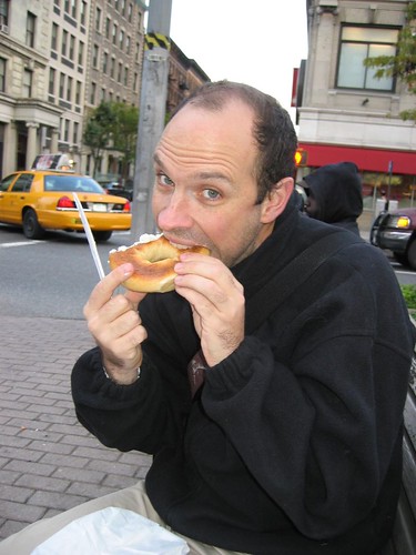
4. H&H Bagels: still the fucking best.
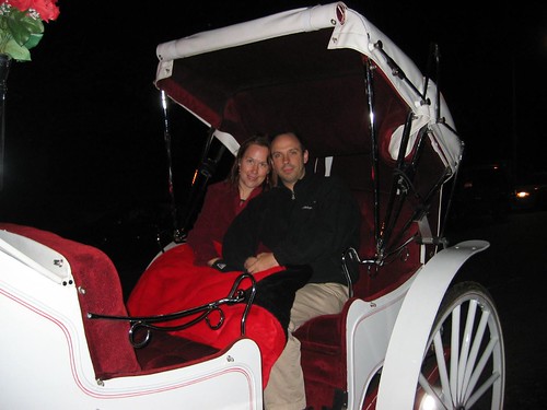
5. Though wildly overpriced, taking a horse-drawn carriage around Central Park at night is delightful, and really, something you simply cannot do anywhere else on earth.
6. Dean and Deluca and the Gourmet Garage simply make me cherish the Berkeley Bowl all the more. But Zabar's... I mean, it's a mob-scene mad-house, but it's also got amazing stuff at good prices.
7. Seeing a Big Show at the Met on a weekend is an exercise in near-futility. The Van Gogh drawings were great, but the jostling... ugh.
8. That said, little is as serene as the under-attended Japanese Art rooms at the Met. And many of the pieces there are amazing. My favorite: the gibbons.
9. I don't think the shitty art in the Art Bar has changed in 10 years.
10. The cupcake I had at Magnolia Bakery was not all that. It was okay, but the frosting was too dense for dense's sake.
11. New York Unearthed is kinda pathetic. I mean, I love the material, what little is there, but it is sadly sadly unloved.
12. Hotel Chelsea - definitely grows on you. I'm quite enjoying it here.
13. St. Marks Bookshop - Still the bomb. Probably my favorite bookstore in Manhattan. Proves that Big Chains don't put independent bookstores out of business -- they just put bad independent bookstores out of business.
14. d.b.a. - still good stuff. I ordered an Old Foghorn, which is a barleywine brewed by Anchor. The bartender, not quite knowing what she was doing, served it in a pint glass. Typically, it's served in a smaller goblet, like a Belgian ale. Not that I complained.
October 26, 2005
first full day in new york
1. It's windy and chilly. Thankfully, it's supposed to get a little warmer. I underdressed.
2. 10 years later, and Starbucks still seems to be the most consistently reliable source of coffee. New York: that's just sad.
3. I had a burger and black-and-white shake from the Shake Shack (thanks, Joshua!). Both were very yummy. I don't know if they're wait-an-hour-for-it yummy, but I would go back. If you eat outside at night (like we did), you see many many rats scurrying around. They're nearly as fearless as park pigeons. They must love their ground chuck!
4. Where the restaurant Le Gamin used to be is a different restaurant with a slightly different name (that I cannot recall) and the exact same menu. And the food is as good.
5. A lot of middle-aged queens with dogs live in the Hotel Chelsea. Maybe this isn't news.
6. Chocolate egg creams - still yummy!
October 21, 2005
Flickr should know bettr!
So, I've just switched from Safari to Firefox, so I have to sign in to all my web services. Including Flickr. Arriving at the sign in page, I see:
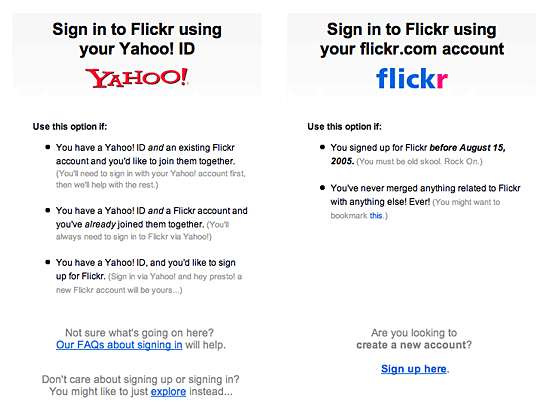
And then I keep staring. Because I can't figure out where to sign in. The page before had a link that said "Sign in". So, naturally I'm looking for form fields. Barring that, I'm looking for a link to those form fields. But the only links I see are to FAQs and a place where I can sign up. I'm already signed up.
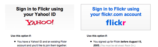
Uncertain what to do, I mouse back up to hit the Back button, and I realize something. When my cursor crosses either of the top boxes, there's a rollover effect, like you see with Flickr below (the cursor disappeared when I did the screen grab -- it was hovering over the Flickr box.)
There was nothing to suggest that those things across the top were buttons. No bevels. No links. Just bold text and a gradient fade that made it look like the header of a column.
This is web interface design 101! For shame!
October 18, 2005
peterme in New York, JJG in Amsterdam
In a week and a half, I'm heading to New York to teach our Beyond Usability workshop with Lane Becker. October 31 and November 1. I've never liked Halloween, but I love Dia de Los Muertos. If you haven't signed up, use my promotion code of FOPM to get 15% off. And if we should be hanging out while I'm in New York, drop me a line.
The following week, Jesse finds himself in Amsterdam for his Elements of User Experience workshop. (If you haven't signed up, FOPM gets you 15% off there, as well.) Jesse has asked for guidance on what he should do in Amsterdam... I added my thoughts.
Technorati Tags: adaptivepath, workshop
October 17, 2005
Is Lab Usability Dead?
I would love it if we could simply put a stake into the practice of lab usability. It's run its course, and it's simply not well suited to truly measuring the effectiveness of designs in the modern era.
Usability engineering was born of a simpler time. Before everyone was networked. When people used computers for Calculation (basic math, spreadsheets, etc.) and Creation (word processors, graphics programs), not Consumption and Communication. When someone could be expected to focus on a single task at hand for many minutes, if not hours on end. When people had one "program" running at a time.
And now we're in a world people are interrupted an average of every 11 minutes. Where they have multiple applications, and multiple windows within those applications, open. Where people are storing passwords and bookmarks on their machines. Where people are managing multiple devices, from their computer to their cell phone to their iPod.
And what have we done? We still practice "lab usability," where we invite someone into a sterile neutral environment (either an observation facility, or a conference room), and ask them to use a strange computer to engage in a series of tasks (whether scripted or self-motivated, it doesn't matter). And so while we might understand how well someone can use our tool in this exceedingly artificial world, it falls short of helping us appreciate how this tool will fit into their ever crazier contexts.
We need to practice methods that factor the complexity and messiness of reality. We need to get out of our labs, and into our users' homes and offices. Where they can use their machines, with their myriad applications and devices, and learn what works for them.
Case in point: I recently finished a project where we were going to develop a product to help people remember the important dates and events in their lives. A fairly standard process would have involved prototyping of this product, and then bringing people in to "test" the prototype. What we did, however, was field research. We went into 12 homes, and saw how people currently managed their stuff. And, believe me, it's messy and complex. One participant used: a church address book, a week-at-a-glance, a Palm-style PDA, a simple address-storing-PDA, and an Access database to manage this task. Had we brought her in to test our prototype, we could have found out all kinds of stuff about how she used this prototype in isolation and away from her tools. But we would have learned nothing about how this tool could possibly have integrated itself into his complex web.
We can't have people come to us. We need to go to them. I can't ask someone to come into my lab and use my neutral computer. They have bookmarks, files, passwords stored, and all manner of things that get them through their lives. This is becoming increasingly true in our ever-more Web-2.0 environment, as monolithic solutions give way to smaller point solutions. As people store valuable information in a variety of places (local machine, website/hosted application, paper print-outs filed away, etc.).
At Adaptive Path, we've become a lot more inclined to use remote usability. We've been playing around with a tool called Ethnio that serves as a Webex-like screen sharing environment, optimized for user research. We're in our offices; the users are in their own environments. And we virtually "look over their shoulder" as they attempt to get things done. We see the instant messages coming in, the interruptions of email; we hear the phone calls or the people walking by their cube. And we do so for less cost (no renting a facility, no video cameras or video tapes, lower incentives for recruitment since it's less a burden on the user).
Or, we're going into people's homes and environments and observing them _in situ_. And we're realizing all kinds of insights that we wouldn't otherwise get.
For our DC workshop, I worked up a table for comparing costs of conducting research with 12 participants, for 1 hour each):
| Lab Usability | Remote Usability | Field Research | |
|---|---|---|---|
| Timing | |||
| Preparation (Plan, Protocol) | 1-2 weeks | 1-2 weeks | 1-2 weeks |
| Recruiting | 1-2 weeks | 1-2 weeks | 1-2 weeks |
| Conducting Interviews | 3 days | 3 days | 4 days (5-6 with travel) |
| Analysis | 1-2 weeks | 1-2 weeks | 1-2 weeks |
| Totals | 4-7 weeks | 4-7 weeks | 4-7 weeks |
| Expenses | |||
| Incentives | $600-1200 | $600-$1200 | $1200-1800 |
| Equipment | (Camera, tapes) $400-600 | $50 (audio tapes) | $400-600 |
| Travel | $0 | $0 | $0 - $3000 (Air, ground, lodging, meals) |
| Facilities | $0 - $1,000/day | $0 | $0 |
| Phone charges | $0 | $200 | $0 |
| Totals | $1000-4800 | $850 - 1450 | $1600 - 5400 |
So, let's get out of our labs and conference rooms and into our users' environments. It's becoming clear that it's the only way to truly understand, and meet, their needs.
Technorati Tags: fieldresearch, usability, userresearch
October 12, 2005
Martin Wattenberg lecture at SIMS

Martin Wattenberg is one of my heroes. He's a information visualization guy, and I've been following his stuff for about as long as I've been maintaining this site (that's since 1998...). Even if you're not an infoviz nerd, you've still probably seen his NameVoyager, which shows trends in baby names since 1880.

This afternoon, he gave a "distinguished lecture" talk at UC Berkeley, the Social Life of Visualizations. In it, he recapped his greatest hits, and talked about what he found interesting. Here are my (slightlly edited, and hyperlinked) notes.
Visualizations from a social point of view
Early brilliant visualizations...
Example 1 - 1787 Ernst Chladni
Interested in acoustics.
He conducted an experiment. He was curious about vibrations. He took a metal plate, covered it in sand, stroked with violin bow, and saw sand arranges in patterns.

Image from here.
Gave demo to Napoleon.
Napoleon offered prize to anyone who could explain the pattern.
The prize was awarded to mathematician Sophie Germain.
Example 2 - Vietnam Veterans Memorial 1982 - Maya Lin
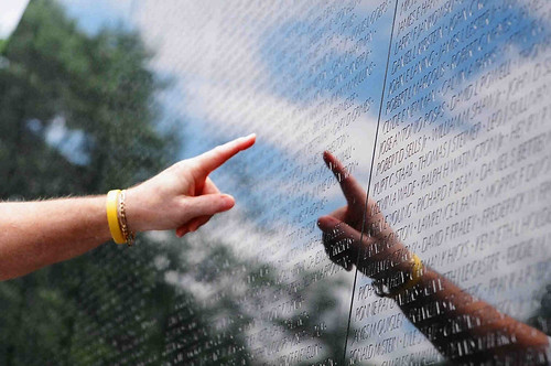 Image from here.
The wall is not only an amazing information visualization, it is also effective at bringing people together... "outside" the visualization.
Segue
Martin has found that his visualizations encouraged conversations.
Map of the Market
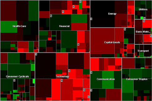
He developed the map of the market at Smart Money. He noticed it would be brought up to start a conversation, to have a conversation.
History Flow

History flow came about as a visual exploration of a collaboration mystery
They were looking at Wikipedia, where anyone can mess with any page, and the mystery is that the pages seem pretty good.
So they tried to analyze why it should work.
There's a mother lode of data... All of the revisions are left on line.
For every single change made, you get the text of the change, who changed it, some kind of comment.
To make looking at the versions manageable, came up with History Flow
You represent each version by vertical line.
Length of line shows length of document.
Color code contributors.
Connect matching sections across versions.
Link those sections with text...
(it's all explained here)
[He then demonstrates this with pages on wikipedia... simple one like the history of IBM.
You can read what he talked about here.
more complex, like "cat". many more people modified the page.
Microsoft has hordes of contributors.
Controversial pages get all kinds of traffic... You can "visualize" controversy.
Their work demonstrated the vandalism and self-healing properties at Wikipedia.
When people would talk about vandalism on wikis, and how quickly the wikis recover, they would refer to the pictures in history flow.
Something about showing the pictures that made people believe.
Apartment
Building a city of words and memories (with Marek Walczak)The apartment is a toy/visualization where
the idea is to take words and turn them into buildings.
As people type and hit return, it would put the words into rooms they might correspond to
loosely inspired by memory palaces.
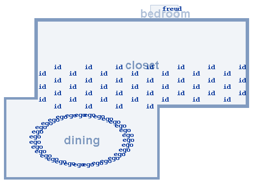
He shows some interesting apartments. One utilizes the word "id" over and over, the word "ego" over and over" and a single use of the word freud. Try it out to see what happens.
They thought the value would be in the art of building rooms. The real value has proven to be the clever ways people manipulate the program to express themselves. In using the program, people recognize patterns... and exploit those patterns. There are feedback loops.
Thinking Machine Series
watching a chess-playing computer think
It's a program that draws the decision tree the computer is "thinking" about
Social Data Analysis
When is statistical analysis like a game?NameVoyager
Martin's wife published a book on baby names... instead of just etymology, it looks at statistics of name user, gotten from the Social Security Administration.
This tool surprisingly became popular.
Do a google search on "namevoyager"-- 39,800 results.
He went to see what people are talking about.
People are talking about it at great length.
Conversations back and forth.
It was not the audience we expected. It was a lot of people not having babies...
On a blog, he saw people turn it into a game:
"find a name that was popular, went away, then came back."
And people responded with "grace" and "porter".
or, "find the steadiest popular name."
What's amazing is that people are proposing complex hypotheses... and are engaged in data mining challenges.
--> this is more sophisticated stat analysis then martin ever sees in the new york times
--> it's neat that people are doing this, beyond what martin ever expected
Whereas a company called Financial Engines couldn't get people to use their 401k visualization...
--> couldn't get people to explore huge amounts of information
Analogy with games
There seems to be an analogy with games in what we saw with Namevoyager.Richard Bartle, in writing about MUDs, came up with four types of players. This corresponds to behaviors seen with Namevoyager.
1. Achievers
-- "this is perfect, as baby names weigh heavily on my mind these days"
2. Socializers
-- "runes name doesn't show up at all... but my name has suddenly gotten popular... I HATE IT FIRST! heh"
3. Explorers
-- ETH. LAT. (type these letters into the namevoyager to see interesting graphs.)
4. Killers.
-- "It is also damn entertaining to me, that I can type in "Lexus" and find that people actually name their kids Lexus... from youandwhosearmy.com
Conclusion
What does it mean to Design for Social Data Analysis. "Audience interfaces": good after all (in contrast to what Jakob Nielsen, said, where he criticized an interface for not being a user interface, but an audience interface, great for movies or tv... great for star trek, but not for a user. Martin's point is that our interfaces need to get more audience-friendly, as these visualizations can appeal to many, and engage many. We need to rethink that... more and more, more than one person around the screenWe need to make the UI "expressive" (see Reeves et al, CHI 2005)
We need to arrange for both unique perspective and common ground
- may depend on data
- we should also consider "anti-social" navigation; emphasize the road less traveled
The success of Namevoyager seems to hinge on the fact that everyone has a point of entry ... everyone types in their own name, or kids name, someone they know.
-----------------------
Then there was Q&A, and I didn't take any more notes.
Technorati Tags: visualization, wattenberg, ucberkeley
October 11, 2005
Office 12 UI Is Information Architecture
A follow-on thought from my previous post.
If you watch the video interview with the Office UI lead, you'll hear her talk about making accessible 1,500 commands.
The new ribbon, and its task orientation, is not an interaction design solution, but an information architecture solution. It's actually classic information architecture. What is the most suitable cognitive/mental model when interacting with Office products? (their answer: task-based). What are the terms/labels that will best guide people to discover/find the functionality they desire?
October 10, 2005
Beware of false prophets...
Causing a buzz among folks who design websites and software is Jakob's latest Alertbox "RIP WYSIWYG." The coming Microsoft Office User Interface portends the move from the What You See Is What You Get interface popularized by the Macintosh, toward a What You Get is What You See model, also called "results-oriented UI."
Now, I am not qualified to criticize the new Microsoft Office interface, as I haven't seen it fully, and, more importantly, I haven't used it.
What not mentioned until the very end (after the conetnt) is that a Design Research Lead is speaking at the User Experience event on the Results-Oriented UI. By not mentioning it at the outset, it feels like Jakob is marketing Microsoft in his Alertbox to promote his workshop.
And I strongly question this part:
If anybody else introduced a new user interface paradigm, it would probably remain a curiosity for years, but Microsoft Office has a special status as the world's most-used interaction design. We know from user testing that users often demand that other user interfaces work like Office. When you're used to one style most of the day, you want it in other applications and screens as well.If the new interaction style works as well as early predictions indicate, users will quickly expect many other user experiences to provide the power of a results-oriented design.
Is "most-used interaction design" really true anymore? Are web browsers and lightweight email apps (NOT Outlook) not more-used? Particularly around the world?
Wouldn't mobile interfaces be the "most-used interaction design"? I guess there's no single mobile UI with the dominance that Microsoft has on the desktop, but I need more proof of Microsoft Office's "special status." And I'd also like to see trends.
Also, "results-oriented design" doesn't make sense to me. From the description, Office is now even *more* monolithic. The idea of "results-oriented design" only plays into the user-as-victim model that plagues user-centered design... The poor user can't handle things, so we'll try to do all the thinking for them.
The problem is, there are infinite desired results... How will Office be able to accommodate them? And, given their past UIs, why should I not simply fear that their attempts at making it "easier" will only confound and frustrate me?
The last thing I find puzzling about RIP WYSIWYG is that, well, WYSIWYG remains pretty well intact in the new Office interface. I try to make the thing on the screen look exactly how I want it, so that I can then print it. There's no great paradigm shift. At best, the introduction of the Ribbon is not about results, but about tasks. It's akin to iPhoto's interface. Others have also labeled it "task-based."
Also, this new interface is solidly WIMP (Windows, Icons, Menus, Pointers). Remarkably, WIMP has remained the standard paradigm, even though the fundamental ways that people use their PCs have changed. And as long as WIMP remains so prominent, it's hard to claim any paradigm shift.
Before signing off, I wanted to mention that I'm enjoying Jensen Harris' Office User Interface blog. My comments above notwithstanding, clearly, the UI of Office is a big deal, and will have a significant impact. It's refreshing to see its story told in such detail.
Update: I've just finished watching a 40 minute interview that Robert Scoble conducted with Julie Larson-Green, where she walked him through the new UI. If you're curious, this is probably the best source of info.
October 05, 2005
Just come out and say it...
From an email I just got...
Peter
Bestica, Inc is helping World’s Number 1 internet brand find some directors in User Experience Design. If you want to contribute and be a part of their success and have experience in the User Experience Design in any of the following products please send me your resume. The products are
Communications, Email, Images( photos ), Instant Messanger, Mobile, Set-Top, Desktop Applications, Homepage, Personal page, Groups, etc....
Hint.
October 01, 2005
Podcast I Like: The Word Nerds
Finding good podcasts has been remarkably difficult. The various services (Odeo, Podcast Alley, Loomia) have terrible terrible search and browse mechanisms. But, with my new Nano, I wanted something to accompany the walking part of my commute.
One podcast I've gotten to like is The Word Nerds. It's a weekly program by three high school teachers who love words. And hey, I love words, too! The production quality is actually pretty good, and it's clear they've learned a lot by modeling themselves on NPR shows. My only complaint is that the musical interludes are a) overlong and b) poorly programmed.
My favorite show so far is "Regional Speech and Our Roots." Long ago I wrote about regionalisms here and here (scroll down to February 4, 1999).
Technorati Tags: podcasts
