January 18, 2004
Designing for People - Introduction and Initial Thoughts
My corporate-sponsored New Years resolution is to rekindle my passion for user experience work. A key aspect of that plan is to reread works that have fired me up in the past. As I do so, I'll transcribe passages and write up thoughts.
The first book I am dipping back into is Henry Dreyfuss' Designing for People. Henry Dreyfuss is probably the premier American industrial designer of the 20th century, working on projects ranging from commercial to governmental to military. Personal favorite designs include the Bell telephone and the Big Ben alarm clock (featured on the cover of his biography). His design firm lives on (though, sadly, they seem to think that an "under construction" notice suffices. Though, Google pointed me to the old pages that are still live, just not linked to.)
Written in 1955, Designing for People captures Dreyfuss' thoughts, philosophies, and processes as an industrial designer. I first stumbled across this at the San Francisco Public Library, and then spent a few years tracking down an affordable used copy. Nearly 50 years old, it's an eye-opening work -- the leading practitioner of industrial design is essentially writing a how-to on business-savvy user-centered design. And does so in plain-talking, buzzword-free style that communicates simply.
In future posts I'll be exploring the content chapter by chapter, but here I want to address the book's design. It's gorgeous. Stately typography and layout. Two-color printing to emphasize key aspects. Marginalia that illustrates concepts from the text. Pseudo-hypertextuality with call-outs to pages elsewhere in the book. Again, it's 50 years old, but feels remarkably modern.
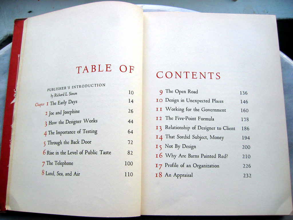
The Table of Contents sets the typographic tone. Click image to enlarge.
When I first planned this series of write-ups, it was under the assumption that you wouldn't be able to read the book yourself -- it had been out of print for years, and available only through second-hand stores (and often at a high price). That changed late last year when Allworth Press re-released it in paperback. I haven't seen this new printing, so I don't know how true it remains to the design details of the original, but I'm sure it's worth picking up.
I'll leave you with the title page, and a transcription of it's text:
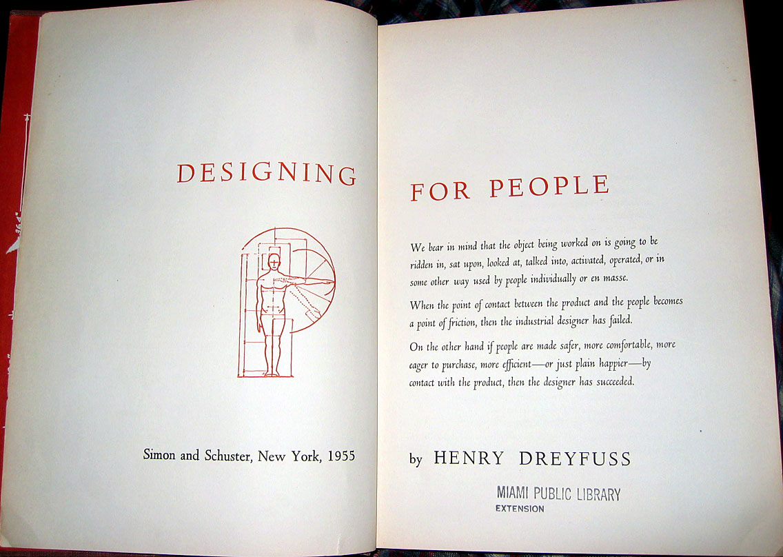
Click image to enlarge.
We bear in mind that the object being worked on is going to be ridden in, sat upon, looked at, talked into, activated, operated, or in some other way used by people individually or en masse.When the point of contact between the product and the people becomes a point of friction, then the industrial designer has failed.
On the other hand if people are made safer, nore comfortable, more eager to purchase, more efficient--or just plain happier--by contact with the product, then the designer has succeeded.
