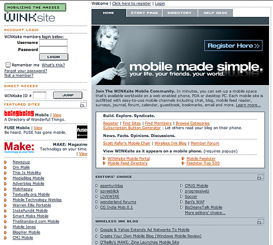
Winksite’s tag line is “mobile made simple,” but when I got to it’s homepage, all I see is complexity.

This reminds me of Professor Maeda’s post, comparing the evolution of the Yahoo and Google home pages.
True simplicity is remarkably difficult to achieve. And you don’t get there through taglines.
Hi Peter. I couldn’t agree with you more. WINKsite started off as an R&D site. To some it looked like we were trying to slay too many dragons, for us we just wanted to provide people with the ability to mix and match pre-built services and see what they would do with it. The site at the time was not meant to be a portal but more an admin to the site builder tools. Well people started to do an awful lot with that functionality and WINKsite has since grown to include 10,000 registered publishers worldwide – creating sites, communities, or simply gluing together off-portal content – friends, feeds and favorites. The visitors to those mobile spaces generated 200 million mobile screen impressions over the last 18 months. While the mobile version (visit us from a phone) of the winksite.com portal or for that matter an individual mobile site is simple & clean (IMHO) the desktop web site is in need of a MAJOR overhaul. It needs to be simplified and made friendly. We’re working on it and listening to anyone with a opinion – so anyone reading this post feel free to contact me at talk@wirelessink.com.
Cheers. Dave Harper, Founder, WINKsite
…I really dig the work done by adaptive path. I constantly use the phrase “We have to redesign WINKsite so it’s Blogger simple.” Dave
Hi Peter,
The “simple part” is for the mobile publisher. So far, WINKsite is as good as it gets, which is clearly a low hurdle to jump. To also make it a usable portal for people whose standards are modern broadband sites will require the work that Dave mentions above.
The people who like the kind of simplicity we offer so far say things like this:
http://mportfolios.blogspot.com/2005/09/possibilities-with-mlearning-tools.html