Convergence of some sort

So, I was reading the comments to my last post, one of them from a woman at Hallmark. I figured she was a longer-term peterme.com reader.

Well, it turns out I’m in Hallmark’s offices, and when I open up iChat, I see this woman on the local network. So I say, “Hi! I saw you had written on my site!”

In chatting, I found out that she hadn’t been to my site before today. What had happened is that my computer had popped up on the local network, and had appeared in people’s iChat and iTunes. She Googled my name, and saw my site, read that I was in Kansas City, and posted a comment. I then read that, and later discovered her on the network.

I don’t know quite what to make of all this, except that it seems like a glimpse of what’s to be as things get increasingly digital and public.

petermedia update

Batman Begins – …and ends, with little to show for it. Before it opened, I had little interest in seeing it — the Batman film franchise has been one long disappointment. But both critics, and many many friends raved about it, so I thought I’d take a gamble. Particularly because I wanted some escapism.

What I got was merely competent fare. The movie takes an awfully long time to get going, setting the backstory for Batman’s transformation. And then it takes a long time to continue. One problem with the film is that it’s all exposition. As Joe Bob would say, there’s too much plot getting in the way of the story.

BB doesn’t measure up at all to, say, either Spider-man movie. For starters, it’s not nearly as fun. But more importantly, I think, the Big Action Sequences are instantly forgettable. Spider-man and Spider-man 2 have bunches of unforgettable scenes — the wrestling match where he first dons his suit, chases down the cavernous streets of New York, the out-of-control subway that nearly kills him. Batman Begins has nothing so memorable, so iconic. The action tends to be stock fight scenes or car chases, very mechanical, with no emotion.

Word Wars – rented this documentary on DVD, and it is well worth a look. I loved Stefan Fatsis’ Word Freak, upon which this film draws a lot of inspiration, and the movie ends up bringing to video the characters that Fatsis brought to the page. Word Wars is about the world of competitive SCRABBLE™, and follows four top players as they make their way to the Nationals. It’s clear that this doc would never have been released without the success of Spellbound.

This film doesn’t really compare with Spellbound, but it’s good nonetheless.

Egads, eBay!

A friend pointed me to a survey that eBay is conducting. Because that survey will likely expire soon, I grabbed screen shots of the survey, because it was a fascinating example of how not to understand user behavior.

The first page of the survey is straightforward enough:

eBay survey 1
Click to see at full size

They want to get a sense of general satisfaction. Probably good for calibrating responses that follow.

But the second page of the survey is bizarre.

Ebay Survey 2
Click to see at full size

They are asking you to
– pretend to be someone you are not
– pretend you’re interested in something you are not
– pretend that you did something you have not

And then, after you look at the information shown,
– estimate your likelihood to engage in an action

Hell, even if you WERE interested in digital cameras, this survey is meaningless, because you haven’t actually seen these “different models.”

There is no way this survey can generate valuable insight. I worry as to what eBay ends up making of the responses.

Don’t get me wrong… I love surveys. But surveys are best at uncovering demographic information, and pretty spotty when it comes to predicting behavior. And, if you are trying to predict behavior, you at least need to:

  • survey with people who are in the midst of the process which you’re interested in understanding (so, in this case, anyone not actively in the market for a digital camera would be screened out)
  • provide enough context so that reactions can be meaningful (as in — show those other pages)

Latest Essay: Create Value By Relinquishing Control

My latest essay is up on Adaptive Path’s site: “How I Learned to Stop Worrying And Relinquish Control.” The thesis is that the more control companies give up, the greater value they receive in return.

As I started writing that essay, I thought I’d write more of a diatribe against designers who feel that controlling the user’s experience is the point of their work. While I have a dig at that perspective in the paragraph on the interactive design competition that Jeff wrote about, the essay took a decidedly different tack, trying to come to grips with the more fundamental concept of control.

The problem was, I end up using 5 or so different types of control, and I don’t really call them out distinctly. This was a nagging thing in the back of my mind as I was writing the essay, and didn’t really become clear to me until after I had turned it in, and talked about it with others in Adaptive Path.

I’ll go example by example…

Google’s relinquishes behavioral control. Instead of trying to create “stickiness” that keeps you clicking into their site, they instead try to provide the best results to your queries, wherever that might lead. I find it impressive that, if you type an address into the Google search engine, you a link not only to Google Maps, but Yahoo and Mapquest as well. You prefer the competitors? Fine! Enjoy!

Amazon and eBay have relinquished editorial control.

Whereas the designers that Jeff grew so frustrated with were unwilling to give up experiential control. Not surprisingly, this is pretty typical in the experience design and graphic design communities — the idea that the designer knows best, and the designer needs to have total control of your experience, and you should just sit back and enjoy it.

Flickr relinquishes a combination of these forms of control. Flickr relinquishes behavior control, editorial control, and experiential control, really letting their users cobble together their own meaningful experiences.

The Long Tail is all about shifting control of selection from the business to the customer. Amazon, iTunes, and other long tail content companies simply expose databases of material, and let you have at it.

Netflix does that, but even more disruptive is their Google-like take on giving up behavioral control. Rental store late fees inflicted a cost on customers who wanted more control of their viewing experience. No more!

And then there’s Craig of Craigslist, whose polling of his community for thoughts on corporate direction is some form of giving up strategic control.

While these are all different forms of control, I think there’s still a foundational concept of control that underlies this. Particularly because companies typically give up control in more than one way. Google, Amazon, and eBay all have APIs. Netflix is long tail, by mail, and has no late fees. I think these companies have a core philosophical tenet that encourages relinquishing control, and that this gets expressed in many different ways.

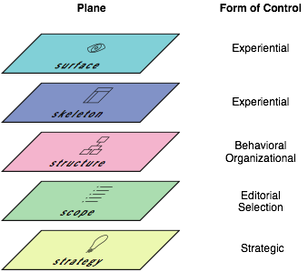
That said, I think uncovering a framework for considering control would be valuable. To understand how these different forms of control work, how they relate, how companies and their products can figure out what forms of control make sense to relinquish. An initial thought was to use Jesse’s planes

Control Planes

…but I think for the framework to be successful, it would need to be specific to the idea of control.

If you’re familiar with such frameworks, or have comments about my article, I encourage you to leave the comment here.

In other news, it turns out that “How I Learned To Stop Worrying And…” is a remarkably overused phrase, particularly in the digerati space (Example Other Example Google Search. ) Oh well. It worked here. And Dr. Strangelove *is* one of my all-time favorite films.

Comics Review For People Who Like, But Aren’t Obsessive About, Comics: Street Angel

Streetangel

Many comics lovers have known for a while that Street Angel is something to crow about. A few weeks ago I bought issues 1 through 5, based on the strength of the cover art and flipping through a few pages.

I was not disappointed. Street Angel has gotten me the most excited about comics since I first stumbled upon Hellboy. The short of it: Street Angel is Jesse Sanchez, a homeless 8th-grader with skateboarding and martial arts skillz. Over the 5 issues she takes on mad scientists, Spanish Conquistadors (in my favorite-titled-issue, “Inca-Dinka-Doom”), Satan, hunger, cuckolds, and ninjas. Lots and lots of ninjas. The stories are a marvelous combination of humor, action, and pathos.

The artwork keeps it all together, and propels you relentlessly forward. The best thing about the whole series, is that it’s just…simply…fun. A welcome antidote to the bleak dystopian bloodbaths that pass for “edgy” in today’s comics market.


All 5 issues (and there will only be 5, at least for a while), have been collected in a trade paperback, which I’m considering buying even though I have every comic.

Designing for the Sandbox

I’ve been thinking a lot about control and design.

People who design experiences often believe that in order to succeed they must exert complete control. And while in extremely rare instances they might be afforded the opportunity to dictate an entire environment (say, in a casino, or a theme park), when designing for the real world, for the ebb and flow of actual lives, such control is impossible. Often, the designer’s response is to exert as much control as possible on their portion of this world. (Jeff found out this sad fact when reviewing submissions to an interactive design competition.) In fact, the best thing a designer can do is dictate *as little as possible.* Because the point isn’t to control, it’s to connect–to weave your offering into the complexity of people’s life experiences, to allow them to figure out how to make sense of your offering within their world. 


Photo by Yogi from Flickr

In my head, I’ve been calling this “designing for the sandbox.” This acknowledges a space for content, tools, and people to interact and create their own meaningful experience. This is not a monolithic creation, that dictates how the content, tools, and people best interact. This is instead reminiscent of David Weinberger’s phrase “small pieces loosely joined” — things that connect, but aren’t bolted onto one another.

The example I’ve been thinking of compares Ofoto with Flickr. Ofoto wants nothing more than to exert control. Hell, if I post photos to Ofoto, and want you to see them, you have to register to do so. Flickr wants nothing more to do than provide a space for interaction. Post your photos. Others can see them, no hassles. Connect photos with tags, groups, sets. Connect with people. Flickr has simply provided us a database of photos, people, and tags, with some ways to loosely join them, and let us go to town.

They’ve also provided an API that lets others dig deep into what Flickr has to offer. This leads to brilliant interfaces like Mappr. Or, in a more mundane, yet more impactful, note, the Flickr uploader plug-in for iPhoto. Before I used that plug-in, uploading photos was enough of a pain that I never got close to the max of the free account. Once I started using it, uploading became so easy that I needed an upgrade to Pro in order to use it how I wanted it.

So some passionate guy creates a free plug-in utilizing Flickr’s openness, and Flickr gets my money. *That*’s the beauty of the sandbox. You encourage others to improve it, and you still get the fee. And people love you for it. Meanwhile, the other photo sites devolve into price wars, desperate for your business.

Del.icio.us, Backpack, Upcoming, and others are designing for the sandbox. Hell, Google is designing for the sandbox. Here’s their API. Maybe you’d like to put some of their ads on your site? Go ahead. Or use their maps to view rentals on Craigslist? Sure, why not.

Thinking about this, I would say that, while people have done a lot to compare Yahoo and Google of late, this is a key point of distinction. Google designs for the sandbox. Yahoo tries to control the playground (am I overextending the metaphor?). Yahoo is still about drawing you in, and not letting you go. Google has always been willing to let you go, ever since they bucked the then-predominant search engine trend of “stickiness”. Maybe Flickr will help the rest of Yahoo get the sandbox religion.

I wonder about how my clients could design for the sandbox. Is there a sandbox for Silicon Valley enterprise IT companies? Could Oracle have a sandbox? Sun? Can you conduct marketing in a sandbox? Is that what the Cluetrain guys were talking about?

And finally, I think about, how do we design for the sandbox? What are the guides? Is there a Tao of the Sandbox? My sandbox will look different than yours. Amazon.com was an early sandbox designer — customer comments, wishlists, friends, etc. Barnes and Noble made feeble attempts at maintaining feature parity, but it was clear their heart wasn’t in it. Could B&N be a sandbox company? How would B&N’s sandbox differ from Amazon’s? How could they relinquish control in a way that felt true to their approach to business?

Anyway, some things I’ve been thinking about.

Laptops are mobile devices, too

Something I’ve been wondering about is why laptops aren’t really treated as mobile devices, in any interesting way. Laptop manufacturers tend to treat them as portable desktops, and people interested in “mobile device design” focus on PDAs, cell phones, and the like.

Now that laptops outsell desktops, it’s worth treating them as interesting and distinct entities that warrant special consideration as a mobile device. What, say, are the tools for the working-at-coffeehouse types? For the airplane commuters, the road warriors, the college students, etc.? What makes sense for a laptop to have that would have never made sense in a desktop? Why don’t we have location-awareness built into laptops?

Anyway, something to ponder. I would wager that the folks thinking about “mobile device design” would get a lot more traction if they considered the laptop as a platform, not the PDA or cell phone.