A couple weeks ago, a friend and I were asked to present on the subject of interaction design. The audience needed primer material. We started out the presentation by walking through some examples of web-based interaction design and explanations as to why they were interesting.
I thought I’d share a few.
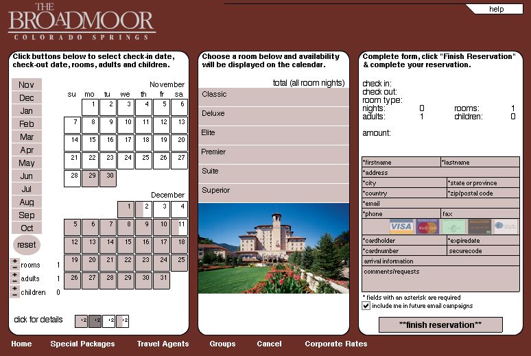
Booking Reservations at the Broadmoor. A Flash-based interface that lets you choose dates, pick rooms, and submit payment information all on one-screen.

Why it’s interesting:
1. Visitors determine order of importance — date and then room, or room and then date?
2. You see the ramifications of your choices immediately — if you want these dates, then you won’t get these rooms.
3. You cannot “finish reservation” without having filled everything in — it doesn’t require a trip to the server to receive an error message. This pretty much prevents that error
Is it perfect? No. The color-coding of dates is non-intuitive, adding people or rooms is a bit of a kludge, and it features a dreaded “info-slit” below the picture of the room (only a few lines of text visible, requiring a lot of scrolling).
Still, this site is the best of its kind out there, at least that I know. It’s also a couple years old, and as an example is getting hoary… Except that no one (apart from iHotelier’s other clients) seems to have followed suit, if my experiences booking airfares and hotel reservations is at all typical. Why aren’t we seeing more of this?
I would have sorted the room types by rate rather than alphabetically.
Also, I went straight to the calendar without reading that I had to ‘book’ my checkout date and thought they weren’t handling a single night’s accommodation correctly as the rates weren’t appearing. Once past this though, not bad.
Developer coming out of training are still being told that there are still security issues with Flash. Accessibility and mobile use are still stated concerns. Tougher to save state in Flash. Having the right version of the Flash player keeps impacting those decision makers as it seems their computers are never up to date.
Great Flash interface example? Flickr.com. Hands down. It is not apparent that the interface is Flash or straight (D)HTML. The interface just works smoothly and intuitively. HTML forms are used where it makes sense, as they are easy to pre-populate. The HTML portions of the page show up on the screen immediately and provide the user with enough to keep them entertained and occupied while the magic of Flash gets the interactive bits.
The Broadmoor show the clunky nature of Flash and waiting for the interface to show up. Flash is getting better with each iteration, but a mixed interface, like that of Flickr uses the best of both worlds.
Yer getting ahead of me! I have every intention of discussing Flickr. Just later!
Getting accused of jumping ahead reminds me of high school math classes. I don’t have your book. Really.
“Developer coming out of training are still being told that there are still security issues with Flash.”
I’d like to know more, please… who is saying what where? Same with accessibility, mobile, saved-state and versioning issues, I’d be interested in hearing from those who have concerns, thanks.
Resources:
http://www.macromedia.com/devnet/security/
http://www.macromedia.com/macromedia/accessibility/
http://www.macromedia.com/mobile/
http://macromedia.com/software/player_census/flashplayer/
(The “saved state” issue is more complex, and depends greatly on what type of state they want to recall out of what type of application… it’s possible to do things like this, but the answer depends on the question.)
Regards,
John Dowdell
Macromedia Support
Hi,
I am seeing more and more sites using Flash to have “single screen” interactive applications replace complex multi-page HTML forms, with dramatic (postive) results.
The best recent example I have seen is the one screen check out shopping cart on the TJMaxx site. Check out the demo on the developer’s site (or go to TJMaxx for the real thing): http://www.molecular.com/singlescreencheckout/index.aspx
-David
The MGM Grand and Mirage properties in Las Vegas recently implemented a Flash reservation interface of their own making. See https://secure02.mgm-mirage.com/roomres/mgm/mgmBook.asp?start=hotel
The MGM Grand reservation app is not as “all in one” as iHotelier. The MGM app, has three screen transitions. First for room selection, second for special requests and payment information, and third for confirmation. Also, they have overcome the “info-slit” by using text pop-ups on rollovers. Of course, since it is Vegas the MGM Grand and Mirage sites are a lot more (shall we say) Flashy!
Flikr is great, but it still suffers from the familiar html page transfers and raises the question of whether users prefer to see bits of content or wait once for the initial UI…Then all the calls to the server are ‘silent’ as far as the user’s concerned.
I think many web applications would surely benefit from being a single screen Flash RIA…