One of my favorite sessions at the IA Summit was Laurie Gray’s case study on ethnography of stockbrokers and their trading methods(2 MB PowerPoint. It’s got Laurie’s notes, so you can really follow along).
There’s a lot of good in it, but what most excited me is how Laurie used a simple visualization to better understand what she had observed, and to demonstrate how the current system under consideration satisfied the approach of its users.
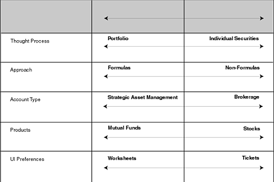
On Slide 10, she introduces the set of simple oppositional continua that emerged from her observations:
In her talk, she mentioned how she didn’t hit upon these herself — she was working closely with a subject matter expert on her client’s side, and the two of them were able to come up with this.
So, then they took each subject, and plotted their approach along these various lines.
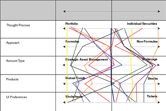
Not particularly revealing.
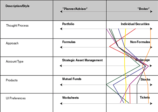
But then they had an insight. If they separated “Brokers” from “Planner/Advisors”, and considered them separately, a trend emerged. First the Brokers:
Then the Advisors:
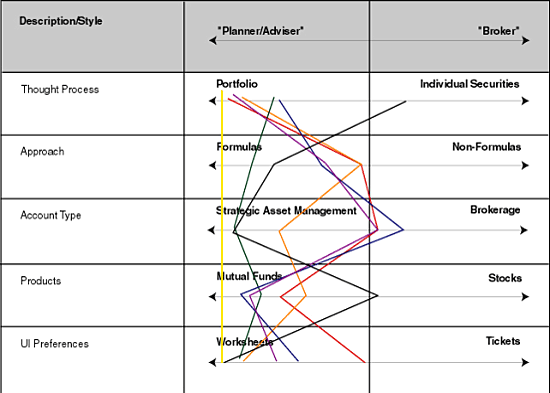
In her talk, Laurie pointed out that her client hadn’t considered these as two distinct audiences. They’d identified one “user type.” Her research and this analysis made it clear that there were two distinct groups, with significantly different approaches.
She was able to take this one step further, by plotting how the current web-based system functioned along these various axes.
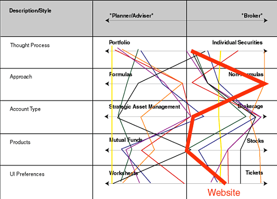
I love this last graph. It clearly demonstrates that the current system is designed for brokers, and that the planner/advisors are likely having to fight against it. This makes apparent a clear opportunity for the client to pursue.
In general, I just love this set of visualizations. While such attribute-oppositions are common in things like branding and positioning (where you place “your company” along such lines and compare it to other companies), I’d never seen it used as a user research tool. And it proved quite powerful. First in providing the insight around the two distinct user groups. And then in mapping the current system and demonstrating opportunities. Good on Laurie, and something to add to the methodological toolbox.