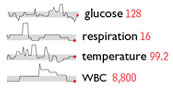
Edward Tufte, “the information designer” (as NYT calls him), offers us a glimpse at his forthcoming book Beautiful Evidence in a section devoted to “sparklines” — teeny illustrations no taller than a line of text, that communicate data patterns. An intriguing notion, particularly relevant to computer/web displays, where such graphics can be dynamic.
I’m not so sure this *is* particularly relevant to computer/web displays… this sort of extremely high-density information seems much more appropriate for print, with its significantly higher resolution.
Also, I’d be curious as to whether the scannability tradeoff is worth it, as sparklines are so much more eye-catching that I suspect it’d be difficult to skim any text that contained them.
I know of what I speak; As a Prince fan, I spent a couple years reading press articles that tried, to various degrees of success, to include his name glyph inline with text. Though the graphic was small, smaller than sparklines, it *immediately* drew your attention, regardless of how many times it was used in a page or how seamlessly the typography accommodated its use.
I knew that all the time I wasted reading that stuff would be useful for something.
Screen resolution has little to do with the real impact of these things. At least, the point is that screen resolution is large enough to make images and graphics look good with reasonable line quality. So to that end, if the sparklines idea has merit, it has merit on both paper and screen.
I think sparklines have a lot of merit. And their use be make some significant impact with many interface ideas. (Dashboards come to mind.)
I’m also not sure the intention behind these sorts of things is to place them inside large blocks of text, like Prince’s glyph. The example shown seems to me to be the key use. In clusters of multiples to present dense amounts of information.
I’d dare say that sparklines have a very large potentiual in CMS apps like MoveableType. There are many spots in MT that could benefit from this sort of graphic. Ways to see whcih article receive the most hits, how many comments they have, where refers come from, etc etc etc. But I leave that to you.
Andrei, that’s a great idea, but you mean in the application interface side of things, not the output pages, correct?
I mean mostly the apps pages, but you could find create ways for the output pages as well, I’m sure. Things like “Favorites” or “What Music I’m Playing Now”. Naybe for photo galleirs or book reviews. Maybe even displaying what articles are most read by readers.
But to really get into it, you’d have to pay me. 8^)
Take care.
This dude lays the smackdown on Adaptive Path website.
Auto Insurance http://auto.insurance-wholeworld.com/map.html
Health Insurance http://health.insurance-wholeworld.com
Travel Insurance http://travel.insurance-wholeworld.com/map.html
Health Insurance http://health.insurance-wholeworld.com/map.html
Life Insurance http://life.insurance-wholeworld.com/map.html
Auto Insurance http://auto.insurance-wholeworld.com/map.html
Auto Insurance http://auto.insurance-wholeworld.com
Health Insurance http://health.insurance-wholeworld.com
Car Insurance http://car.insurance-wholeworld.com/map.html
Insurance http://www.insurance-wholeworld.com/map.html
Travel Insurance http://travel.insurance-wholeworld.com/map.html
Health Insurance http://health.insurance-wholeworld.com/map.html
Life Insurance http://life.insurance-wholeworld.com
Life Insurance http://life.insurance-wholeworld.com/map.html
Auto Insurance http://auto.insurance-wholeworld.com
Insurance http://www.insurance-wholeworld.com
Car Insurance http://car.insurance-wholeworld.com/map.html
Life Insurance http://life.insurance-wholeworld.com
Car Insurance http://car.insurance-wholeworld.com
Insurance http://www.insurance-wholeworld.com/map.html
Home Insurance http://home.insurance-wholeworld.com
Insurance http://www.insurance-wholeworld.com
Home Insurance http://home.insurance-wholeworld.com
Car Insurance http://car.insurance-wholeworld.com
Travel Insurance http://travel.insurance-wholeworld.com
Home Insurance http://home.insurance-wholeworld.com/map.html
Travel Insurance http://travel.insurance-wholeworld.com
Home Insurance http://home.insurance-wholeworld.com/map.html
Cigars http://cigars.cigarettes-smoking-online.com
Cigars Online http://cigars.cigarettes-smoking-online.com/map.html
Cigarettes Online http://www.cigarettes-smoking-online.com/map.html
Cigarettes http://www.cigarettes-smoking-online.com