February 16, 2005
Google Maps UI - Some thoughts
My last post served as something of a paean to the new Google Maps. While that hadn't been my original intent, it is the way my writing went.
This post will be more critical of the application, particularly of its interface.
One of the biggest challenges Google Maps faces is introducing a radical departure to how people interact with online maps. Such innovations are a huge interface design problem -- how do you provide people with cues, so they know what to do, but enable new, more powerful means? People use best what they use most -- which can mean that user-centered design, when taken to some extremes, inevitably stagnates. This is particularly problematic with the Web, because people develop assumptions on how the web works from *all* the web sites they use -- they don't do a lot to distinguish one site from another, they pretty much expect them to all behave the same.
So how does Google Maps do?

Google Maps biggest weakness is, unfortunately, it's home page. The place where they most need to orient people to their new way of interacting with maps is overloaded with search input boxes. And the layout of the search input boxes down the right hand side is misleading -- it suggests that each box is tied to a different search -- that if you want to search for directions, you use the 5th (or 6th?) box. It's not clear that these are all simply examples of the same search -- no matter which you use, it all gets sent to the same place. I know I'm not the only person to have been confused by this.
I only JUST NOW saw the words "Example Searches" -- and I've looked at this page many times. Instead of having them in search input boxes, I think it would have been better to just show them in the body of the page, and cue people to use the widget across the top. The current set up draws your eye right to those 6 boxes, so you don't see the interface at the top straight away, nor does the design suggest these are examples.
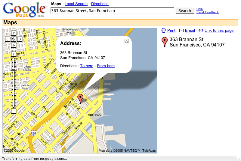
The address search, the simplest for a map application, works very well. Freely type in an address (no need to specify what is the street address, city, state, zip, etc.) and there you are. The map is big and attractive. The address is boldly called out with both a red balloon and a word balloon. I love that Google Maps uses the word balloon to draw attention to details of particular locations.
I also love that they've embedded, in the map, where your attention is, the links to whether or not you want directions to or from this place. You don't have to click some "driving directions" tab, or some link off on the side somewhere. It's right there, in the middle.
When getting directions:
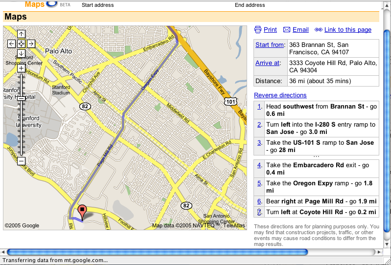
I love that you can click the numbers on the right-hand side to highlight those turns...
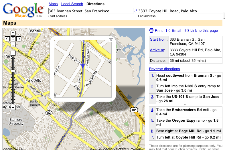
And that it uses a word balloon as a magnifying glass. That it allows you to see the detail *in the context* of the whole.
I do think they missed an opportunity to bring the numbers of the turns into the map... something like what I've mocked up below...

In terms of getting people to adopt unconventional interface elements, Google Maps does a bang up job by offering multiple means to the same goal. The most obvious is with panning. The arrows in the upper left-hand corner provide the "typical" way of doing it, and they work fine. Even better, of course, is the ability to click-and-drag on the map, which responds pretty speedily. They've also enabled the arrow keys (and even the page up, page down, home, and end keys) so that your fingers never have to leave the keyboard.
(Too bad you can't type numbers for the different turn markers in the directions...)
One place where there is a HUGE opportunity is with what gets printed. Currently, you pretty much just get a print out of what's on the screen. And there's a bug, where if you are printing driving directions, the directions line doesn't print.
Enabling better print outs could be a killer feature for an online map -- it's probably the one kind of thing I print out more than any other. You always need a print out to take with you in the car. It would be great if you could get some power for the online print out -- like, you could print a map at a significant level of detail over a number of pages (so that you're not confined to whatever is visible on your screen). Or that you could have it print out the magnifications for every turn (the trickiest part of following directions).
I don't know if I addressed what I had originally set out, but I wanted to get some of these thoughts out there. Google Maps is, clearly, impressive. And there's a lot to learn. I think there's a lot its designers could learn from observing and analyzing how people use maps in the real world -- such as how to really extend the experience to what happens after you've left the computer and you're taking your map with you.