« Check Your Irony at the Door | Main | TED Talks; People Listen »
July 09, 2006
Thoughts on reading Tufte's Beautiful Evidence: Intro and Chapter 1
"The principles of analytical design are universal--like mathematics, the laws of Nature, the deep structure of language--and are not tied to any particular language, culture, style, century, gender, or technology of information display." (Page 10)
Wow. that's an inauspicious beginning. I'm shocked that Tufte is so myopic not to realize this passage is full of shit. And, more importantly, that it's a claim he cannot back up. He tries to with what follows ("our examples come from 14 centuries, 16 countries...3 planets, and the innumerable stars." Not only does he conflate the provenance of the illustrations with the subject (I don't think any creatures from planets other than earth drew what is in the book), this "evidence" of universality is laughable, and seems like a desperate attempt at legitimacy. Tufte -- you're a smart guy, and you have interesting points to make, and those of us reading the book are likely to agree that appropriate information design is valuable. Why puff it up with this foolishness about "universality"?
Anyway, on to the show...
Page 18 features an geometric illustration by Durer and page 19 a drawing by Mersenne of stringed instruments annotated with numbers and letters. Tufte lauds both as remarkable examples of "mapping." I can't figure out the point, or the message, of either. The Durer drawing seems like a geometric abstraction almost for the sake of it. The Mersenne is the most frustrating -- a collection of numbers and letters that one assumes have some connection, but is not *evident* from the illustration itself.
Universal, my ass.
It's not until page 22 and 23 that we get the first excellent example of what Tufte is describing. Chillingly, it's an illustration of men and women packed shoulder to shoulder on a slave ship.
Tufte's talk of universality is once again challenged by the diagrammatic deconstructions of Cezanne's work on pages 24 and 25. After much staring, I finally got the perspective diagrams explained on page 24. Page 25's "picture boxes" are still a mystery to me.
I'm a fan of Hockney's attempts at capturing how great classic artists painted pictures of such precision and detail, so I'm a sucker for the reference on page 28.
I will have to take Tufte's word that the drawings of counter-dancing on pages 32 and 33 helpfully depict how to engage in this activity. After a few drawings in, I'm lost as to which dancer is where, and what they are supposed to be doing.
It actually ended up raising what for me became a significant question -- yes, these drawings compel with their aesthetics and diagrammatics, but are they really the best way to communicate this information?
Tufte, you see, presumes the printed page as the tool for explanation. My tendency to question assumptions leads me to wonder -- shouldn't people learn counter-dancing by counter-dancing? Viewing drawings is going to help how? *Maybe* after you've taken some lessons and need a referent... But then, these drawings are no longer "universal," because they require having engaged in the action, to have *embodied* the action, to understand this "evidence."
This became particularly acute when viewing the admittedly beautiful annotated photographs on 36-39, "How to Ski by the French Method." The photography and typography are stellar, and make for a fun read.
But did anyone ever learn "how to ski by the French Method" by reading this book?
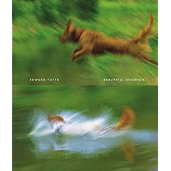
In the introduction, Tufte asserts that it is difficult "to identify what place or time this book is from," lauding the timelessness and placeness of his examples. And then on page 43 he shows a picture of his doggies, overlaid with white Gill Sans, and this book very firmly is placed in the mid-2000s (by the typography and style of the image) in Tufte's backyard.
So, while Tufte makes some good points that images should be mapped in order to provide greater understanding (by, say, juxtaposing photos of planets with the earth to provide scale, or providing rulers in drawings), frankly, it feels like there's a lot of filler in this first chapter. I hope this isn't indicative of the book as a whole.
Posted by peterme at July 9, 2006 04:31 PM
Trackback Pings
TrackBack URL for this entry:
http://www.peterme.com/mt/mt-tb.cgi/463