San Francisco Scapegoated for Silicon Valley’s Civic Blind Spot

Here in the Bay Area, not a day goes by without news of the discontent between San Francisco’s ascendant tech population, and those who are feeling pushed out, marginalized, and left behind. It’s genuinely troubling — forget the working class, with astronomical property costs astronomically, San Francisco is in danger of losing its middle class. The backbone of the city, the folks who work there, whether in civic roles, education, service, etc. increasingly have to live elsewhere.

And while San Francisco undoubtedly could do more from a development standpoint, it does have a very real constraint — geography. It’s 49 square miles, and already pretty dense. Growth can only go so far.

I think the real issue, oddly not at all addressed in anything I’ve read, is that cities in San Mateo and Santa Clara Counties (where Google, Facebook, Apple, etc. are all based), have done absolutely nothing to address the need for housing, particularly around creating environments that are appealing to the recent college grads upon whose labor these companies rely. The Google Bus wouldn’t be such an icon of gentrification and displacement if the folks who rode it could happily live in Mountain View or Sunnyvale.

Over the last 40 years (since the dawn of Apple and Intel), more wealth has poured into Silicon Valley than probably any other region in human history. And yet from a civic and municipal standpoint, there’s very little to show for it. And so the Peninsula remains an unappealing place to live, leading folks to reside in San Francisco, where there’s restaurants, bars, stores, entertainment, and the ease of walkability.

And it’s pretty clear that the cities on Silicon Valley are not going to do anything to address this. I think they think that small is beautiful, and to hell with how our bad planning causes trouble elsewhere. And so I suspect the only way this gets addressed is if the companies that fund those buses begin to spend their money local to their campuses in an effort to improve the nearby quality of life. These companies ought to embrace their civic and municipal responsibilities.

Design’s power is in its leverage

As we shift from an economy of products to services, the role that design plays, and how it’s situated in the organization, must shift as well.

How It Has Been

In ye olden days, in-house product design was typically organized as an internal services function. There would be a group of designers, and they would receive requests from throughout the business for Things To Be Designed. Designers would then work to deliver on that request, and, when finished, would then move on to the next thing, which could be for a totally different part of the business.

For designers, the upside was that they could work on a wide range of projects, and they got to group together with other designers. The downside was that they were seen purely as tactical makers, with little influence over how business decisions were made. And, because they would work on things for such a brief period of time, it was easy for the members of the product team to dismiss a designer’s suggestions, since designers weren’t seen as being committed to that part of the business the way they were.

A more recent shift, spurred by digital product design, is for design to be decentralized such that there are designers embedded in product teams, working alongside engineers and product managers, and reporting up through that product team. The upside is that designers are included throughout the product development process, their commitment is appreciated, and their voice is taken seriously. The downside is that designers may find themselves working on a fairly narrow problem for a long time, they aren’t easily able to engage with other designers, and they can feel lonely “fighting for the user”.

In a services world, this embedded model features an additional drawback from the perspective of customer experience. Design problems are solved in isolation from one another (because designers on different product teams don’t interact), and so what gets shipped can feel fractured, or “Frankensteined,” as a customer moves through some experience, unknowingly being passed off from product team to product team.

A New Model Emerges

At Groupon, we operate under a new model, one that I’m hearing other digital/internet native businesses are using as well. I’ll call it the Centralized Partnership model, which endeavors to deliver the best of both models, and is suited for the coherent delivery of services.

At Groupon, all design is functionally centralized. Though we technically live in the Product organization, we also support marketing, lines of business, and internal needs. (I am of the opinion that the typical division of design, where you have a design team in marketing and a design team in product, is stupid. In a service world, you design for a customer’s journey, which weaves between marketing and product touchpoints. Those designers need to work together to ensure coherence throughout.)

Though centralized, we are not an internal services firm. We have design teams (Platform Design, Local Marketplace, Goods, Getaways, Internal, Core Merchant, and Merchant OS) that are dedicated to certain collections of products or features. So, our Platform Design team works on anything that underlies the entire Groupon experience, such as personalization, social, checkout, gifting, and user-generated content. Senior members of that design team have partnerships with the product managers of those features. And that team is dedicated to support those features, leading the product managers and engineers on those teams to respect the designers’ views. But by not working from within those teams, the Platform Design team maintains a holistic view of the Groupon customer experience, and can ensure that design decisions across those features are consistent and coherent.

This Centralized Partnership model has an interesting additional advantage, one that took me a while to appreciate. The entire designed output of Groupon flows through this one team. We have around 50 folks in the Design Union (what we call ourselves internally), and they touch everything across the business, interfacing with many hundreds of developers, marketing, and operations people. That’s leverage! We serve as the glue that holds things together. And, often, we’re the first to realize that two different teams, who otherwise aren’t interacting, are working on the same, or related, problem, and need to work together.

The more that design is seen as contributing to organizational strategy, and a competency to be outsourced at a company’s peril, this leverage should prove increasingly influential. We’ll know we’re on the right track when companies fear that design has concentrated too much power in too small a team.

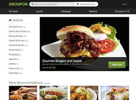
Groupon.com’s whole new look

This morning, Groupon announced to the world it’s new site design. You might have seen it already (we ‘tested in’ to it over the past few weeks), but as of today, every visitor to Groupon.com will see what we internally have referred to as Prom Night (because it’s about growing up, but still having fun). Gone is the sea of “Groupon Green” and design with faux depth, gone is Arial (at least on modern browsers). In it’s place we’ve got a cleaner, more elegant and understated aesthetic, a little flatter (though not purposefully “flat” design”), and enhanced typography thanks to Open Sans.

groupon_home


Additionally, there’s a host of new features:

  • A proper homepage, which we’ve never had before, to start you on your way
  • A navigation-bar with sitewide search (with auto-suggest) and easy access to site subcategories
  • A filter rail to empower browsers to find deals of specific interest to them (getting this to work right was probably our greatest interface design challenge, and I’m sure we haven’t fully solved it)

There’s more coming, and, as always with these kinds of launches, plenty to clean up.

I am immensely proud of the design team at Groupon — this is the culmination of 7-8 months of focused, day-in and day-out work. One thing I’ve learned is that delivering great design has very little to do with process, and very much to do with persistence — constantly pushing to ensure we launch something great, and never satisfied with a simply ‘workable’ solution. We now have a site design that we can point to with pride, and, more importantly, built a foundation upon which we can improve.

The Double Diamond Model of Product Definition and Design

After I left Adaptive Path and started working in-house, I was disheartened to realize how retrograde most people’s view of design still was, with a focus on styling and execution. I needed a way to communicate the full breadth of activities my team and I did.

So, over the past couple of years, I’ve been using a double diamond model for talking about digital product design. It didn’t originate with me — from what I can tell, The UK Design Council created it in 2005. I’ve modified it to more closely track what happens with digital product design. I’ve shown it at a few events, and people seem to appreciate it. So, I’m sharing it here. Click the “full screen” icon to get all the nitty gritty details.

Some explanations

Why diamonds? Because I think the divergence/convergence concept is powerful and not practiced enough. Teams too often go with the first idea and attempt to execute that.

Why the red words about design at the bottom? Those emphasize the role that design plays in each stage. The double diamond is not just about design — it’s about product/service development. Design is a contributor, and I find it helpful to clarify the role. So, in the first diamond, the role of design is to make strategy concrete. In the second, it’s to deliver delightful and engaging experiences.

Hey! I don’t do those things in that order! That’s okay. It’s meant to be suggestive of a process, not enforced linearity.

And, the deliverables slide is just to connect the double diamond to more typical UX design practice. Again, this is meant to be descriptive, not prescriptive.

(Thanks to Thomas Küber and Matthew Milan for enhancing my thinking on this.)

In forthcoming blog posts, I’ll talk more about how I’ve used the double diamond, not just to explain process, but to better coordinate with other roles (such as product management) and to diagnose problems in product development.

If I made a podcast app…

I just returned from XOXO, a remarkable event celebrating independent creators of all stripes. Among the presenters was Marco Arment, former CTO of Tumblr, creator of Instapaper and founder of The Magazine. He talked about the challenges he’s faced as an independent software developer, and then announced his forthcoming product: Overcast.fm, a podcast app.

In hearing about this, my heart both rose and sank. As some friends of mine know, if I were to ever go independent and try to make a thing, it would be a podcast app (thanks to my commute, I listen to podcasts around 2 hours a day). My heart rose because, given Marco’s track record (particularly with Instapaper), I’m excited to see what he does. It sank because of my personal reality that, practically, designing and developing a podcast app is nothing I could undertake at this point of my life, with my career, family, and, oh right, I’m not a developer.

Given that, I thought I’d share why I think it’s a great time to create a great podcast app.

This might seem counterintuitive at first, because the podcast player space is quite crowded (over a dozen apps, such as Instacast, Downcast, Stitcher, and the app I use, iCatcher), and has one exceedingly dominant player, Apple. (If memory serves, Apple launching podcast capabilities was what lead to the demise of Odeo, which lead to the rise of Twitter, but that’s another story.)

The thing is, none of these players are great, or, in my eyes, even good. The ones I’ve tried out all have significant drawbacks. I settled on iCatcher because it had a couple personal must-have features — playlists (so I can have different streams in my morning and evening commutes, and then different again on the weekend), and true double-speed playback (most podcast apps “2x” speed is actually 1.5). But it’s user interface is a wretched disaster that I stumble over even after a couple years of use.

So, even though the market seems saturated, I believe that there’s an opportunity for something truly great to rise above. And there is room to improve across many aspects.

UI Design

Podcast apps would benefit from truly elegant, detail-oriented design, the kind of fit-and-finish we’re seeing, in the note-taking space, with Vesper or Evernote, or what Instapaper pioneered in reading.

However, a shortcoming of every podcast app I used is the amount of visual attention it requires. Developers confuse “UI” with graphical user interface. The thing is, I don’t want to look at my phone when I’m listening to podcasts. Typically, I’m driving, and fiddling with small touchscreen controls is distracting (and potentially dangerous). Podcast apps are ripe for voice user interface exploration and innovation.

Discovery

Finding and subscribing to podcasts of interest is a largely manual, and often arduous, process. My typical mode of discovery is through the AV Club’s weekly Podmass column, and if something sounds interesting, I then have to hunt it down through my app’s search feature. Yet, nearly 15 years ago (has it been that long?) TiVo showed the power of taste-based recommendations, which Netflix has taken to a new level. Where’s the intelligence that takes the podcasts I subscribe to, matches it with others, and makes suggestions?

Management

Once I’ve found podcasts, organizing them into playlists is also a chore, because it proves to be an interface challenge within a smartphone screen. Instacast is smart to support cross-device management and syncing, which means I could use the bigger screens of a tablet or PC to organize my podcasts, and the phone acts primarily as a player. (This was the brilliance of the original iPod — other MP3 players were loaded with features for organizing and managing your music, which made their interfaces unwieldy, whereas Apple offloaded all that to the PC, so the iPod could be simple.) Still, tagging, rating, and organizing podcasts (for those interested in doing so) has much room for improvement.

Playback

This is where everything we’ve learned from Pandora (just hit play and go) and Netflix (leaving off and picking up) could come into play. Additionally, this is where a voice UI becomes crucial — when I’m listening to podcasts, the last thing I want to do is looking at my phone, and fiddle with controls.

Sandbox for media consumption

Ultimately, my interest in designing a podcast app was that it would provide a sandbox for exploring media consumption behaviors and models. As a media junkie, I have a vested interest in the tools we use for listening, watching, and reading, and I’m sure there is heaps of room to explore and improve these experiences. What’s great about podcasts is that this is freely accessible media, with creators eager to give away their material, so you have this massive corpus of content to play with, and no worries about licensing and fees.

Now there’s no Nielsen numbers for podcasts, so it’s unclear just how large the current audience is, and how actively they listen. Podcasts have not yet broken ‘mainstream’ to compete with terrestrial or satellite radio. It’s possible that a killer app could provide podcasts that quantum leap of exposure. More likely, it will be like blogs and RSS feeds, where there is a sizable, but relatively limited, ultimate audience. I suspect that integrating podcasts with other media will be where this all heads. Experimenting with podcasts, you could develop new paradigms for media consumption that could then also be applied to “premium” content.
It’s not a layoff, it’s a fauxquihire

A phenomenon I’ve recently witnessed is what I’m calling the “fauxquihire” (a purposefully ugly mouthful, though not any worse than acquihire.) In particular, there was a company, with a decent-sized design team, that made a strategic shift in its business, that meant it no longer made sense to have an in-house design team. If it were 5 years ago, this would be a simple (and unfortunate) layoff, with things like severance and, one hopes, a program to help folks find new work.

Now, in this overheated job market (at least in Silicon Valley), this team was being served up as a kind of acquihire, where other companies were offered the opportunity to hire the entire team, and were expected to give the provider some kind of premium in terms of a per-head fee. This way, the provider turns a liability (a team that they can’t get enough value from) into a highly desirable asset. But, it’s not really an acquihire, because the providing company still exists and continues to go about its business.

I don’t have anything more to say about this, except that I find it interesting, and indicative of just how nuts things are in terms of design talent around here.

Don’t “design for mobile”, design for your customer relationship

Last night I saw Luke W give his excellent “Mobile to the Future” presentation. In it, he questions many of the interface paradigms and assumptions that underlay our desktop web experience, and demonstrates the power of thinking “mobile first.” He shares great ideas for improving mobile interfaces, many of which are applicable to desktop web as well. It got me fired up to overhaul our designs.

Relatedly, there’s been enormous buzz about mobile in the past week. Mary Meeker’s internet trend report seems mostly about mobile (Groupon is featured in slide 35!). Sheryl Sandberg recently claimed that every team at Facebook is now mobile first.

All this talk about mobile is necessary. However, it’s also misleading. In that it sets up a false distinction. The idea of “mobile first” or “design for mobile” is in order to contrast it with “design for desktop”. But, as the ascent of mobile demonstrates, “design for desktop” was also always flawed. The problem is to focus on the specifics of a platform or technology. These things will continue to change. In five years, will we be saying “wearables first!”?

It’s never been about the technology. It’s about where your customers are. If you design for your customer relationship, then the rest falls into place. If your customers are moving from web to smartphone, you’ll just move with them. If your customers are moving from smartphone to tablet, head there. (Though, as we’re seeing, it’s less about moving from one to another than it is about customers using a variety of devices throughout a day.) USAA was the first to offer mobile check deposit not because they’d embraced a “mobile first” mindset, but because they have a remarkably attuned sense of customer care and service, and realized they could address a real need, one that happened to use that platform in the solution.

My concern with “mobile first” is that we’ll mistake that for “mobile only” (the way that the Web was seen as the end-all be-all for quite a while) and not appreciate just what our customers are actually doing, nor prepare ourselves for what’s next.


Supply and demand of digital product designers

12 years and 1 day ago, a group of 7 founded Adaptive Path. If you look at the NASDAQ 100 around that time, you’ll see just how far things had fallen, and they actually got worse over the course of the following year.

But, no matter how bad the internet economy was, there was always work for digital product designers. Even with layoffs or companies dissolving, I never knew any designer who went long without work. It might not have been the most desirable work, designers might have felt continually compelled to prove our ROI, but there were always jobs.

What I realized then was that, even at its lowest point, there were still more jobs than there were designers to fill them. Up until 1995, design for software meant working on packaged goods, and there simply wasn’t as much need. Beginning in 1995, the web created a sea change in the job market, and then the launch of iPhone in 2007, and iPad in 2010, has lead to successive waves of need for digital product design.

So now, supply and demand in the market of designers is frighteningly out of whack. The competition for designers is fierce. I remember getting paid $60,000 in 1997, roughly 4-5 years into my career. That is the equivalent of $87,000 today, and I can tell you that capable designers with 4-5 years experience are earning much more than that.

There is a paradoxical risk when designers are in such demand. The demand reflects the value that is seen in design work. But, with such demand, most organizations have too few designers given what they’re trying to deliver. That means those designers are spread too thin, and are focused on execution that keeps the light on. Which means design isn’t being used to its fullest extent, driving not just execution, but product strategy and definition.

Because designers are seen as so valuable, they are not able to deliver their ultimate value.

3 inspiring people and thoughts from BusinessWeek’s Design conference

Last week I attended BusinessWeek’s first conference dedicated to design. I got more out of it than I thought I would. Many had eye- and mind-opening things to say. I thought I would share a few.

Brian Chesky, CEO of AirBNB

Among my favorite presenters was Brian Chesky, CEO of AirBNB. He has a degree from the Rhode Island School of Design, and is very design-forward in thinking about how to run AirBNB. Some of his thoughts/beliefs:

  • Designers have the opportunity to remake the world around them. If there’s something we don’t like, we can fix it.
  • Early on AirBNB followed Paul Graham’s advice of being loved by 100s rather than kinda liked by millions. They felt that passion was important, and they were very explicit in designing the service to stoke that passion in their customers.
  • At one point he said, “You’re not going to A/B test your way to Shakespeare”. Too often companies defer decisions to A/B testing.
  • “Take a method acting approach to design”… Develop deep empathy for your customers so that you can then really understand what it’s like to be them. This will allow you to develop magical experiences, and you can help your customers elevate their expectations of what a great service can and should be. I LOVE THIS.
  • When asked about what flaws designers have, Brian said, “They can lose touch of who they are designing for. Particularly when they silo themselves. Designers have to watch their ego. And collaborate with every function throughout the company.”
  • Brian also stressed the importance of physical space. He remarked on how most offices interiors are awful, and most home interiors are delightful. They’ve designed their conference rooms as re-creations of spaces available in people’s homes on AirBNB.
  • AirBNB doesn’t offer a desk for every person. Some people need permanent desks, yes. Many don’t, because they’re always collaborating, or rarely at them. So AirBNB favored creating spaces to promote collaboration rather than making sure everyone has a dedicated desk. I ALSO LOVE THIS.

Paul Bennett, Chief Creative Officer at IDEO

Paul used a metaphor of flying flocks of wild geese to talk about designers and design teams:

  • the lead goose creates uplift for followers
  • when the lead gets tired, it moves to the back of pack
  • the followers honk as a way to motivate the leader

Tony Fadell, CEO of Nest

Tony Fadell, lead designer of the iPod and iPhone at Apple, and now CEO of Nest, the dynamic thermostat folks, stressed that any design/product team needs to have a “point of view, a vision.” The reality is that not every decision can be fact-based, that many will be opinion-based, and with a shared point-of-view, teams can arrive at a shared opinion.

For me, this tied into Brian Chesky’s comment about A/B testing. If you simply let A/B testing decide your future, you’ll have a product that might perform well in the moment, but that could miss out on a much more impactful gestalt. You need that point of view, that shared perspective, to ensure coherence and the best experience over all. I think you should then use A/B testing to optimize those parts of the experience.