Snap judgments are valuable. Except when they are not.
Category: Uncategorized
Jesse on the New Web User Experience
My colleague Jesse James Garrett has an essay on the new web user experience platform he’s dubbed Ajax. Don’t let all the boxes and arrows in the diagrams overwhelm you — the essay is clear in spelling out how it works and what it means. The nub (or gist) — Ajax serves as an intermediary between the browser and the server, and while we typically think of intermediaries as making things take longer, here, it’s just the opposite. Ajax sends stuff to the server only when needed, and much of the time it can handle the request itself, providing for more the immediate interactions and feedback we’ve been seeing in new web applications. Additionally, when Ajax determines that it needs to go to the server for data, it does so in such a way as to not interrupt the flow of the user’s experience.
Anyway, Jesse’s essay is great in how it brings together a lot of the discussion around this new application interface approach.
Headin’ Back To Hong Kong
For a week — fly back to the States Friday the 25th.
Here’s what I looked like when I went over two years ago.

Google Maps UI – Some thoughts
My last post served as something of a paean to the new Google Maps. While that hadn’t been my original intent, it is the way my writing went.
This post will be more critical of the application, particularly of its interface.
One of the biggest challenges Google Maps faces is introducing a radical departure to how people interact with online maps. Such innovations are a huge interface design problem — how do you provide people with cues, so they know what to do, but enable new, more powerful means? People use best what they use most — which can mean that user-centered design, when taken to some extremes, inevitably stagnates. This is particularly problematic with the Web, because people develop assumptions on how the web works from *all* the web sites they use — they don’t do a lot to distinguish one site from another, they pretty much expect them to all behave the same.
So how does Google Maps do?

Google Maps biggest weakness is, unfortunately, it’s home page. The place where they most need to orient people to their new way of interacting with maps is overloaded with search input boxes. And the layout of the search input boxes down the right hand side is misleading — it suggests that each box is tied to a different search — that if you want to search for directions, you use the 5th (or 6th?) box. It’s not clear that these are all simply examples of the same search — no matter which you use, it all gets sent to the same place. I know I’m not the only person to have been confused by this.
I only JUST NOW saw the words “Example Searches” — and I’ve looked at this page many times. Instead of having them in search input boxes, I think it would have been better to just show them in the body of the page, and cue people to use the widget across the top. The current set up draws your eye right to those 6 boxes, so you don’t see the interface at the top straight away, nor does the design suggest these are examples.
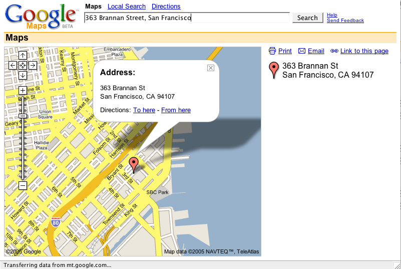
The address search, the simplest for a map application, works very well. Freely type in an address (no need to specify what is the street address, city, state, zip, etc.) and there you are. The map is big and attractive. The address is boldly called out with both a red balloon and a word balloon. I love that Google Maps uses the word balloon to draw attention to details of particular locations.
I also love that they’ve embedded, in the map, where your attention is, the links to whether or not you want directions to or from this place. You don’t have to click some “driving directions” tab, or some link off on the side somewhere. It’s right there, in the middle.
When getting directions:

I love that you can click the numbers on the right-hand side to highlight those turns…
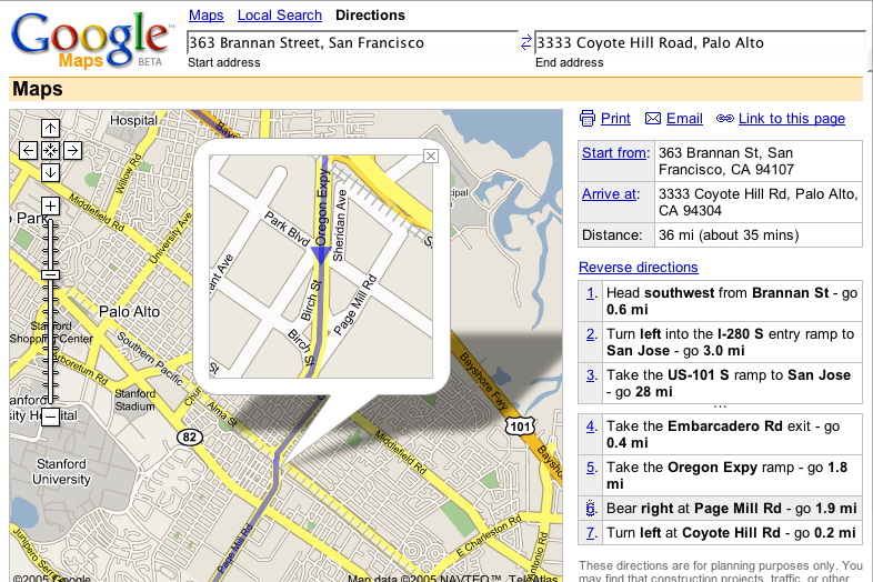
And that it uses a word balloon as a magnifying glass. That it allows you to see the detail *in the context* of the whole.
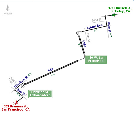
I do think they missed an opportunity to bring the numbers of the turns into the map… something like what I’ve mocked up below…

In terms of getting people to adopt unconventional interface elements, Google Maps does a bang up job by offering multiple means to the same goal. The most obvious is with panning. The arrows in the upper left-hand corner provide the “typical” way of doing it, and they work fine. Even better, of course, is the ability to click-and-drag on the map, which responds pretty speedily. They’ve also enabled the arrow keys (and even the page up, page down, home, and end keys) so that your fingers never have to leave the keyboard.
(Too bad you can’t type numbers for the different turn markers in the directions…)
One place where there is a HUGE opportunity is with what gets printed. Currently, you pretty much just get a print out of what’s on the screen. And there’s a bug, where if you are printing driving directions, the directions line doesn’t print.
Enabling better print outs could be a killer feature for an online map — it’s probably the one kind of thing I print out more than any other. You always need a print out to take with you in the car. It would be great if you could get some power for the online print out — like, you could print a map at a significant level of detail over a number of pages (so that you’re not confined to whatever is visible on your screen). Or that you could have it print out the magnifications for every turn (the trickiest part of following directions).
I don’t know if I addressed what I had originally set out, but I wanted to get some of these thoughts out there. Google Maps is, clearly, impressive. And there’s a lot to learn. I think there’s a lot its designers could learn from observing and analyzing how people use maps in the real world — such as how to really extend the experience to what happens after you’ve left the computer and you’re taking your map with you.
Wherever you search, there you are
So, there’s definitely boatloads of buzz about Google Maps, thanks to what might be the slickest presentation of any application on the web.
Maps and driving directions have long been one of the killer apps of the Web. It’s such that it’s hard to remember what it was like pre-Web, getting lengthy directions from friends, or puzzling over torn and stained maps. Maps are one place where our cultural behavior fundamentally changed — when having a party, it’s perfectly acceptable supplying just your address and maybe a link to it on Mapquest — we know that our guests can figure out the rest.
Maps on the Web haven’t seen a lot of evolution since MapQuest launched in 1996. They’ve mostly just larded them up with paid placements — don’t you want to find a Holiday Inn near wherever it was you were searching?
Many moons ago, I wrote about a map rendering engine that became LineDrive, now available through MSN’s mapping tool.
This was pretty much the only innovation in mapping for years, until very recently, when Yahoo included traffic on your Maps.

(The traffic is good ’cause I grabbed this at 10:15p)
But all these innovations stayed within the same interaction model — type in addresses, submit, wait for the next page to load, see a result. If you want to move around the map, you click arrows around the outside of the map, and wait while the page reloads. Just last weekend, I used Yahoo Maps to get directions to a friend’s place for the Superbowl, and spent many minutes zooming, clicking arrows, and all trying to get oriented.
Google Maps, apart from simply looking good, changes everything through one simple thing — panning. (It’s also nice that you can make the map as large as your browser window). No longer do you have to zoom out, re-center, zoom in, wait for reloads, all that. Maybe it’s just the novelty, but I love entering driving directions, zooming in so I can’t see the whole thing, and click the numbers down the right hand side of the page, imagining the car following the purple route.
Prohibitions and Restrictions on Items Mailed to the United Kingdom
In researching the cost of sending a letter-size envelope to London ($.80, so now you know), I stumbled upon a page detailing Country Conditions for Mailing – Great Britain and Northern Ireland. I will quote the prohibitions and restrictions in full:
Prohibitions
Any postal item containing enclosures addressed to different persons at different addresses.
Arms and parts of arms, except as noted under Observation #5 below.
Articles, goods infringing British trademarks or copyright laws.
Cards decorated with mica or ground glass or similar materials unless they are placed in envelopes.
Citizens Band Radios, walkie-talkies, microbugs, and radio microphones that are capable of transmitting on any frequency between 26.1 and 29.7 megacycles per second and 88 to 108 Mhz per second.
Goods made in foreign prisons, except those imported for a non-commercial purpose or of a kind not manufactured in the UK.
Horror comics and matrices.
Obscene articles, prints, paintings, cards, films, videotapes, etc.
Perishable infectious biological substances.
Seal skins except those from an accepted source.
Switchblade knives.
Restrictions
Coins; banknotes; currency notes (paper money); securities payable to bearer; traveler’s checks; manufactured and unmanufactured platinum, gold, silver; precious stones; jewelry; and other valuable articles, may only be sent in registered letter-post shipments or insured parcel post.
Foods or beverages to which any preservative or other substance has been added must comply with the British regulations for importation.
Live bees.
Live queen bees must be accompanied by an import license issued by a UK Government Agricultural Department and a health certificate issued by the appropriate Government Department of the country of origin stating that the bees are free of disease.
Meat, meat products, and animal products including dry sausage and dried milk require import license issued by appropriate UK Agricultural Department.
Plants and parts of plants require import permit issued by the appropriate Agricultural Department in UK.
That, my friend, is Comedy Gold. I see Harper’s mined it as such a couple of years ago.
Oh, and if you were wondering what horror matrices are (as I was), M-W tells us that, a matrix is (among other things)
2 a : a mold from which a relief surface (as a piece of type) is made b : DIE 3a(1) c : an engraved or inscribed die or stamp d : an electroformed impression of a phonograph record used for mass-producing duplicates of the original
Tag Inversion – When Metadata Isn’t
I really should be working, but last night, I found myself staring at the ceiling as I thought about how social free tagging is inverting the standard tagging behavior.
Typically when you tag, you assess some object for it’s attributes, and tag it with those attributes. Those tags are invariably metadata — information ABOUT that object/thing. The tags are derived from the nature of the object themselves.
What we’re seeing on Flickr with tags like “sometaithurts” or Technorati’s “10placesofmycity” is less about metadata then it is about… community? group-forming? art projects? I don’t quite know. But what I do know is that we have an inversion. Instead of people tagging an item based on the qualities of that item, they’re instead generating content based on the qualities of the tag.
Whether the tag or the content comes first might seem like a subtle distinction, but I think it’s a crucial and important one. These tags are no longer simply keywords that describe something about the content, but instead are the reason for that content to be.
(If this post were to have a bibliography, it would be made up of Adam Mathes’ excellent essay on folksonomies, and Dave Weinberger’s “cool stuff with tags”.)
Google UX Talk Thoughts, Once Removed
So, I didn’t see Marissa Meyer speak at BayCHI about Google’s approach to user interface design, but Rashmi and Luke did, and I found some of what they related to be quite interesting.
The thing that most grabbed me was this comment from Rashmi’s notes:
“Marissa also addressed whether User Experience is a sustainable competitive advantage. Although analysts such as Gartner believe that User Experience is not a sustainable competitive advantage (because it can be copied easily) Google has observed that their competitors have not been able to catch up. Marissa thinks that since Google started from such a different point (a very bare interface), other companies have had a difficult time reaching that point (since they started from such a busy interface, and have so much paring down to do).”
Luke echoed this statement in his notes, with a slightly different emphasis:
” Marissa began by questioning whether a particular user experience could be a sustainable advantage as it can essentially be copied. In practice, however, Google has found that competing sites have a hard time maintaining the level of feature restraint that Google adheres to. Mayer pointed out that it is quite difficult to remove something once you have added it. This is especially true in large organizations with pronounced vertical structures and vertically based incentive systems.
My first thought was, “Gartner said that? Are they that stupid?” It’s one of those things that’s plainly stupid in that there is a wealth of evidence that user experience helps sustain competitive advantage, with Google being on obvious example (and, things like the iPod and Tivo bearing this out as well). Obviously, it’s not the only element toward an advantage — if it were, the Mac OS would be far more popular than Windows. But, it’s worth nothing that, even at only 3% market share, even with all this talk about network effects and self-fulfilling monopolies, the Mac OS still exists, and, frankly, is thriving. It’s continued existence is due solely to its user experience — while it might not have been a competitive advantage against Windows, it’s what has let the Mac OS stick around when so many other OSes simply vanished over the last 20 years.
Luke’s comment said much the same thing, though it added, “This is especially true in large organizations with pronounced vertical structures and vertically based incentive systems,” and it made me wonder if this is something Marissa said, or if this is Luke’s interpretation. That statement is basically the thesis of my essay, “Organization in the way: how decentralization hobbles the user experience,” and is the primary reason WHY user experience provides a competitive advantage — because an emergent property of typical organizational structures is to needlessly complicate a user experience. This is the genius of Apple, Tivo, Google, and other contemporary design icons — that they *exhibit restraint*.
Restraint is phenomenally difficult to practice.
The Unbearable Sadness of Exquisite Eating
Last Sunday, I ate at the French Laundry with Stacy and Janice, thanks to the generosity of a dear friend who couldn’t utilize her reservations.
For those unfamiliar, The French Laundry is considered one of North America’s premiere dining establishments, and it’s chef, Thomas Keller, has developed something of a cult following.
The meal was remarkable. I won’t go into the details here–you can witness it, blow by blow, in the Flickr Photoset I created of the meal.
What’s not captured in the photos is the totality of the experience. Eating at The French Laundry isn’t just sitting down for a good meal. It begins with the drive up there — to Yountville, in Napa Valley. About an hour north of “the Bay Area,” this excursion serves to leave your day-to-day life behind and travel to another place — a jaw-droppingly beautiful countryside, nestled in hills, groomed with agriculture.
Upon arrival, we were seated in an alcove off the main dining room. This was by chance, but it was delightful. We had the building’s original stone masonry around us, connecting us with the site’s history in a very direct way.
The serving staff is a near theatrical operation. We had a main server (I believe her name was Marta), whose job was to take our primary orders, and to appear throughout the meal to make sure things were going well, to suggest appropriate wines, and generally to look after us. But over the 9 courses, we must have had at least 7 different people serving us food. Some had specific roles — the Truffle Bearer and the Truffle Shaver and the Sommelier. Others were just food servers. It was a remarkable feat of orchestration.
The food, of course, is exemplary. I won’t attempt to describe the flavors — that would be an exercise in futility. Suffice to say it was mind-blowing, mouth-melting, and challenging. I marvelled at the “vision” (“taste”?) of the chefs to know that they could create such savory medleys.
The meal lasted about 3 hours. 3 hours of eating rich, decadent food, drinking complex surprising wines, and talking about various and sundry. We spent another 30-45 minutes in the garden afterward, relaxing, digesting, and getting our heads together to complete the trip home.
Almost from the moment we entered the garden, I felt a seeping sadness. Because the meal was over. Because those flavors — that exquisitely marbled beef, cooked rare, that chocolate mousse cake, so smooth and cream, that buttery buttery lobster, those candies, etc. etc. — were fleeting. I was already beginning to forget what things tasted like. Or I couldn’t trust my memory’s re-creation of those flavors. I had never had a meal so thoroughly satisfying from start to finish.
And when would I again?
I pretty much couldn’t eat for the next 24 hours. The idea of eating pedestrian day-to-day food has as much appeal as placing ashes in my mouth. I didn’t want my tongue to lose its connection with this bounty it had experienced.
But I know it must. Obviously, I need to eat. Obviously, I must move on.
And what surprised me is how sad this made me. How distraught I was. (I know this sounds… pathetic. Boo-hoo! You ate at the French Laundry! Oh how you’ve suffered!) But I have to admit I did face some existential despair. It almost called into question the value of the experience — because yes, it was so good, but it’s also, by nature, FLEETING, and you can’t help but feel like anything after that is a letdown.
Should one forgo the mountaintop if, in relation, other experiences fall short? Does one visit the mountaintop as much as possible (which is: until you have no more money)? Does one simply accept the marvelous bounty placed before you, live in THAT MOMENT, and just move the hell on? Part of the point of a French Laundry experience is the memory created — how do you move on from that? How do you retain the magic of that memory without it overshadowing what you feel today?
Once Again, with more Activity Theory
Professor Nancy Van House has posted her evolving syllabus for IS212, Information in Society. Lots of good stuff, many with direct links to the papers themselves.
From my experience auditing the course last semester, my favorites are:
Engeström,Yrjo. Expansive Visibilization of Work: An Activity-Theoretical Perspective. Computer Supported Cooperative Work 8: 63–93, 1999.
Nardi, B. (1996). Activity theory and human-computer interaction(pp. 7-16); and Kuutti, K. (1996).Activity theory as a potential framework for human-computer interaction (pp. 17-44). Both In B.Nardi (Ed.)
J. Johnson [Bruno Latour] (1995): “Mixing Humans and Nonhumans Together: The Sociology of a Door-Closer” in Susan Leigh Star (ed.): Ecologies of Knowledge: Work and Politics in Science and Technology. pp. 257-277.
Hutchins, E & Klausen, T. (1996)Distributed cognition in an airline cockpit. In Y. Engeström and D. Middleton (Eds.) Cognition and communication at work. New York: Cambridge University Press.
Bijker, W. E. (1995). King of the road: the social construction of the safety bicycle. In Of bicycles, bakelites, and bulbs: Toward a theory of sociotechnical change (pp. 19-100). Cambridge, MA: MIT Press.
These two were probably the most mind-changing:
Latour, B. (1999). Pandora’s hope : Essays on the reality of science studies. Cambridge: Harvard University Press. Chapter 2: Circulation Reference: Sampling the Soil in the Amazon Forest.
Latour (1986) Bruno Latour, ‘Visualization and Cognition: Thinking with Eyes and Hands’, Knowledge and Society 6: 1-40.
(This one will be very hard to find, but damn is it good.)