peterme’s pedant corner: coffee shop/coffeehouse

I’m a words guy. And as a words guy, I’m easily rattled by verbal misuse. I get that language evolves and all that, but I also respect the power of words to communicate concepts clearly.

Anyway, this morning the SF Chronicle featured the headline “Coffee shop’s name has Standard & Poor’s in a froth.”. The place in question, Standard and Pours Coffee and Stocks, is not a coffee shop, but a coffeehouse.

As Merriam-Webster states, A “coffee shop” is a small restaurant. Typically, a diner-like restaurant, roadside eatery, basic American fare, as these examples attest.

My fight, however, is in vain, as a Google search for “coffee shop” demonstrates the language has shifted towards gourmet coffee, with links to Starbucks, starting your own espresso business, and the like.

IDEA Conference – Blog Post, Discount Reg ends soon!

Many moons ago, I marveled at the quality of the design of National Park Service materials. That wonderment lead, after a fashion, to inviting Betsy Ehrlich, a designer for NPS, to speak at the IDEA Conference. On the IDEA Conference blog, I write about meeting her last Friday. I went “behind the scenes” at the National Park Service!

It’s worth noting that discount registration ends in a week. Sign up now!

When “Clever” Labels Attack!

One thing I teach in our information architecture workshops is the importance of clear, understandable labels. I even went so far as to write a report about it.

At UX Week, our conference hotel demonstrated the need for such a mindset in environmental graphics and wayfinding. Our elevator pointed out that the “POOL/HEALTH CLUB” was on the 2nd Floor.

But when you arrived on the floor, looking for the “HEALTH CLUB”, the only pointer I could find was:

I don’t think I’m that stupid, and it took me a long time to figure out this sign. Sculpting Room? Is that *really* what they would call the health club? Because I’m “sculpting” my body? Really? I honestly suspected it might mean something else (pottery? art?) for a bit, because that label made me so uncertain.

It also broke a cardinal information architecture rule. Since the elevator said “Health Club,” I was looking for the phrase “Health Club.” But nowhere on that floor is the phrase “Health Club” used.

(And, I mean, come on… “Sculpting”? Even once I got it, I found it so off-putting.)

IDEA Conference Blog


The IDEA conference continues to take shape.

We’ve got a remarkable set of presenters (with a few more slots open).

We’re closing in on the next registration deadline (August 27th).

And we’ve just launched the IDEA Conference blog, where we’ll be posting about the design of complex information spaces, as well as conference news and information. The latest post focuses on the venue, the Central Library of the Seattle Public Library, and how information went into its design.

“The Descent” of film critics’ taste

I love a good horror movie. But I haven’t seen one recently, because the parallel trends of sadism (Saw, Hostel) or Japanese surrealism (The Ring, The Grudge) don’t interest me. I like my horror to have a story, some cleverness, and good thrills.

Last night, a bunch of guys went to see The Descent. It’s a horror film about 6 woman cave-diving. I was encouraged to see it in part by the mostly favorable reviews collected at Metacritic. I’ve learned not to put much stock in film critics’ opinions, but my triangulation of their thoughts lead me to believe that there was hope.

That hope was misplaced.

The Descent isn’t a bad movie, but, it’s a surprisingly boring one. There is no plot, so there’s nothing to really get you involved in what’s happening on screen. The bulk of the thrills are shocks and startles, which also doesn’t really get you involved. The film is little more than a ride, and, like rides at theme parks, doesn’t really go anywhere.

What I realized is that, in these bleak cinematic times, critics are so desperate for anything that doesn’t outright suck that they will laud the mediocre, because it shines by comparison. Which is sad.

No wonder box office take is down. Particularly when we have DVD access to truly great horror such as Alien, Nightmare on Elm Street, The Exorcist, Halloween, An American Werewolf in London, The Changeling, and more.

You know a horror film is pretty weak when you have no interest at all in the human characters, but find yourself curious about the society of the “Crawlers”, the subhuman cave-dwellers who serve as the enemy of the film. Are they hierarchical? What is the family dynamic? Courtship and mating rituals? How do they communicate? Anyway.

Microsoft R&D – So what?

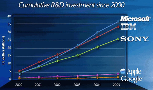
I’m a little late to the party on this one, but last week, Paul Kedrosky pointed to this chart presented by Microsoft touting their R&D spend, seemingly as a way to say “we’re more serious about this stuff than Google.”

As Paul, and his commenters, point out, spending R&D money isn’t the same as producing results. I wrote about this in February 2004, where I called into question the value of R&D in interaction design. Over two years later, and it still stands — innovation is occurring in places with almost no official R&D spend (particularly in this Ajax epoch).