I spent today looking at ~60 entries to Exhibit A, and thought I’d share some thoughts on what I saw.
Maybe it shouldn’t be surprising, considering this is an AIGA event, but the number of sites that used images to display text was shocking. Designers have *got* to get over this need for typographical control. An example is The Willey House, devoted to a residence designed by Frank Lloyd Wright. It’s a striking site, engaging aesthetic, but frustrating in its graphic heaviness.
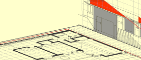
Still, though, the Massing Model was pretty nifty. Which the house grow before your eyes!
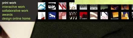
The Design Online 04 is a remarkably clever online design exhibition. It’s design-y, but has some interesting innovations — “Entering” from stage right, the floating navigation (that you can close), and that you can page through the entries with the arrow keys.
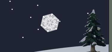
The most delightful site was Snow Days, where you design a snowflake to share with the world. For internet news, the most fun is conducting a search, and seeing how the results appear. It might give Google some new ideas.
Bamboo Design‘s site is remarkably simple, and fairly clever, but the only reason I’m noting it is for the surprise I had when clicking across the navigation bar.
Also created by Bamboo is Hyper-Cow, a site promoting a new caffeinated milk beverage. It’s, um, pretty crazy. I don’t know if it accomplishes any viable business goal, but it’s a blast.
Peter writes:
“Maybe it shouldn’t be surprising, considering this is an AIGA event, but the number of sites that used images to display text was shocking. Designers have *got* to get over this need for typographical control.”
Well, I don’t think we’re ever going to get designers to give up the need for typographic control, so we have to find workarounds and techniques to address that. Fortunately, CSS provides us some solutions, and some clever designers have found somewhat accessible means of image replacement techniques to achieve this, meaning that designers can create graphic-based text, place it in the background of a given element, and then hide the text from visual browsers.
Here’s a list of current IRT’s:
http://www.mezzoblue.com/tests/revised-image-replacement/
And here’s a new IRT that I just stumbled across yesterday from Shaun Inman, that works with Flash:
http://www.shauninman.com/mentary/past/ifr_revisited_and_revised.php
Figuring out how to manage great type in web design has no doubt been a bit of a nighmare, but I think we’re learning a little more about how to do it well, and how to let designers retain at least a *little* more control over their type choices than in the past.
–Molly
I’m bummed I missed your talk on Saturday. I’m anxiously awaiting to see how this AIGA show goes…having been a long time on-again, off-again AIGA skeptic in terms of them being able to embrace anything but paper. My hopes are up for this one. We’ll see. ;o)
Only one comment on your post:
“Bamboo Design’s site is remarkably simple, and fairly clever”
…and ungodly abnoxious, forcing my browser to be maximized across my dual-monitor display to show me a 100 pixel (at most) button to launch the flash site which then, again, is centered and split in half on my two monitors. That should be automatic disqualification IMHO. ;o)
OK, had to come back and comment on the FLW site.
Try viewing it sans images. Hmm…nothing. Interesting.
Hi Peter
I was at the AIGA forum last night and you were enlightening! It was refreshing to hear someone talk about usability with such passion, it seems minneapolis is still caught up in prettiness, not functionality. What you had to say challanged me.
I entered my company’s site in the AIGA contest. I didnt expect it to win, but I would REALLY love to know why it wasnt chosen, how I could make it better, whats wrong with it. I am the only interactive person at our design agency and would love a good kick in the pants, as I dont seem to get it often enough.
http://www.adsoka.com
anyone else reading this I would love to hear your crit of my site as well. email me: alyssag@adsoka.com
thanks for your time!
AIGA Minnesota has got to do better outreach for it’s interactive design competetions, there has got to be better work then this out there. Shit.
It’s kind of a chicken and egg thing. How do you get more Interactive folks interested in AIGA until you get more programs targetted at them. And how to you get more programs targetted at them until you get more interactive folks in AIGA.
I think the reality is that a lot of interactive folks find informal online/offline communities as their main source of networking and professional inspiration/development.
Candles
Peter;
Having once lived amongst a huge concentration of Wright houses, I thought I’d check out the Willey House site. Ouch.
Yeah, the rollover building mass thingy was neat.
The rest? As the quickest critique I can make-where is the house located? I did find it, by using the “Contact” link, and the snail-mail sublink. But there was no reason on my part to assume that the organization that had the website would also be located in the house.
The split navigation-main heads across the top and changing subheads across the bottom is divided by “content” that frquently has nothing to do with the menu selection. My first thought was that I’d missed the little, teeny, tiny hot spot and triggered the wrong link. My high res monitor made that particularly difficult. It wasn’t until the third attempt that I noticed the sublink menu.
Pretty, but unusuable.
Dale
PETER,
Thank you so much for all your efforts at our show, I was the Co-Chair that was MIA in Austria at the time of the event. I love to see all the comments here.
Just as it is in the rest of our world, if you want change let it start with YOU! AIGA Minnesota is going to struggel with embracing interaction design until we all jump in and participate.
Although I agree that we got more “pretty” than “Functional” work, this was an incredibly successful first time event for us, and I want to thank everyone who had the courage to hold their work out there for the rest of us to critique. And the rest of you, especially those with functional design that is pretty 🙂 There will be a next year!
-Larisa