In the early days of the web, it was common to find examples of really bad web design done by obviously talented designers. As folks were learning the medium, they tried all kinds of things, many of them which lead to terrible experiences for users — overwrought splash screens, clever interfaces too difficult to use, aesthetics and style placed above utility, etc.
Since 2002 or so, though, these kind of site experiences have pretty much disappeared. As we all figured out what it meant to put together a basically good site that didn’t screw things up, it’s become harder and harder to find examples where otherwise talented creative folks have totally screwed up. This has made teaching web and interaction design harder, because it’s these examples of design that serve as great tools for instruction.
Which is why the site for the 2007 PDMA conference is so interesting. The Product Development and Management Association is perhaps the leading professional association for folks in its field. It’s a world that Adaptive Path has been getting closer and closer to as we shifted our focus away from marketing and toward product development, particularly product development that makes sense for the people using those products.
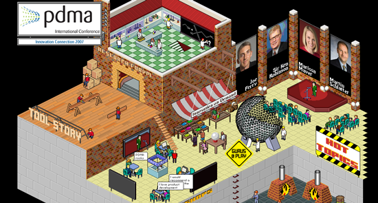
The website of the conference is a disaster. Or rather, the home page is a disaster. It is a giant flash movie, done in an-eBoy-like isometric pixelated style. And it’s impossible to figure out what to do. Originally, I went to that page looking for the date of the event. It’s nowhere on that screen that I can find. And I couldn’t figure out just where I should click. Nor do I know what the following phrases mean, all used on the page: “tool story”, “gurus @ play”, “research forum”, “innovation on demand.” I also found out that if you click in the pool, you go to “workshops.” I don’t know why there’s a geodesic sphere, or kilns. I had no idea where to click to get a simple overview of the event, with, you know, IT’S DATE.
Anyway, I don’t mean to be a Scrooge and all, and really, I do like fun and play in my web experiences… where appropriate. I realized I had a hard time taking this conference seriously if this was the way they were going to showcase it… What does it say about the philosophy of product development on display?
I love the little slogans the tiny PMs say: “The future is bright”, “Fancy a dip in the workshop”, and my favorite “Hmmm. Innovative”.
But when will the sharks in the pool devour that poor swimmer?
And don’t the coal- and oil-fired underground kilns apparently powering everything sort of mean the opposite of “innovation”?
The web site is only one part of the overall marketing campaign. The community that PDMA attracts is familiar with the titles: Hot Topics/Research Forum/Workshops. The site is designed for the inquisitive and intuitive person – and isn’t that what innovative “spirit” is all about? We invite you to explore and take a deep dive and don’t judge this “book” by its cover.
The site reminds me rather strongly of Microsoft Bob.
Okay maybe from an exec perspective dull text would be better, but I still love the retrogaming feel of this designs. Feels like going back to Populous or Cadaver 😉 – follow me ?
Just a pity that interactivity is limited to clickable areas on the map. Would be swell being able to play with the site too….
I agree with you, Peter. I thought this sort of “explore and experience” design style was gone.
Awhile back someone pointed me to this conference. I stared at the site for 5-10 seconds (pretty generous, according to usability specialists), but couldn’t figure out how to find more information.
“The site is designed for the inquisitive and intuitive person”
I hear that excuse a lot. It’s a silly argument if you put it in the context of pretty much any other design discipline.
Architecture: Well we put the front door on the roof because…
Product design: Well, we hid the power button because…
Fashion design: It’s made out of dead fish because…
The only time that argument works is when talking about modern art, IMHO. ;o)
“don’t judge this “book†by its cover”
But if I can’t even open the book to read it…
It does bring up memories of those early years when at EVERY client meeting you always heard the client start off with “we were thinking of having a virtual city where the library would be our document repository and the movie theater would be our demos…”