With all the hullaballoo around web applications, there’s one site that is continuing to delight — Flickr.com. They’re doing great design work in providing what is by far the best photo-sharing site on the Web.
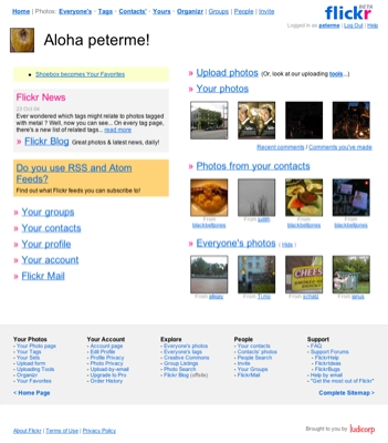
I’m posting today because of a recent, simple, change. They’ve added a task-oriented sitemap to the bottom of every screen.

Click for the making it bigger
I’ve discussed placing navigation at the bottom before. On February 12, 2000 (scroll down), I posted an email from Peter van Dijck, who had been experimenting with this practice, and found it remarkably successful. (Sadly, many of the links in that post are now dead.)
What surprises me is how few sites take advantage of that space “at the bottom.” It’s prime space for a few reasons: it doesn’t clutter up the top, where the focus should be on stuff, not movement; it suits a reading flow… read to the bottom, and then see what it is you can do; when scrolling to scan a page, people often head all the way to the bottom of a page, and then make their way back up. Amazon.com has long used the bottom as a smart place for cross-selling.
I maintain that if one gets a good usability result from putting a site map at the bottom every page, the only thing it proves is that the main site navigation is broken.
This seems to be the case on the photo site you mentioned.
Putting a site map on every page really riles me, actually. It’s just laziness on the IA’s part. Come up with a navigation that makes sense, and there won’t be a need for it.
Vespa–
It’s funny that you think that. Because you’re wrong.
It’s not a matter of laziness. It’s a matter of figuring out how to best present the most popular options available. You could clutter up the “navigation” across the top, but then you’d be getting in the way of the *point* of the site — the interaction with the photos.
You could have just the top level as links (Your Photos, Your Account, Explore, People, Support), but then you’d have to guess what’s beneath them, and have to make two clicks to get there.
Especially considering the degree to which Flickr is more of an application than a content site, exposing the functionality is important — like being able to find the features in your application’s menus. The best way to do this without getting in the way is placing it at the bottom.
Why not make the most important, frequently accessed items the navigation, then?
I don’t care where it goes on the page. The bottom, the top, whatever. But if items listed in the lower levels of the site map are more frequently accessed than the top-level items in the nav, it would make sense to replace the nav with those items, no?
Did you delete my comment I posted last night? Whoa, that was completely and utterly unforeseen. I link to another blog article discussing sitemaps in the footers and get booted, is that the trigger? I’m holding out hope it’s some kind of technical error, I can’t imagine what the motivation for comment moderation might be.
Did you delete my comment I posted last night? Whoa, that was completely and utterly unforeseen. I link to another blog article discussing sitemaps in the footers and get booted, is that the trigger? I’m holding out hope it’s some kind of technical error, I just got another error message when trying to post this one (“Rebuild failed: Renaming tempfile etc etc “) and I can’t imagine what the motivation for comment moderation might be.
But if items listed in the lower levels of the site map are more frequently accessed than the top-level items in the nav, it would make sense to replace the nav with those items, no?
but they aren’t more frequently accessed .. that’s the whole point.
the bottom footer contains all navigation links to both often used and infrequently used features.
the top nav bar only contains the most frequently used links.